c/bisexualagenda · by Yayaj15@lemmy.world · 2yLove has a sense of humor 138 points · 8 comments · view on lemmy.world

8 Comments
irish_link@lemmy.world · 14 pts · 2y
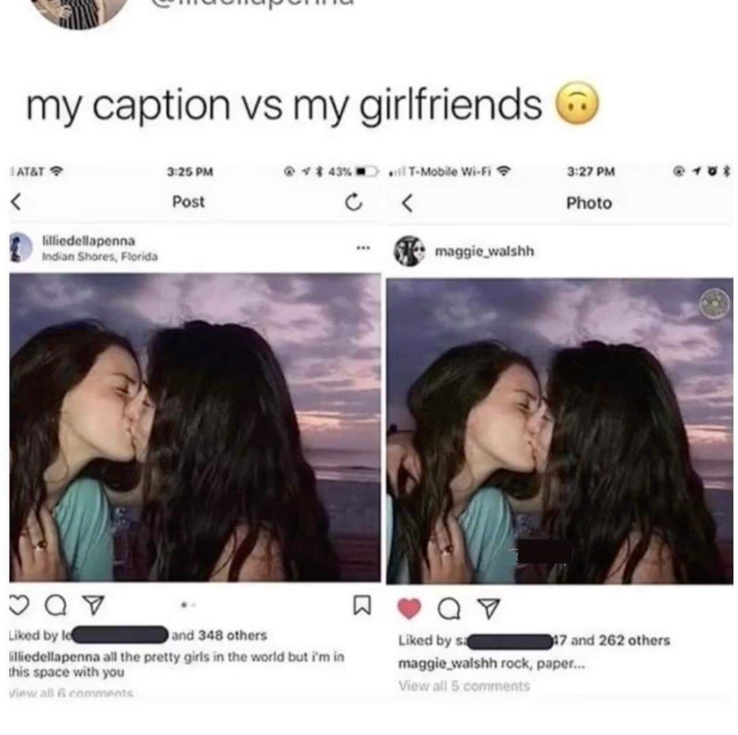
rock, paper, kiss her. I get it!!!
berryjam@lemmy.world · -2 pts · 2y
Zachariah@lemmy.world · -1 pts · 2y
Edit: wrong button.
bradons@lemmy.world · -1 pts · 2y
Who's UX is this? The exact same font, size, color, & format for the user's name and the post's text... What the living fuck?
appelkooskonfyt@lemm.ee · 5 pts · 2y
The username is bold but it's hard to see through all the JPEG compression.
bradons@lemmy.world · 1 pts · 2y
Ah yes, I think you are exactly correct.
SandroHc@lemmy.world · 0 pts · 2y
Zachariah@lemmy.world · 3 pts · 2y
I think it’s two different posts, and each screenshot is from their own account.
bradons@lemmy.world · 1 pts · 2y
That's true, but the username appears in front of the post's text in each.
Zachariah@lemmy.world · 2 pts · 2y
I think the usernames are very slightly bolder than the text, but still as terrible as you’ve pointed out.