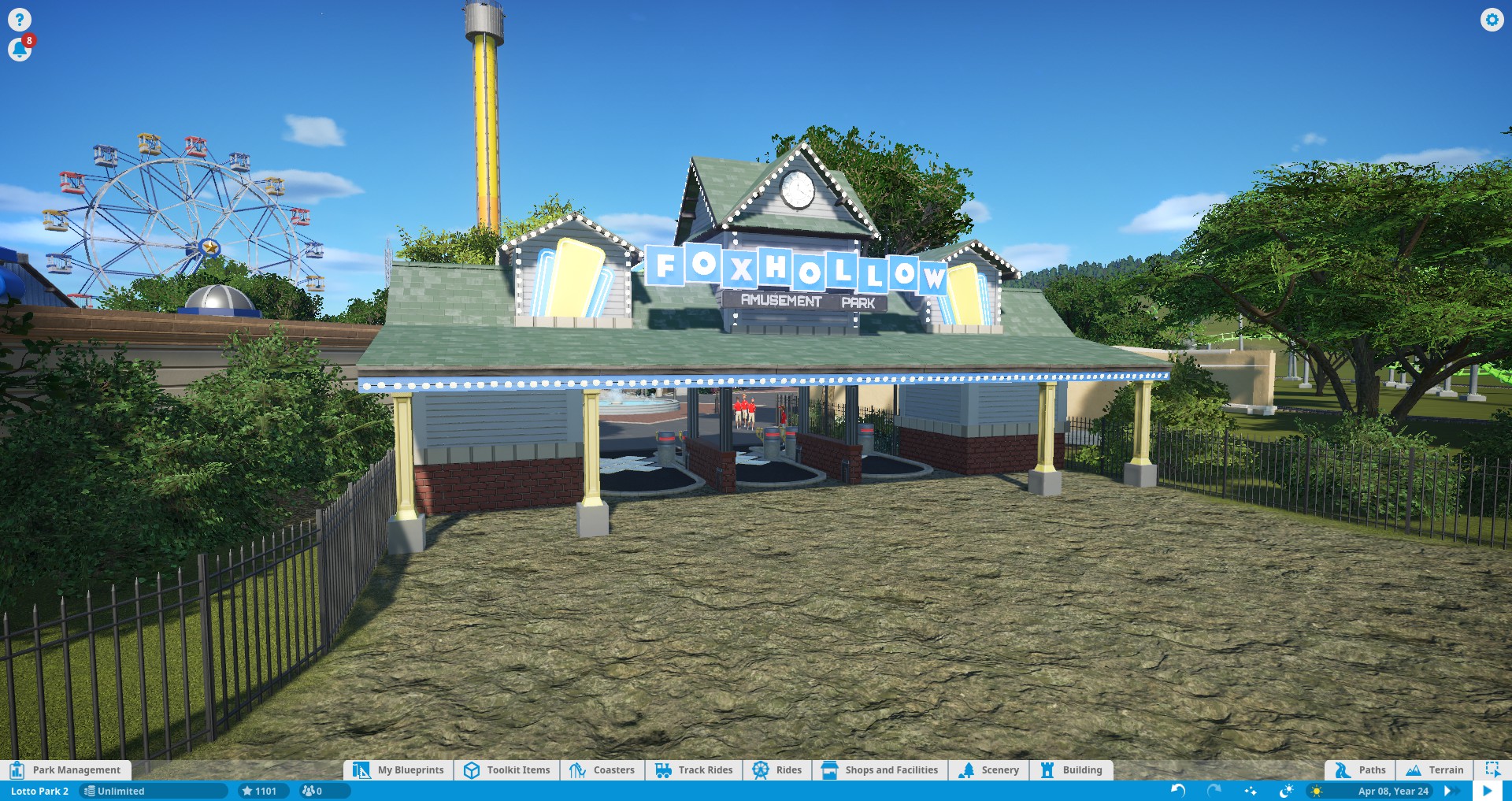
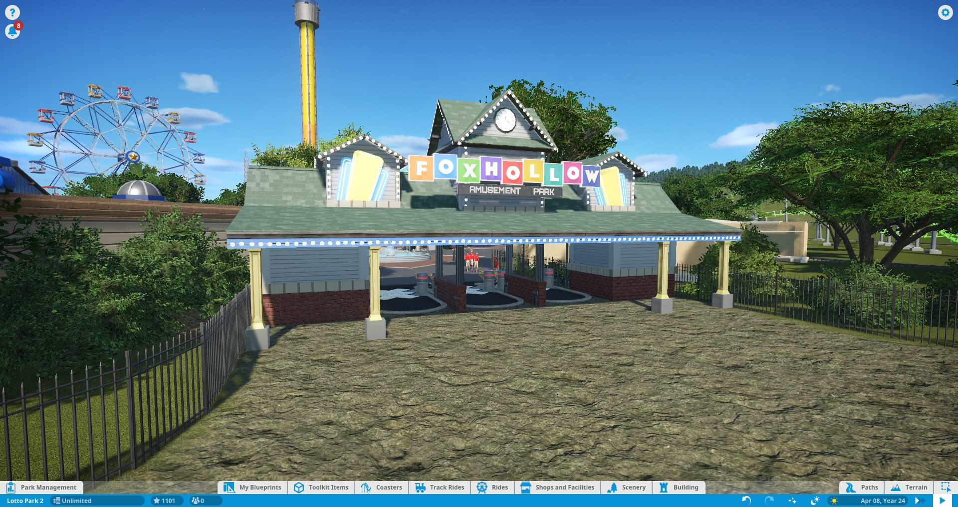
Very nice aesthetic! Both the blue and the rainbow look very nice, and if you're looking for feedback on which is better, sorry to say I won't be much help because I like them both 😅
Thanks for the feedback! I see what you mean about the Disney sign. I'm trying for an aesthetic that's just a little classic/vintage, but still contemporary. I may stick with the blue since I agree it looks slightly more modern (but I'm keeping an extra save file with the rainbow just in case!)
2 Comments
MrMusAddict@lemmy.world · 2 pts · 3y
Very nice aesthetic! Both the blue and the rainbow look very nice, and if you're looking for feedback on which is better, sorry to say I won't be much help because I like them both 😅
The rainbow one reminds me of some of the old Disneyland signs I've seen.
Same-ish sentiment for the blue one, although it feels more modern.
Butter_catbear@lemmy.world · 2 pts · 3y
Thanks for the feedback! I see what you mean about the Disney sign. I'm trying for an aesthetic that's just a little classic/vintage, but still contemporary. I may stick with the blue since I agree it looks slightly more modern (but I'm keeping an extra save file with the rainbow just in case!)