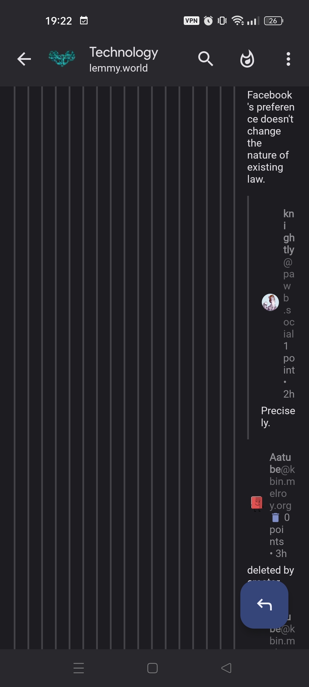
This old thing that sometimes happened in Sync for Reddit seems to happen again here, where comments are always indented even to the point of not rendering correctly because they reached the right border. If I'm remembering correctly, this was fixed by giving the user the option to "Load more comments" in the old app, which opened a new screen starting back at the left border. Can we get something like that again?
Post in question: https://pawb.social/comment/7430106
Device information
Sync version: v24.03.26-14:56
Sync flavor: googlePlay

View type: Slides

Device: RMX3085L1
Model: realme RMX3085
Android: 13
11 Comments
can@sh.itjust.works · 5 pts · 2y
Can you link the post?
Kayana@ttrpg.network · 5 pts · 2y
Sorry, I should have thought of that myself:
https://pawb.social/comment/7430106
kratoz29@lemm.ee · 4 pts · 2y
Hmm, I think it looks fine for me.
can@sh.itjust.works · 3 pts · 2y
What adding style are you using?
Settings shortcut: Comments > Padding style
Device information
Kayana@ttrpg.network · 2 pts · 2y
For me it's "Material (medium padding)", I'm guessing it's similar to yours since our screenshots look decidedly similar.
Omniraptor@lemm.ee · 5 pts · 2y
sync classic all the way for me
scottywh@lemmy.world · 1 pts · 2y
Same here and it definitely doesn't exhibit the described behavior.
kratoz29@lemm.ee · 4 pts · 2y
Material minimum padding, I guess that's why.
can@sh.itjust.works · 2 pts · 2y
Correct. I assume that's the default.
Master@lemm.ee · 3 pts · 2y
That is unreadable to me as well on sync.
Minimum padding fixed it for me though.
Pulptastic@midwest.social · 3 pts · 2y
It looks like the behavior of "view more" has recently changed. Before it would load just the sub tree of comments but now it loads them within the main comment tree. Old way was a bit jarring but loaded correctly, new way scrunches comments as they get too close to right side border.