cross-posted from: https://floss.social/users/LabPlot/statuses/112484470459165421
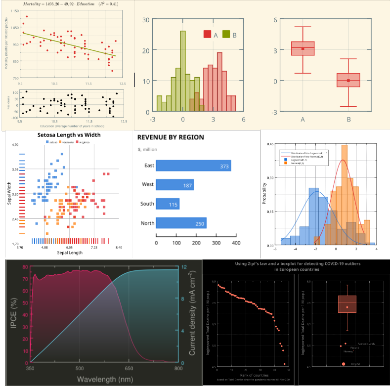
Below is just a small sample of plots that were created with #lLabPlot.
#LabPlot is a FREE, open source and cross-platform Data Visualization and Data Analysis software.
Would you like to share with us your plots made in LabPlot?
#DataAnalysis #DataScience #Data #DataViz #DataVisualization #Science #Statistics #Mathematics #Math #STEM #FOSS #FLOSS #OpenSource #KDE
8 Comments
Stitch0815@feddit.de · 10 pts · 2y
This looks amazing. I was actually looking for a foss plotting software but could not find anything. Will have a look at this
blackbirdbiryani@lemmy.world · 3 pts · 2y
R tidyverse (specifically ggplot) is used by pretty much everyone in the scientific field. Probably the only implementation of a plotting system that has the least friction.
Successful_Try543@feddit.de · 2 pts · 2y
Gnuplot would usually be the first that comes into my mind. However, it's command line only.
Labplot does not only have a GUI, it also integrates well into the KDE desktop environment.
produnis@discuss.tchncs.de · 9 pts · 2y
I use R, btw ;)
boredsquirrel@slrpnk.net · 4 pts · 2y
This is neat.
I like the Unix idea of doing one thing. But that was also kinda the issue with Labplot. R can also do conversion, table operations etc.
Excel is very easy to use with no learning curve. But it is of course bloated Microsoft nonsense.
CommunityLinkFixer@lemmings.world · 4 pts · 2y
Hi there! Looks like you linked to a Lemmy community using a URL instead of its name, which doesn't work well for people on different instances. Try fixing it like this: !labplot@lemmy.kde.social
anzo@programming.dev · 3 pts · 2y
It would be great if it had some grammar of graphics embedded in the UX
Moshpirit@lemmy.world · 2 pts · 2y
What kind of plot was used for "setosa length vs width"?