It even has a demo right there on the phone. Also nice to see the version of the latest release at the top. This is the home page at https://www.home-assistant.io/
The new Home Assistant website design looks great
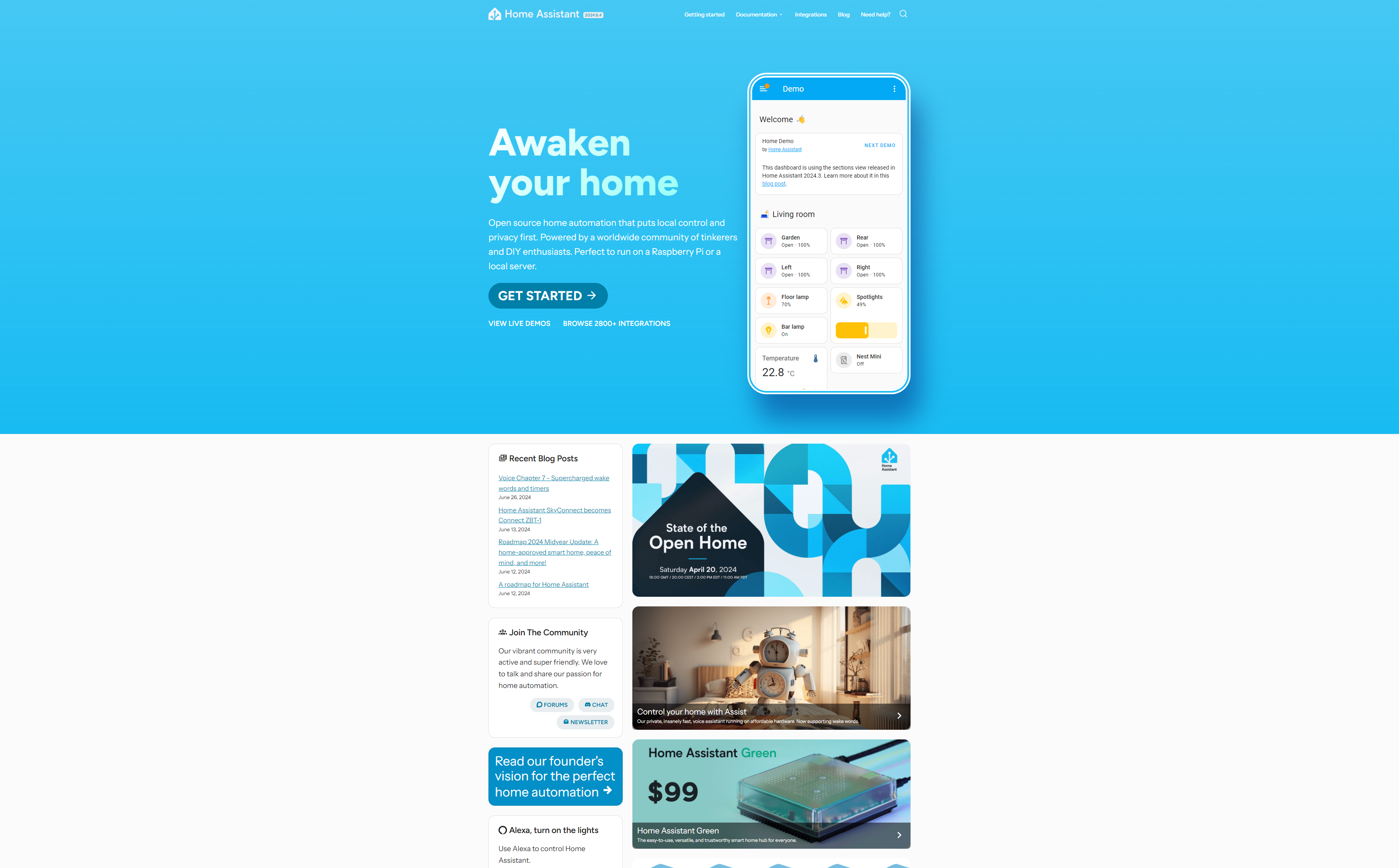
It even has a demo right there on the phone. Also nice to see the version of the latest release at the top. This is the home page at https://www.home-assistant.io/
8 Comments
ptz@dubvee.org · 5 pts · 2y
Are you being sarcastic? That looks terrible. I hate when websites go for the CVS receipt layout.Or did you just zoom way, way out for the screenshot? I'm on mobile so it already looks CVS-receipty.Edit: Oh, you did just zoom way out, so I take a lot of that back. Still don't think it looks great though. Cluttered and just "too much".
Shr1k3@lemmy.world · 7 pts · 2y
To each their own, I quite like it. I do get you though, it could make better use of the white space. On the other hand, it fills out my vertical monitor quite nicely:
The joys of responsive website design I guess.
ptz@dubvee.org · 9 pts · 2y
Hey, I pay for those pixels along the sides, so I expect them to get used once in a while 😆
scottmeme@sh.itjust.works · 4 pts · 2y
Trust me when I say I design my websites with 32:9 being my main development display.
SUW is my primary "how will this website be fucked in weird and mysterious ways" solver.
ptz@dubvee.org · 3 pts · 2y
Yup. Same.
Though I only have 3x 1080p ones so I have to fudge it and size the browser window across multiple monitors lol.
scottmeme@sh.itjust.works · 4 pts · 2y
Lol before I had massive UW and SUW monitors, I actually did a 5x 1920x1080p setup, was just a dome around me.
At night, I was able to just open a notepad on all monitors and light up the entire room
JaddedFauceet@lemmy.world · 3 pts · 2y
What is a CVS receipt layout? Why do you hate it?
ptz@dubvee.org · 8 pts · 2y
Not sure if "CVS receipt layout" is a common term or not, but I've used it over the last 10 years or so.
It describes websites that have massive margins with the content displayed as a thin strip down the middle; everything on the side is just wasted space (or crammed with ads).
Receipts from the retailer CVS are a known joke where the smallest, single-item purchase will generate a receipt that's 6 foot long because of all the ads, coupons, and other junk tacked on.
In the old days, it was a lazy way to make websites work on desktop and mobile. Now, it's a lazy excuse for not doing responsive design and/or allocating massive amounts of space for ads. I hate it. lol.