I know that, but it just looks weird. Though on second thought, maybe the issue is the connection between E and K. Star Wars has the R and S connected, but there it looks like a natural extension of the strokes made when writing the letters. Here it doesn't work nearly as well, and the second line already has two connected letters with T and R anyway. So after thinking about it a bit more, I think I'd just cut the connection between E and K. The K still looks a little odd, but it conforms to the SW logo, and at least the entire bottom right corner doesn't stick out like a sore thumb.
15 Comments
FlyingSquid@lemmy.world · 16 pts · 2y
I have that on a shirt. I love it.
swab148@lemm.ee · 15 pts · 2y
Riker: steps over it
DmMacniel@feddit.org · 14 pts · 2y
Move it a bit more and you have Star Shrek
negativenull@lemmy.world · 27 pts · 2y
possiblylinux127@lemmy.zip · 6 pts · 2y
Why is Shrek a Vulcan?
swab148@lemm.ee · 6 pts · 2y
Maybe he's actually a Romulan
The_Picard_Maneuver@lemmy.world · 10 pts · 2y
Yes please
FlyingSquid@lemmy.world · 7 pts · 2y
"What are you doing on my swamp world of Degobah? All right, get out of here. All of you. Move it. Let's go."
The_Picard_Maneuver@lemmy.world · 5 pts · 2y
Shrek as the most enlightened Jedi master is something I need to see.
marcos@lemmy.world · 3 pts · 2y
Hum... That will be almost exactly like the real thing.
ininewcrow@lemmy.ca · 6 pts · 2y
For some reason my brain immediately just read ... SHREK
Sordid@lemmy.world · 10 pts · 2y
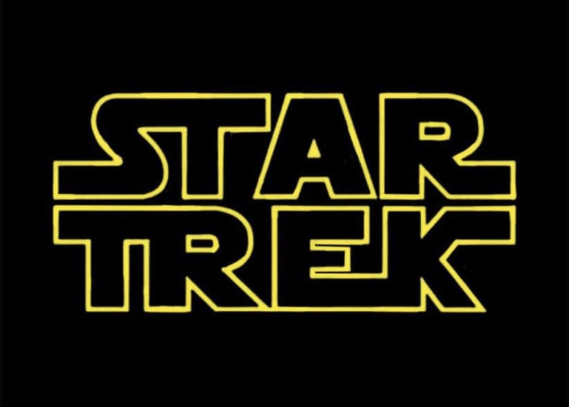
Is it just me or is the K upside down? Surely this looks better?
ilinamorato@lemmy.world · 8 pts · 2y
In the original "Star Wars" logo, the extensions on the text are adjacent. I think they're trying to mimic the original.
Sordid@lemmy.world · 5 pts · 2y
I know that, but it just looks weird. Though on second thought, maybe the issue is the connection between E and K. Star Wars has the R and S connected, but there it looks like a natural extension of the strokes made when writing the letters. Here it doesn't work nearly as well, and the second line already has two connected letters with T and R anyway. So after thinking about it a bit more, I think I'd just cut the connection between E and K. The K still looks a little odd, but it conforms to the SW logo, and at least the entire bottom right corner doesn't stick out like a sore thumb.
homesweethomeMrL@lemmy.world · 4 pts · 2y
Font nerds?! In my Trek nerds shitpost??
Well! Harrumph.