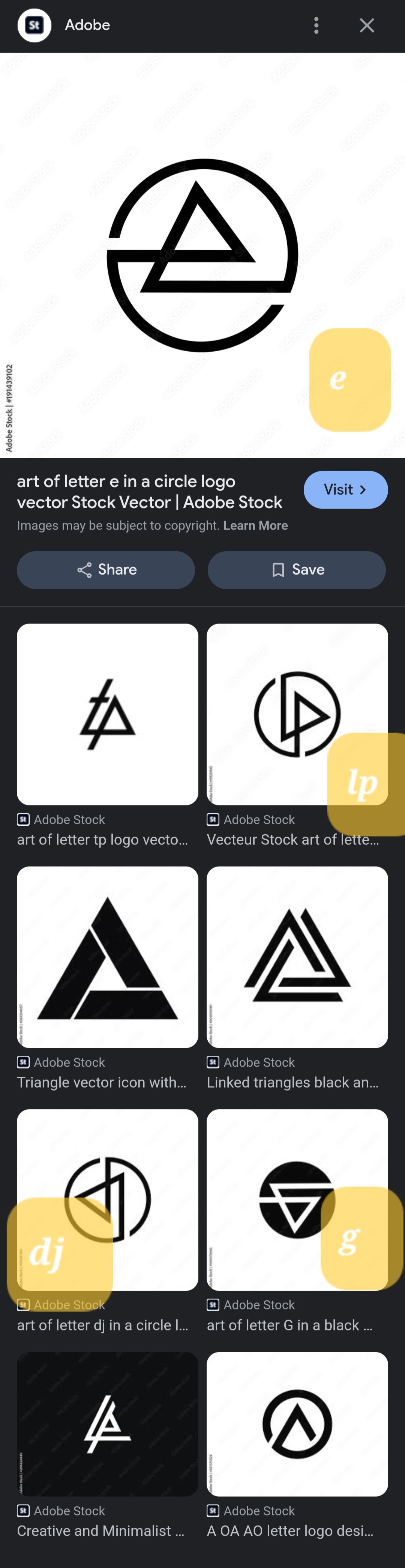
c/aboringdystopia · by eightpix@lemmy.world · 2yAdobe sells these as 4 different designs. They're all the same. Rotated 90° for each one. Except for the 'e', they flipped that one. 73 points · 8 comments · view on lemmy.world
8 Comments
Aurenkin@sh.itjust.works · 62 pts · 2y
Is it just me or do they really closely resemble the Linkin Park logo?
AlexWIWA@lemmy.ml · 32 pts · 2y
These are all rip offs of the Linkin Park logo. One is literally the 2008 logo rotated. I thought this was a Linkin Park post when I saw it
No_Eponym@lemmy.ca · 12 pts · 2y
AnarchoNoAdjective@lemmy.ml · 12 pts · 2y
Good shout, I was thinking the Audio Technica logo but LP logo is closer
Canadian_Cabinet@lemmy.ca · 18 pts · 2y
I swear one of them is literally just the Abstergo logo
Artyom@lemm.ee · 10 pts · 2y
Possibly exactly. I'm suspicious these were all made with AI based on copyrighted logos, at which point almost everything it'll spit out is a copyrighted logo.
hellfire103@lemmy.ca · 10 pts · 2y
So we've got six Linkin Park ripoffs, the postmarketOS logo, and a valknut? Not sure what the last one is, but I'd be surprised if it were original.
Fuck Adobe.
letme_meowmeow@sh.itjust.works · 1 pts · 1y
So, I think some dude try to split their work so it is more likely to hit on Search bar, and make a sale.