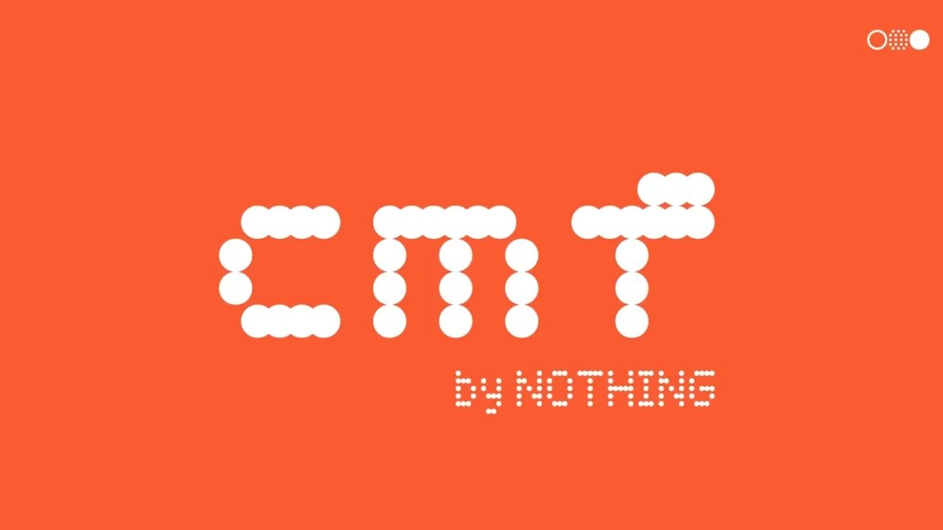
The sad thing is, they had enough vertical "pixels" to make a proper "F". 🤦♂️ If they were worried it didn't look lowercase enough, just remove the top-left "pixel".
Of course what they really need is for someone to shake them and yell "IT'S 2023, ENOUGH WITH THE FAKE DOT-MATRIX DISPLAY BULLSHIT", but what can you do.
4 Comments
momocchi@lemmy.world · 6 pts · 3y
How does a logo like this ever get to the point where someone other than its designer even sees it?
extant@lemmy.world · 3 pts · 3y
It does say "cmf" in lowercase, though it could be more clear.
Wreckronomicon@lemmy.world · 1 pts · 3y
Not gonna lie, on first glance it looked like it said cunt
meejle@lemmy.world · 1 pts · 3y
The sad thing is, they had enough vertical "pixels" to make a proper "F". 🤦♂️ If they were worried it didn't look lowercase enough, just remove the top-left "pixel".
Of course what they really need is for someone to shake them and yell "IT'S 2023, ENOUGH WITH THE FAKE DOT-MATRIX DISPLAY BULLSHIT", but what can you do.