
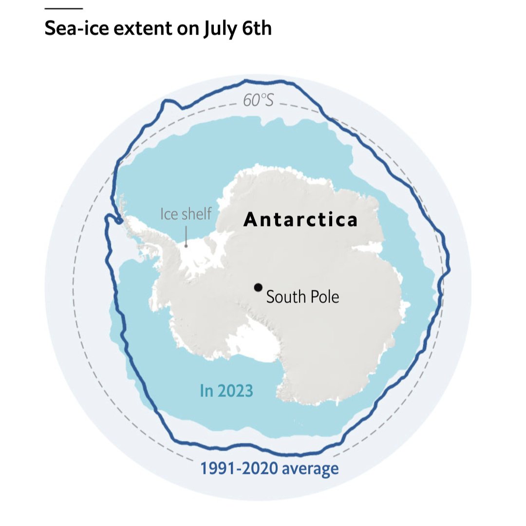
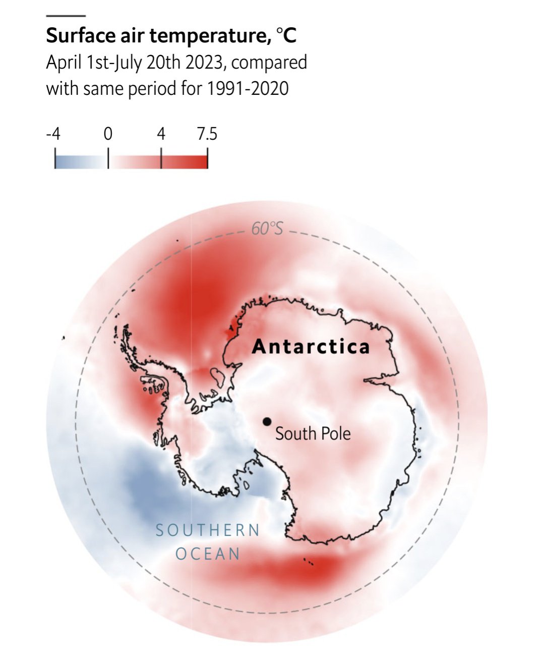
That 2023 line does not look ideal...
Source: The Economist
Each point represents a five day moving average. The x-axis is in terms of historical standard deviations, i.e each day is compared to the standard deviation of historical values for that year. So we are at -6 SD from the historical average for this point in time.
Other excellent visualizations are in the article!

11 Comments
stebo02@lemmy.dbzer0.com · 20 pts · 3y
Black_Gulaman@lemmy.dbzer0.com · 12 pts · 3y
Damn, I know we're in !dataisbeautiful@lemmy.world
But there's nothing beautiful with this data.
LostCause@kbin.social · 6 pts · 3y
Holocene extinction any%
Driftking@lemmy.ml · 6 pts · 3y
Good. When it's gone we'll be able to get to that sweet sweet oil
overzeetop@lemmy.world · 8 pts · 3y
[Slaps the newly exposed dirt] "It's free real estate!"
doppelgangmember@lemmy.world · 2 pts · 3y
I mean.. that is literally what Russia, right-wingers, and neoliberals want..
Melt the ice, get the dino juice bc we only have 47 years of reserves left...
Kikkertje@aussie.zone · 5 pts · 3y
This is fine!
ThrowawayPermanente@sh.itjust.works · 3 pts · 3y
Take that, stupid mean sea ice. That's what you get for sinking our boat. Apes together strong.
Stoneykins@mander.xyz · 2 pts · 3y
This is probably one of the most insane things I've ever said but its like the Mario and Luigi of terrifying climate charts from 2023
danikpapas@lemmy.world · 2 pts · 3y
I love graphs that don't have their axis labeled. I the first graph, y axis, what am I looking at? -2 what?
coys25@lemmy.world · 2 pts · 3y
They are standard deviations, which is described in the footnote. But yeah, probably better to label that axis.
TheBat@lemmy.world · 1 pts · 3y
soviettaters@lemmy.world · -13 pts · 3y
To be fair we were in a heat wave, even by the new standards set by climate change.