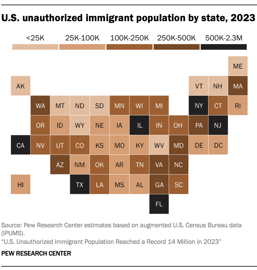
c/dataisbeautiful · by Innerworld@lemmy.world · 207dU.S. unauthorized immigrant population by state, 2023 -18 points · 14 comments · view on lemmy.world
14 Comments
yesman@lemmy.world · 43 pts · 207d
That color scheme was a choice.
over_clox@lemmy.world · 11 pts · 207d
Oh fuck, you got a point.. ☹️
HejMedDig@feddit.dk · 10 pts · 207d
Shouldn't it be as a percentage of the state population?
Nollij@sopuli.xyz · 4 pts · 207d
Yeah, as it is it's basically just a population map.
9tr6gyp3@lemmy.world · 1 pts · 207d
I don't believe thats what they were trying to represent in this graph. This is estimating the total, not percentage.
HejMedDig@feddit.dk · 9 pts · 207d
Yeah, but 100K in a 1 mio people state is a lot. Where as 100K in as 30 mio people state is not that many, and thus I think both should be shown
9tr6gyp3@lemmy.world · 2 pts · 207d
I agree it would be nice to see a percentage based map as well, but OP didn't post that
123@programming.dev · 2 pts · 206d
Or just not use racist coloring with no context.
9tr6gyp3@lemmy.world · 2 pts · 206d
100% agree
ZeroGravitas@lemmy.dbzer0.com · 9 pts · 207d
Computer, overlay a red/blue scheme for governor party affiliations per state at 60% transparency.
Insekticus@aussie.zone · 3 pts · 207d
Absolutely unsurprised it's black in Florida and Texas. Almost like they were taken there on working visas for cheap labor, or something.
AE5NE@lemmy.radio · 9 pts · 207d
All of the highest population states are in the highest category, because the number isn’t represented per capita.
Also, this color scheme, wtf
Fleur_@aussie.zone · 2 pts · 206d
This fuckin map bro
PM_ME_VINTAGE_30S@lemmy.sdf.org · 1 pts · 207d
Based, those are rookie numbers 😈