I wish charts like this included how much damage environmentally each of those did, proportional to the amount mined; as well as comparisons with previous years and estimates for how much is left.
“Environmental damage” isn’t something that’s reducible to a single number on a graph. There’s no way to convert cancer incidents into carbon emissions or increased soil nutrient mobility, etc.
And reserves aren’t necessarily a fixed number. What exists underground isn’t the same as what’s economically recoverable. And as the price of a mineral goes up, it may become more economically recoverable and worthwhile to dig up more.
3 Comments
KSPAtlas@sopuli.xyz · 5 pts · 2y
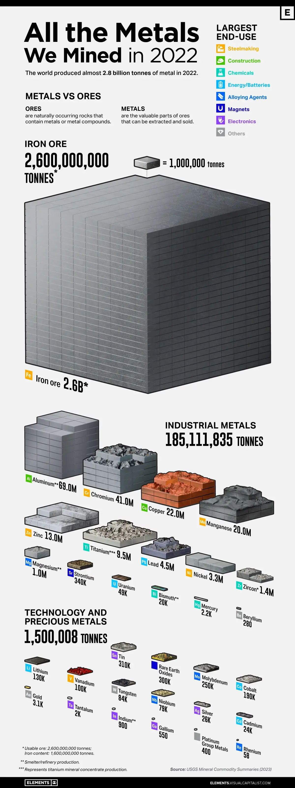
Does this measure just ore amount or metal content?
MossyFeathers@pawb.social · 0 pts · 2y
I wish charts like this included how much damage environmentally each of those did, proportional to the amount mined; as well as comparisons with previous years and estimates for how much is left.
Entropius@lemmy.world · 14 pts · 2y
“Environmental damage” isn’t something that’s reducible to a single number on a graph. There’s no way to convert cancer incidents into carbon emissions or increased soil nutrient mobility, etc.
And reserves aren’t necessarily a fixed number. What exists underground isn’t the same as what’s economically recoverable. And as the price of a mineral goes up, it may become more economically recoverable and worthwhile to dig up more.