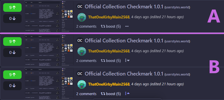
I want to add an icon for the "more" button in my userstyle, idkbin, and I'm not sure which of these I prefer. A is much simpler, but B is what Lemmy uses and also has a cool thing where the caret flips when the menu is active.
EDITː I've decided on A, which is now in idkbin 1.3.3. Like with other features in idkbin, this icon can be disabled in settings if you'd just prefer the text.
8 Comments
minnieo@kbin.social · 6 pts · 2y
I prefer A, i'm a simple gal :D
PlzGivHugs@sh.itjust.works · 3 pts · 2y
I perfer A. B is too different from the standard.
DarkThoughts@kbin.social · 3 pts · 2y
A, because the three dots sort of, to me, indicate a followup / extension of the previous menu options.
testing@kbin.social · 1 pts · 2y
@DarkThoughts
yep
@ThatOneKirbyMain2568
ThatOneKirbyMain2568@kbin.social · 2 pts · 2y
I want to add an icon for the "more" button in my userstyle, idkbin, and I'm not sure which of these I prefer. A is much simpler, but B is what Lemmy uses and also has a cool thing where the caret flips when the menu is active.
EDITː I've decided on A, which is now in idkbin 1.3.3. Like with other features in idkbin, this icon can be disabled in settings if you'd just prefer the text.
iHUNTcriminals@lemm.ee · 1 pts · 2y
I like b
SuperSpaceFan@kbin.melroy.org · 2 pts · 2y
wagesj45@kbin.social · 2 pts · 2y
B
IONLYpost@kbin.social · 1 pts · 2y
Alright, A isn't "good" but B is pretty unnecessary.