
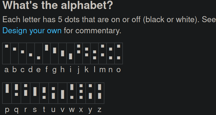
 I kinda like the way this looks as it makes the script predictable but I still feel like it could really be improved
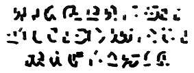
 These two are pretty bad in my opinion as I can't really tell where the dots are meant to be and it looks very overcomplicated.
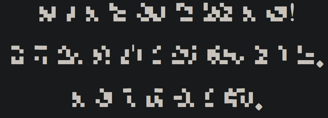 This is the original font and I believe it can be easily written (unfortunately my artistic skill is pretty low).
6 Comments
Sterile_Technique@lemmy.world · 11 pts · 2y
Darthjaffacake@lemmy.world · 4 pts · 2y
😂😂😂 I'm ashamed to say I laughed out loud at this one
frosty99c@midwest.social · 3 pts · 2y
Lined paper like music notes?
Darthjaffacake@lemmy.world · 1 pts · 2y
That would probably help but also make everything merge together a bit
Warl0k3@lemmy.world · 2 pts · 2y
Personally I'd use a stubby calligraphy pen like a Pilot Parallel. Otherwise these are gonna be really hard to make distinct enough to read, the very-similar-height dots especially
Darthjaffacake@lemmy.world · 1 pts · 2y
Yeah so luckily it's designed in such a way that smaller destinctions like the height of a dot can't change the actual meaning (if a word looks like "baskxt" we'd all know what it's meant to spell because clearly a consonant isn't meant to be there)
sbf@feddit.org · 1 pts · 1y
I wouldn’t. Hope this helps!