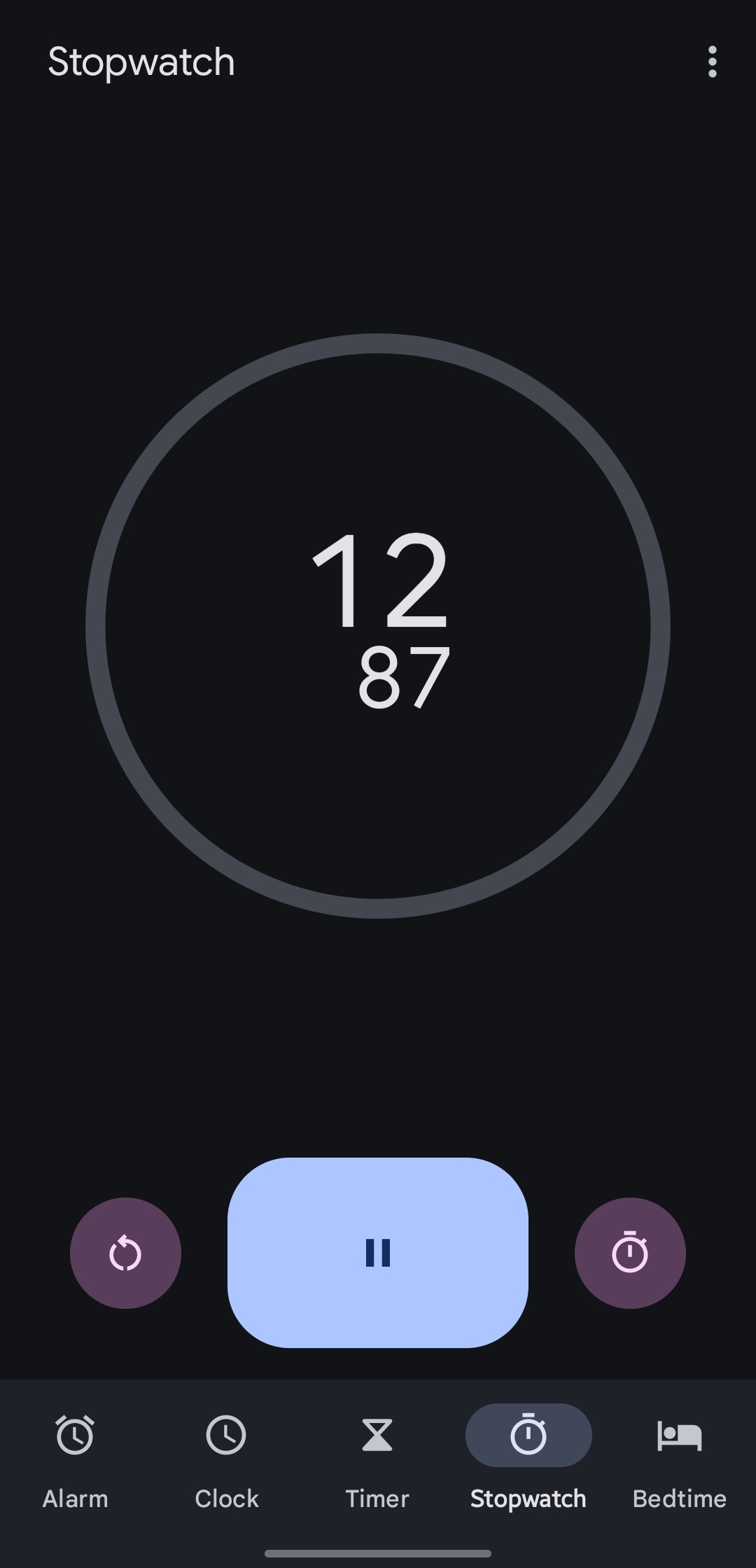
One of the buttons laps the stopwatch, the other resets the entire session clearing all lap markers and stopping the counter. Better not forget which is which, especially given that you're probably timing something in the physical world not paying much attention to your phone...
Annoyingly similar buttons with very different functions
19 Comments
agelord@lemmy.world · 27 pts · 2y
The placement of the numbers and their relative size are ugly too. I understand why the sizes are different, but it looks ugly nonetheless.
runswithjedi@lemmy.world · 22 pts · 2y
__matthew__@lemmy.world · 14 pts · 2y
Yeah I think it's the fact that both are circular icons inside circular buttons of the same color in the same relative position. The reset icon itself is fine.
HubertManne@kbin.social · 2 pts · 2y
is that what it is. for point in time readings like laps?
zerosignal@lemmy.world · 20 pts · 2y
I think worse is the alarm clock, where snooze and stop are the same size and shape, and hard to tell apart when you are half asleep
dingus@lemmy.world · 3 pts · 2y
Dude I struggle with this all the time! The symbols are way too similar to each other and I occasionally find myself turning off the alarm when I meant to snooze.
dmention7@lemm.ee · 1 pts · 2y
On top of that, I swear the UI changes 1-2 times per year with software updates. It's hard to pinpoint since I'm usually 90% asleep when interacting with the alarm, but I know it has changed from tap to swipe and switched sides at least once since I got my last phone in 2022.
There is absolutely no reason for that shit. If you look at an old school alarm clock, the snooze button is the size of a small country, and there is usually a much smaller button or sliding switch to make damn sure you meant to turn the alarm off.
possiblylinux127@lemmy.zip · 7 pts · 2y
Foss for the win
Kolli@sopuli.xyz · 3 pts · 2y
That's a shot from the wrong screen.
turbowafflz@lemmy.world · 7 pts · 2y
Yeah the AOSP one lineage uses which I assume is the same one this person was using has the same button layout as OP's when it's actually running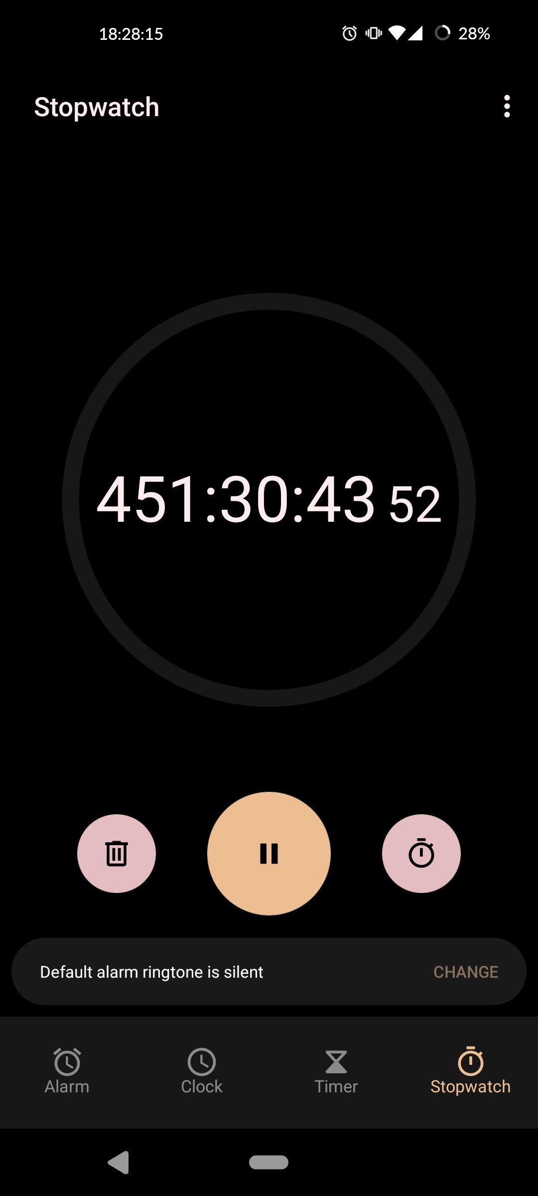
possiblylinux127@lemmy.zip · 6 pts · 2y
Lineage OS does its own thing actually. The Google one is proprietary and the AOSP one is abandoned.
turbowafflz@lemmy.world · 2 pts · 2y
Oh interesting, huh
dingus@lemmy.world · 2 pts · 2y
Have you been running your stopwatch for 451 hours???
possiblylinux127@lemmy.zip · 4 pts · 2y
Reasons of course
turbowafflz@lemmy.world · 2 pts · 2y
493 now
possiblylinux127@lemmy.zip · 2 pts · 2y
What do you mean?
Willie@kbin.social · 4 pts · 2y
Samsung's clock application did this pretty well, where you don't even have a reset count button until you press the button that stops the stopwatch from counting.
LordCrom@lemmy.world · 4 pts · 2y
UIs went to shit when some marketing person decided to stop putting labels on buttons and just go with shapes that are somehow supposed to be universally interpreted.
Melonpoly@lemmy.world · 2 pts · 2y
Everything about this is infuriating
neo@derpzilla.net · 2 pts · 2y
button placement not really an issue for me, however, the text being off center is