The Inter typeface is very versatile and has many different options and variants, including more distinguishable uppercase i and lowercase L. The article just installed the base version as an example. https://rsms.me/inter/
Fair, they're pretty common but most fonts support OpenType variations which let you change parts of the fonts to other variants. Having a variant with distinct l's and I's is pretty common and Inter supports this.
Like most modern fonts, it supports a lot of OpenType features, so this can be changed dynamically. Changing some settings by default has already been mentioned in the discussion around the change.
IIRC this issue is mentioned in the gitlab discussions (from months ago ... not sure how this became news suddenly); they're looking to patch Inter if they decide to use it as the UI font.
The article isn't great as it fails to mention that Gnome is considering a variation of Inter and not the default and therefore the article uses the wrong font in the screenshot. It addresses some of the concerns people have mentioned, like the capital I and lower l being the same
31 Comments
unknowing8343@discuss.tchncs.de · 47 pts · 2y
Capital i is same as non-capital L... So a horrible font for me.
bogpunk@lemmy.ca · 36 pts · 2y
The Inter typeface is very versatile and has many different options and variants, including more distinguishable uppercase i and lowercase L. The article just installed the base version as an example. https://rsms.me/inter/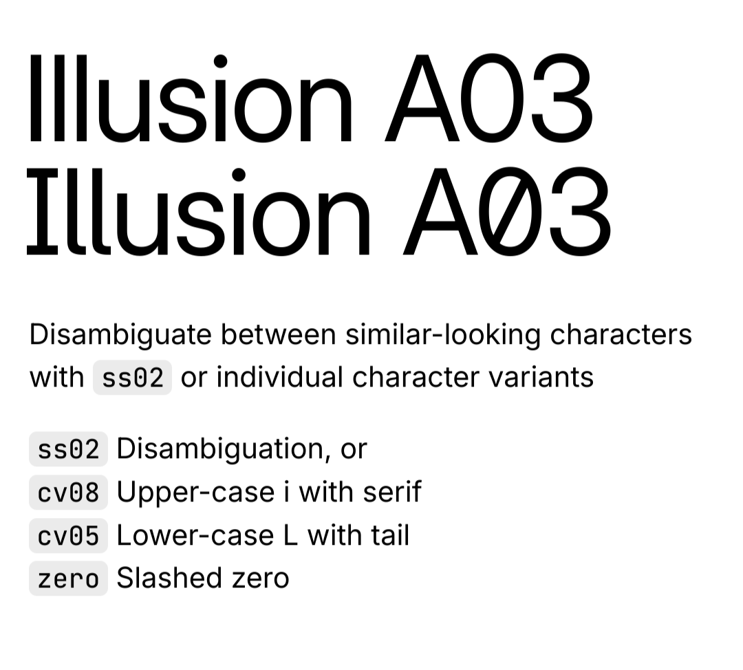
moontorchy@lemmy.world · 6 pts · 2y
Oh thanks! This is very helpful. Next thing to figure out is how to set those options as default. Found this gem after a bit of googling.
KryptonNerd@slrpnk.net · 11 pts · 2y
Yeah that's really frustrating
slacktoid@lemmy.ml · 9 pts · 2y
Why do they do this?
priapus@sh.itjust.works · 3 pts · 2y
Do what? Nothing has even been done yet, they're just discussing the possibility of changing the font...
slacktoid@lemmy.ml · 1 pts · 2y
I mean making a font whete the l and I are the same
priapus@sh.itjust.works · 3 pts · 2y
Fair, they're pretty common but most fonts support OpenType variations which let you change parts of the fonts to other variants. Having a variant with distinct l's and I's is pretty common and Inter supports this.
slacktoid@lemmy.ml · 2 pts · 2y
but thats counter intuitive, why not stick to a clear fonts? im not gonna judge ones choices but i just dont understand it is all.
priapus@sh.itjust.works · 2 pts · 2y
I agree, I wish fonts just defaulted to distinguishing between them
slacktoid@lemmy.ml · 1 pts · 2y
time for a mass boycott of bad fonts!!
priapus@sh.itjust.works · 4 pts · 2y
Like most modern fonts, it supports a lot of OpenType features, so this can be changed dynamically. Changing some settings by default has already been mentioned in the discussion around the change.
GolfNovemberUniform@lemmy.ml · 2 pts · 2y
I guess they're copying mainstream OSes (at least Android) with this one
walthervonstolzing@lemmy.ml · 7 pts · 2y
IIRC this issue is mentioned in the gitlab discussions (from months ago ... not sure how this became news suddenly); they're looking to patch Inter if they decide to use it as the UI font.
muhyb@programming.dev · 1 pts · 2y
Generally it renders much better but that's a turn off for me as well.
HouseWolf@lemm.ee · 0 pts · 2y
I'm normally not someone who gets hung up on fonts but this one thing bugs me SO MUCH.
Jegahan@lemmy.ml · 22 pts · 2y
The article isn't great as it fails to mention that Gnome is considering a variation of Inter and not the default and therefore the article uses the wrong font in the screenshot. It addresses some of the concerns people have mentioned, like the capital I and lower l being the same
boredsquirrel@slrpnk.net · 22 pts · 2y
TL;DR they switch to "Inter"
https://www.omglinux.com/gnome-may-switch-to-inter-font/
Peer@discuss.tchncs.de · 23 pts · 2y
Not even that: merely looking to switch to Inter.
boredsquirrel@slrpnk.net · 4 pts · 2y
True. A system font needs to be REALLY good.
velox_vulnus@lemmy.ml · 5 pts · 2y
thayer@lemmy.ca · 3 pts · 2y
I believe Noto is a much more robust typeface, with several more language options than Cantarell. Still, I do prefer Inter to both of those.
voidnutcracker@feddit.de · 4 pts · 2y
Please don't hate me but I use Segoe UI
yak@feddit.it · 1 pts · 2y
hates you
voidnutcracker@feddit.de · 2 pts · 2y
Oh... so I better not tell you that I also use windows folder icons because gnomes blue folders make no fucking sense
Heavybell@lemmy.world · 4 pts · 2y
Whenever I read something on the lines of X`s new Y, I think of Curt's new hat.
Codilingus@sh.itjust.works · 4 pts · 2y
That's the photo where he took a selfie with the hat, in front of the billboard which is a photo of him with the new hat, Yea?
Heavybell@lemmy.world · 2 pts · 2y
That's the one :)
Rentlar@lemmy.ca · 4 pts · 2y
If the Gnome team don't like this new Inter font, will they return to "Déjà Vu"?
m4m4m4m4@lemmy.world · 2 pts · 2y
blitzed@noauthority.social · 1 pts · 2y
@just_another_person
My main go-to fonts are; VL Gothic, Jetbrains
Mono, M Plus
gi1242@lemmy.world · -9 pts · 2y
lord_ryvan@ttrpg.network · 22 pts · 2y
They don't. They're thinking of switching to another font.
Jumuta@sh.itjust.works · 6 pts · 2y
inter already exists