cross-posted from: https://programming.dev/post/18098231
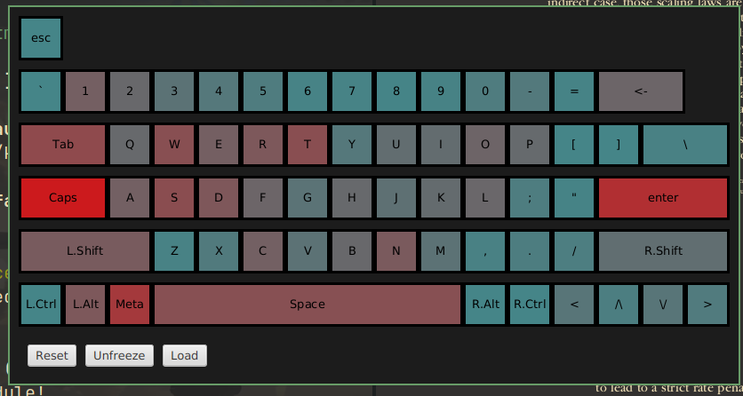
Have you ever wondered if your keyboard shortcuts are set up optimally? Well, I did, so I decided to visualize it with a heat-map.
It proved to me that I rely on my left pinky too much, so I'll try to rework my shortcuts.
You can check out the project here, currently it only works on Linux.
11 Comments
mihnt@lemmy.ca · 8 pts · 2y
Meta key to the right of alt? wut?
Atropos@lemmy.world · 3 pts · 2y
How do you open Facebook?
andnekon@programming.dev · 1 pts · 2y
Yeah, it is on my keyboard
Jesusaurus@lemmy.world · 4 pts · 2y
Why is caps lock your most used key?
56_@lemmy.ml · 1 pts · 2y
I'm assuming blue means a key is more used, so it's showing Caps never gets used. enter doesn't make sense though, so maybe it's only showing key combinations?
andnekon@programming.dev · 3 pts · 2y
No, the red is more used, I just have Caps remapped to control
56_@lemmy.ml · 2 pts · 2y
Oh, that explains why ctrl is blue.
otp@sh.itjust.works · 2 pts · 2y
That seems pretty misleading...
andnekon@programming.dev · 3 pts · 2y
Why? The purpose of this project was for me to see which keys I press more often so I know which fingers get stressed, and it exactly what the project does
otp@sh.itjust.works · 4 pts · 2y
From the title, it sounds like something that any keyboard shortcut enthusiast would be able to extrapolate to their own shortcuts. But if yours are custom, then it's more like a fun fact about yourself.
andnekon@programming.dev · 2 pts · 2y
Fair enough. I've only created a visualization tool, I haven't gathered statistics.