I think it’s an improvement on the black and gold shirts originally but still falls short of the green and purple ones for me. I get wanting to create a different identity though.
New Ducks logo and uniforms
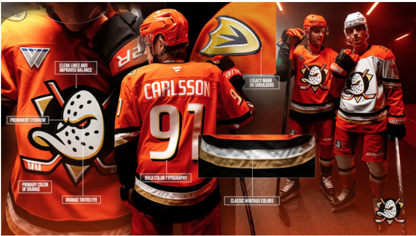
I think it’s an improvement on the black and gold shirts originally but still falls short of the green and purple ones for me. I get wanting to create a different identity though.
5 Comments
ryathal@sh.itjust.works · 4 pts · 1y
They never should have stopped using the duck mask. It's one of the best logos in sports.
troyunrau@lemmy.ca · 4 pts · 1y
This is sexy. Saw the highlights last night, and I can almost imagine Jofa helmets with this uniform haha
Venicon@lemmy.world · 2 pts · 1y
Im a fan of the old Koho gear myself!
ryan213@lemmy.ca · 2 pts · 1y
At least it's not just letters like Utah or NYR. Lol
Lost_My_Mind@lemmy.world · 1 pts · 1y
I wish they were still the MIGHTY Ducks.