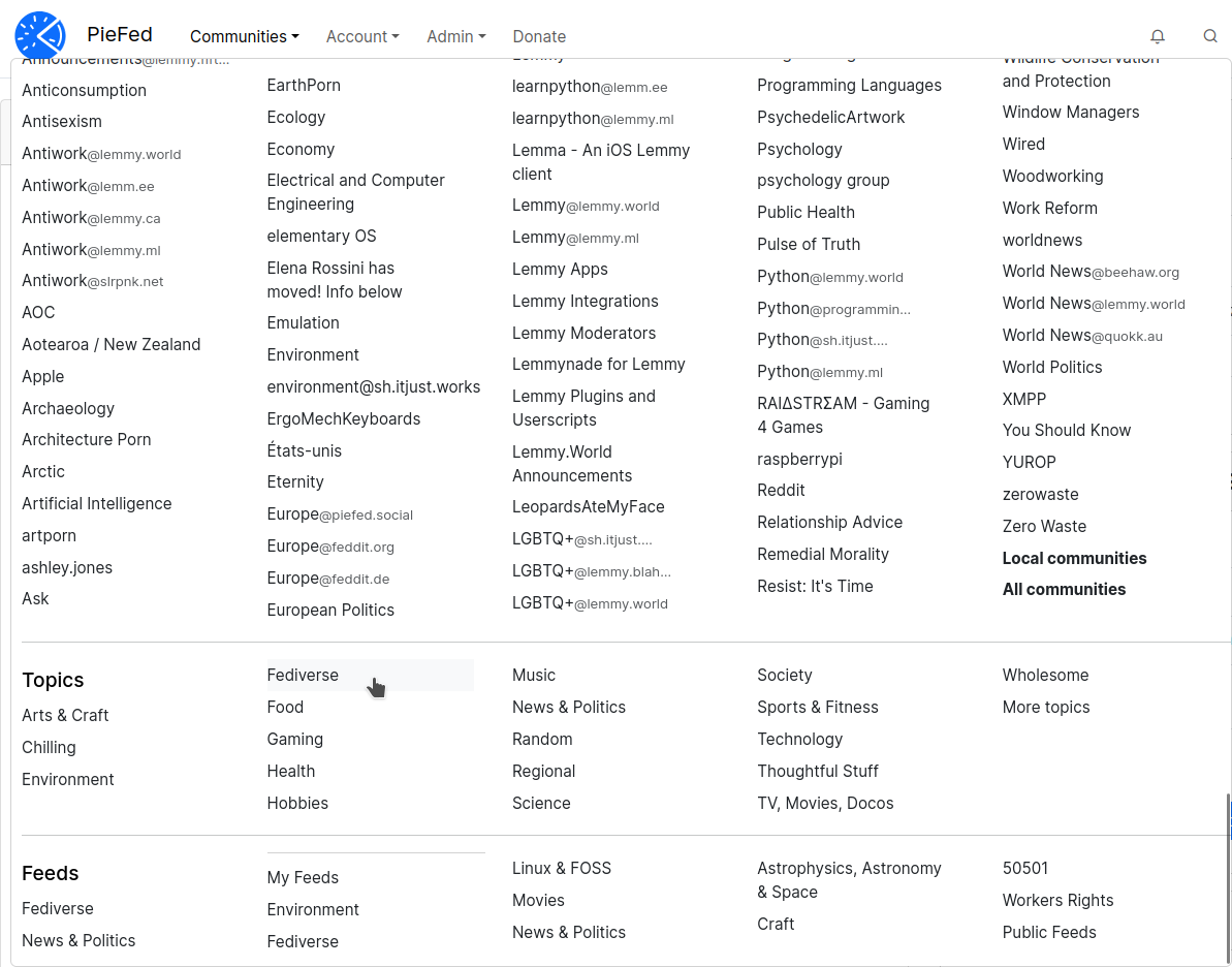
In web development, the technical term for those popup menus with multiple columns and headings inside is a "mega menu" and I just added one to PieFed. It unifies the topics and feeds menus into one.
It only works on a tablet or larger.
What do you think?
20 Comments
Jerry@feddit.online · 5 pts · 1y
MUCH better!!
notabot@piefed.social · 4 pts · 1y
The pace of development of Piefed really is something to behold! I like the new menu structure with communities at the top, but I know others would prefer feeds there, and frankly either is good. However, could we get the mega menu as a separate page too, so I can bookmark it?
Blaze@piefed.social · 1 pts · 1y
Feeds are first now
perishthethought@piefed.social · 3 pts · 1y
Thank you! I love that you list the comms we moderate first.
simple@piefed.social · 2 pts · 1y
It's better than before, but I think there needs to be a way to favorite feeds or communities to show up at the top. I'm subscribed to maybe 100+ communities, so the list is MASSIVE to scroll through.
Blaze@piefed.social · 1 pts · 1y
Feeds are first now
jeena@piefed.jeena.net · 2 pts · 1y
I mean it's better but uhm. I would rather have a quick search like when you post to a community implemented than trying to find something specific in this big list.
jeena@piefed.jeena.net · 3 pts · 1y
Oh and Feeds are now all the way down so I have to scroll a lot to gt to them, that kind of defies the purpose a bit for me who is using them as a filter.
rimu@piefed.social · 7 pts · 1y
Good feedback, thanks.
Moving feeds up and adding a search is doable
cabbage@piefed.social · 2 pts · 1y
Yeah, for me too - I'd rather have feeds on top.
I'm following so many communities the list is really useless unless I use Ctrl+F. For users like me it would make more sense to collapse the list of communities unless I ask to see it.
Then again, I brought this on myself.
I really like that instance is now added to communities with the same name!
Blaze@piefed.social · 2 pts · 1y
Nice!
squirrel@piefed.social · 2 pts · 1y
It seems there are new features in PieFed every day. Great work!
dzajew@piefed.social · 2 pts · 1y
I haven't used desktop version in a while, but this looks good :D
suff@piefed.social · 1 pts · 340d
It would be nice to have all my feeds on top.
Blaze@lemmy.zip · 2 pts · 340d
They moved to Explore in version 1.2
PieFed.zip has it since a while, it's quite nice
suff@piefed.social · 1 pts · 340d
is piefed.zip running some experimental implementation?
Blaze@lemmy.zip · 2 pts · 340d
It runs the development version, like https://crust.piefed.social/ does
PieFed.social runs the stable version
ada@piefed.blahaj.zone · 1 pts · 1y
I can't see feeds at all, just topics which are way down the bottom.
Blaze@piefed.social · 1 pts · 1y
Feeds are first now
solo@piefed.social · 1 pts · 1y
For me, this is beautiful because thanks to the many rows, we can access more stuff in just one click.
I don't know how anyone would feel about the following, nor how easy or difficult it would be to implement something like that, but I'll say it anyways. I was wondering if we could somehow access all these in one click, instead of two. Meaning, what if these lists were on the sidebar? Or perhaps create a new, narrower sidebar on the left side? Possibly, them having the option to collapse as well?
Just some thoughts and thank you for everything.