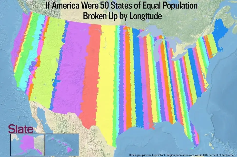
Every time that radial border division map of Europe centered on Vienna comes up, now we've got an American answer in the form of a striped border division.
An extraordinary map of a proposed European Union … in 1920!
A striking, enigmatic and very rare map illustrating a complex utopian scheme for a prototype European Union after the First World War. It was produced by “P.A.M.,” an elusive figure, probably laid in loose to a 24-page pamphlet (not included here) describing his plan in elaborate detail.
"Equal population" means each stripe has the same number of residents in it. Wider areas with the same total number of people indicate a lower population density. Closely spaced lines show there are a high population density.
They are talking about how some states are bigger than others while having a smaller population. The width, in this case, means just the area of land which a state would have to be to have a population count equal to all other states.
This still has the representative issue that each of the narrow bands are narrow due to a huge metropolis within them, and the rural population of that band will always live with rules created by the metropolis for the metropolis.
It's a pretty map, though.
And is still makes more sense than "carefully negotiated by powerful ultra rich a few hundred years ago to protect each of their giant egos."
The little squiggles are necessary to ensure election outcomes acceptable to the ultra rich.
I'm joking. (Mostly)
The squiggles are probably county line divisions, and probably simply the smallest existing land divisions with good population data available to make the map from.
I say "mostly joking" because existing county line divisions are already weird in some cases, to ensure election outcomes acceptable to the ultra rich. So there's an unpleasant grain of truth in my joke.
It may be zip code boundaries, given how narrow the NYC strip is. Some of the excessive jankiness in what was Nevada would be because no one lives on a lot of the federally-owned land reserves out there, so they don’t get their own post office, and the catchment area of some zip codes gets huge with weird boundaries.
21 Comments
loomy@lemy.lol · 17 pts · 1y
Gork@sopuli.xyz · 22 pts · 1y
Yes.
tal@lemmy.today · 14 pts · 1y
Every time that radial border division map of Europe centered on Vienna comes up, now we've got an American answer in the form of a striped border division.
https://bostonraremaps.com/inventory/maas-utopian-european-union/
https://lemmy.today/pictrs/image/dc2da395-9cf6-4a84-9325-81f8d11bf032.jpeg
huppakee@feddit.nl · 4 pts · 1y
French infrastructure is like that too, every road leading to Paris. Probably more countries like this.
Hoimo@ani.social · 4 pts · 1y
Gee, I wonder why no one tried this plan for ever-lasting peace in Europe.
FooBarrington@lemmy.world · 3 pts · 1y
That's a heck of a lot of Church State!
lol_idk@lemmy.ml · 10 pts · 1y
So glad it's color blind safe
BigDanishGuy@sh.itjust.works · 9 pts · 1y
What does equal population mean and what does the different widths indicate?
Are the widths just the original area? Because why then introduce the "equal population" information?
I'm sorry if I'm being a bit thick, but I really don't get it.
verity_kindle@sh.itjust.works · 9 pts · 1y
It's not you, it's a lack of legend
TonyTonyChopper@mander.xyz · 5 pts · 1y
"Equal population" means each stripe has the same number of residents in it. Wider areas with the same total number of people indicate a lower population density. Closely spaced lines show there are a high population density.
owsei@programming.dev · 3 pts · 1y
They are talking about how some states are bigger than others while having a smaller population. The width, in this case, means just the area of land which a state would have to be to have a population count equal to all other states.
here's the article
EnsignWashout@startrek.website · 6 pts · 1y
This still has the representative issue that each of the narrow bands are narrow due to a huge metropolis within them, and the rural population of that band will always live with rules created by the metropolis for the metropolis.
It's a pretty map, though.
And is still makes more sense than "carefully negotiated by powerful ultra rich a few hundred years ago to protect each of their giant egos."
NOT_RICK@lemmy.world · 6 pts · 1y
Ha, gayyyyuuuuh
spongebue@lemmy.world · 6 pts · 1y
Texastan
Uli@sopuli.xyz · 4 pts · 1y
Rhode Istan
retrolasered@feddit.uk · 3 pts · 1y
Mississippistan
mojofrododojo@lemmy.world · 4 pts · 1y
2014 article. https://slate.com/culture/2014/10/if-every-u-s-state-had-the-same-population-what-would-the-map-of-america-look-like.html
huppakee@feddit.nl · 3 pts · 1y
Nice, there is an even more chaotic version there. (Yes this is clickbait but it's actually true and you'll appreciate the images they made).
webp@mander.xyz · 3 pts · 1y
I nominate 🏳️🌈 as the new flag.
loomy@lemy.lol · 3 pts · 1y
MsPenguinette@lemmy.world · 2 pts · 1y
Wonder how the little squiggles would affect things if it was straight longitudinal lines
EnsignWashout@startrek.website · 4 pts · 1y
The little squiggles are necessary to ensure election outcomes acceptable to the ultra rich.
I'm joking. (Mostly)
The squiggles are probably county line divisions, and probably simply the smallest existing land divisions with good population data available to make the map from.
I say "mostly joking" because existing county line divisions are already weird in some cases, to ensure election outcomes acceptable to the ultra rich. So there's an unpleasant grain of truth in my joke.
mercano@lemmy.world · 2 pts · 1y
It may be zip code boundaries, given how narrow the NYC strip is. Some of the excessive jankiness in what was Nevada would be because no one lives on a lot of the federally-owned land reserves out there, so they don’t get their own post office, and the catchment area of some zip codes gets huge with weird boundaries.
sxan@midwest.social · 1 pts · 1y
sxan@midwest.social · 1 pts · 1y