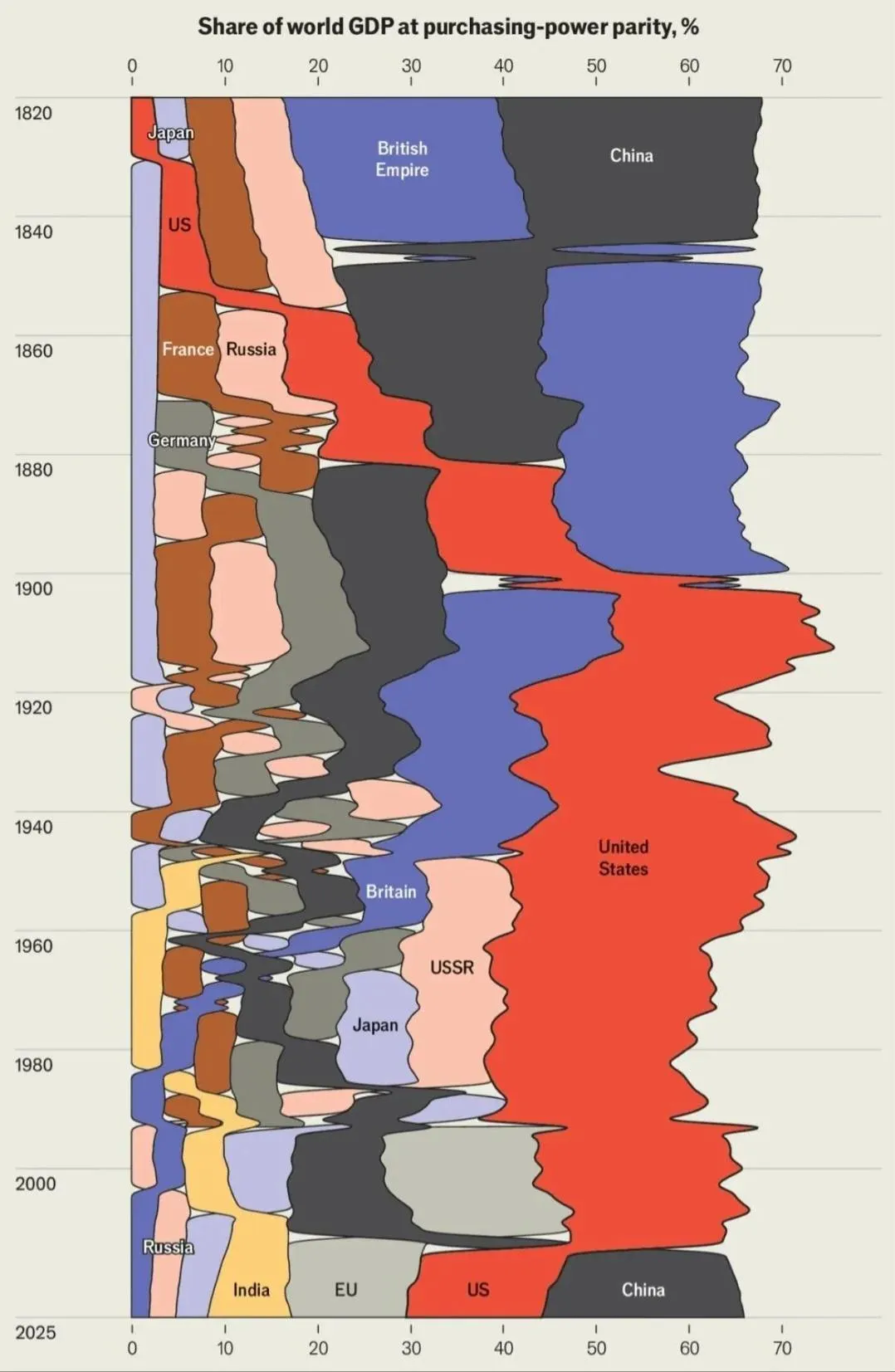
c/dataisbeautiful · by Eyekaytee@aussie.zone · 42dShare of world GDP at purchasing-power parity % tbh more like data is ugly but I like it 26 points · 9 comments · view on lemmy.world
9 Comments
Zedstrian@sopuli.xyz · 17 pts · 42d
c/dataisajumbledmess
breadsmasher@lemmy.world · 10 pts · 42d
this is literally the opposite of this community
Eyekaytee@aussie.zone · 7 pts · 42d
What about if you take its glasses off, is it more prettier then?
slazer2au@lemmy.world · 3 pts · 42d
Maybe keep that nations in their place. Not switching them around, because right now it's a bit confusing as to what is going on.
Eyekaytee@aussie.zone · 1 pts · 42d
i didn’t make it
Natanael@slrpnk.net · 1 pts · 42d
Ah yes a line chart over a non-euclidean space
nutbutter@discuss.tchncs.de · 3 pts · 41d
Source, please?
Eyekaytee@aussie.zone · 3 pts · 41d
https://www.reddit.com/r/EconomyCharts/comments/1utl7oi/share_of_world_gdp_by_ppp/
NutinButNet@hilariouschaos.com · 2 pts · 42d
If it was on its side, it’d be a lot better.