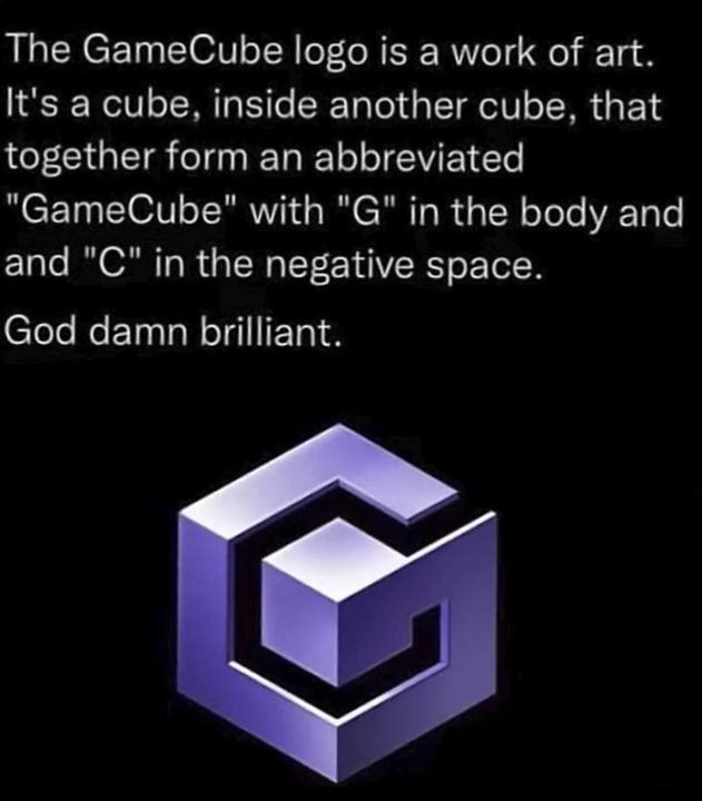
I remember taking a design class in the 1990s right after GC came out, and the professor basically said "this will be used as a demo in intro design classes for the next century." I thought it was hyperbole, but people still talk about it.
it’s not even topologically a cube because of the ventilation holes! it’s first homology group has at least 64 copies of ℤ, it’s supposed to have none!
43 Comments
moosetwin@lemmy.dbzer0.com · 108 pts · 2y
I NEVER EVEN NOTICED THE C
Risus_Nex@lemmy.world · 35 pts · 2y
Funny. I never noticed the real G. The C was always close enough for me.
It really is a brilliant logo
Viking_Hippie@lemmy.world · 44 pts · 2y
Motherfuckers act like they forgot about Dre
errer@lemmy.world · 12 pts · 2y
It’s because real Gs move in silence like lasagna
samus12345@lemmy.world · 4 pts · 2y
Mom's spaghetti
Kusimulkku@lemm.ee · 2 pts · 2y
I never noticed C or G. Just saw a funny box
mutter9355@discuss.tchncs.de · 50 pts · 2y
I can hear this logo
soloner@lemmy.world · 29 pts · 2y
Plp. Do do do do - do do do do - do do do do - da da... PLOMP!
Glytch@ttrpg.network · 8 pts · 2y
I've used this as a ring tone for at least 10 years.
StalfoSpork@lemmy.world · 4 pts · 2y
will_a113@lemmy.ml · 47 pts · 2y
I remember taking a design class in the 1990s right after GC came out, and the professor basically said "this will be used as a demo in intro design classes for the next century." I thought it was hyperbole, but people still talk about it.
Mkengine@feddit.de · 11 pts · 2y
But the GameCube was released 2001
1847953620@lemmy.world · 1 pts · 2y
I think the logo was teased at least a couple of years earlier, iirc.
Mkengine@feddit.de · 1 pts · 2y
Oh yes I am dumb, of course there was information about a console before release...
babyfarmer@lemmy.world · 41 pts · 2y
Both this and the N64 logo were pretty great from a design aspect.
There's a building in Illinois that resembles the N64 logo.
superduperenigma@lemmy.world · 26 pts · 2y
Fun fact: the 3D model of the N64 logo has 64 faces and 64 vertices.
KingJalopy@lemm.ee · 7 pts · 2y
I always looked at it like it had 4 N's and 6 faces but your point is way more interesting.
danc4498@lemmy.world · 5 pts · 2y
I wanna walk up those “stairs”
tryptaminev@feddit.de · 6 pts · 2y
You got 4m long legs?
BReel@lemmy.one · 39 pts · 2y
And don’t forget the ridiculously good sound design and animation to build it in. Happily burnt into the depths of my brain.
rmuk@feddit.uk · 19 pts · 2y
Dinka-dinka-dinhuh-dinkaah-dinka-dinka-dinkadinkadinkadadedink.
Womp.
doom_and_gloom@lemmy.ml · 4 pts · 2y
crashoverride@lemmy.world · 33 pts · 2y
And all the while the GameCube isn't actually a cube.
samus12345@lemmy.world · 5 pts · 2y
GameCuboid or GameRectangularPrism weren't as catchy.
affiliate@lemmy.world · 5 pts · 2y
it’s not even topologically a cube because of the ventilation holes! it’s first homology group has at least 64 copies of ℤ, it’s supposed to have none!
obinice@lemmy.world · 1 pts · 2y
This thing goes all the way to the top!
aeronmelon@lemm.ee · 17 pts · 2y
Also, if you played the GameCube at all, you hear that cube walking across the screen every... single... TIME!
metaStatic@kbin.social · 9 pts · 2y
one does not simply turn on a gamecube without holding Z
smort@lemmy.world · 4 pts · 2y
Never had a GameCube… what’s holding Z do?
wazzupdog@lemmy.world · 10 pts · 2y
Changes the start up sounds sequence, if i recall correctly you could also hold L or R for other sounds as well,
AeroLemming@lemm.ee · 16 pts · 2y
riesendulli@discuss.tchncs.de · 13 pts · 2y
I mean, staying with Nintendo and looking at DS and switch logos - they are pretty & on point.
AeroLemming@lemm.ee · 3 pts · 2y
CarlsIII@kbin.social · 16 pts · 2y
Plus it makes Frank Zappa sounds
Lesrid@lemm.ee · 2 pts · 2y
I thought it was Steve Vai sounds.
misophist@lemmy.world · 2 pts · 2y
Lol, half the comments on your link talk about how Vai sounds Zappa-esque.
pedro@lemm.ee · 2 pts · 2y
Vai worked for Zappa, didn't he?
I remember reading that he was hired to transcribe Zappa's live solos
PipedLinkBot@feddit.rocks · 1 pts · 2y
Here is an alternative Piped link(s):
I thought it was Steve Vai sounds.
Piped is a privacy-respecting open-source alternative frontend to YouTube.
I'm open-source; check me out at GitHub.
m0darn@lemmy.ca · 7 pts · 2y
relevant
PipedLinkBot@feddit.rocks · 1 pts · 2y
Here is an alternative Piped link(s):
relevant
Piped is a privacy-respecting open-source alternative frontend to YouTube.
I'm open-source; check me out at GitHub.
Potatos_are_not_friends@lemmy.world · 2 pts · 2y
It's clever but it's a pretty ugly logo.
And I say that as a person who LOVES the GameCube. Double Dash? Smash bros? The sweet handle to carry the cube around? Amazing system.
shikogo@pawb.social · 25 pts · 2y
I think it really fit its aesthetic.
Raz@lemm.ee · 3 pts · 2y
For the early 2000's this is pretty tight.
Daft_ish@lemmy.world · 3 pts · 2y
What's ugly about it? Wouldn't it be better to say, "I think it's ugly" or something?
Z3R0C00l@artemis.camp · -7 pts · 2y
We clearly have a different definition of “brilliant”. LMFAO
GunValkyrie@lemmy.world · 13 pts · 2y
Don't worry, with a lot of hard work you'll be able to catch up. Good luck.
Daft_ish@lemmy.world · 1 pts · 2y
With comments like that, this guy probably works for Nasa.