If Oklahoma took the big "OKLAHOMA" off the bottom of the flag, we'd have a fairly kickass flag and there'd be something good to say about this shithole. It's not exactly Texas or New Mexico, but this state has a lot of history (especially with the tribes) crammed into a short segment of time so the symbolism is there. It's a complicated flag for a complicated place.
Prior to 1941, this is how the flag looked
And it's so significantly better. It's unique and truly representative of this place. Nobody is confusing this flag for another, except maybe for the blue field.
He was praising the reverse chevron which they kept. My argument is that a kid should be able to draw it with crayons to enough detail that grown-ups recognize it. And it does that nicely.
I know I am, but at least the inverted side is kept, and the two blues could be thought of as keeping with the Sioux word for sky-tinted water that Minnesota got its name from.
I live here, personally the simplicity is growing on me, at least they didn't change the colors to be bright and obnoxious like some of the other variations of it proprosed.
The simple two blues and white feels cozy, the tricolor feels like it'd be an amazing country flag, but for a state I feel the simplicity is a benefit.
I watched a guy on YouTube go through and judge a shit load of the submissions and I wish I could remember if he saw this one. Though I doubt it because there was an ungodly amount. This one definitely more aesthetically pleasing than the old one.
Cool! I read through the related articles after seeing your comment and yeah that’s what it looks like to me as well. Weird that they didn’t just…design their own if they weren’t going to pick an submitted design wholly but I also understand sometimes you need guidance to an idea then you can spring off of it to land with what you wanted but didn’t know how to get there. Lol. Regardless, I like it a lot especially compared to the old one. I live in a “seal flag” state and I hate it they’re so busy.
Edit: sorry my app was having issues and I replied multiple times!
Yeah, I'm also in a "seal flag" state. Kansas, specifically. Our flag is so indistict, they had to write Kansas on it so you could tell it from the ten other flags that are just the state seal on a blue field. Hopefully we're next in line for a redesign.
I do love my city flag (Wichita), though. It's everything you could want in a flag.
37 Comments
Gormadt@lemmy.blahaj.zone · 34 pts · 2y
That's a good looking flag
My state is rocking the boring ass "seal on a bed sheet" look
spicytuna62@lemmy.world · 23 pts · 2y
If Oklahoma took the big "OKLAHOMA" off the bottom of the flag, we'd have a fairly kickass flag and there'd be something good to say about this shithole. It's not exactly Texas or New Mexico, but this state has a lot of history (especially with the tribes) crammed into a short segment of time so the symbolism is there. It's a complicated flag for a complicated place.
Prior to 1941, this is how the flag looked
And it's so significantly better. It's unique and truly representative of this place. Nobody is confusing this flag for another, except maybe for the blue field.
But hey, Tulsa's new flag is pretty great.
FakeGreekGirl@lemmy.blahaj.zone · 8 pts · 2y
My state has the same.
At least my city flag rocks.
spicytuna62@lemmy.world · 5 pts · 2y
Chicago? Lol
FakeGreekGirl@lemmy.blahaj.zone · 16 pts · 2y
Wichita.
Stamau123@lemmy.world · 14 pts · 2y
That's a good one, Denver also has a great flag
FakeGreekGirl@lemmy.blahaj.zone · 5 pts · 2y
That is a lovely flag.
AlligatorBlizzard@sh.itjust.works · 2 pts · 2y
Honestly I would have been okay with Minnesota's new seal on a bedsheet for the flag, we've got a nice looking loon now, but I like the new flag too.
JusticeForPorygon@lemmy.world · 31 pts · 2y
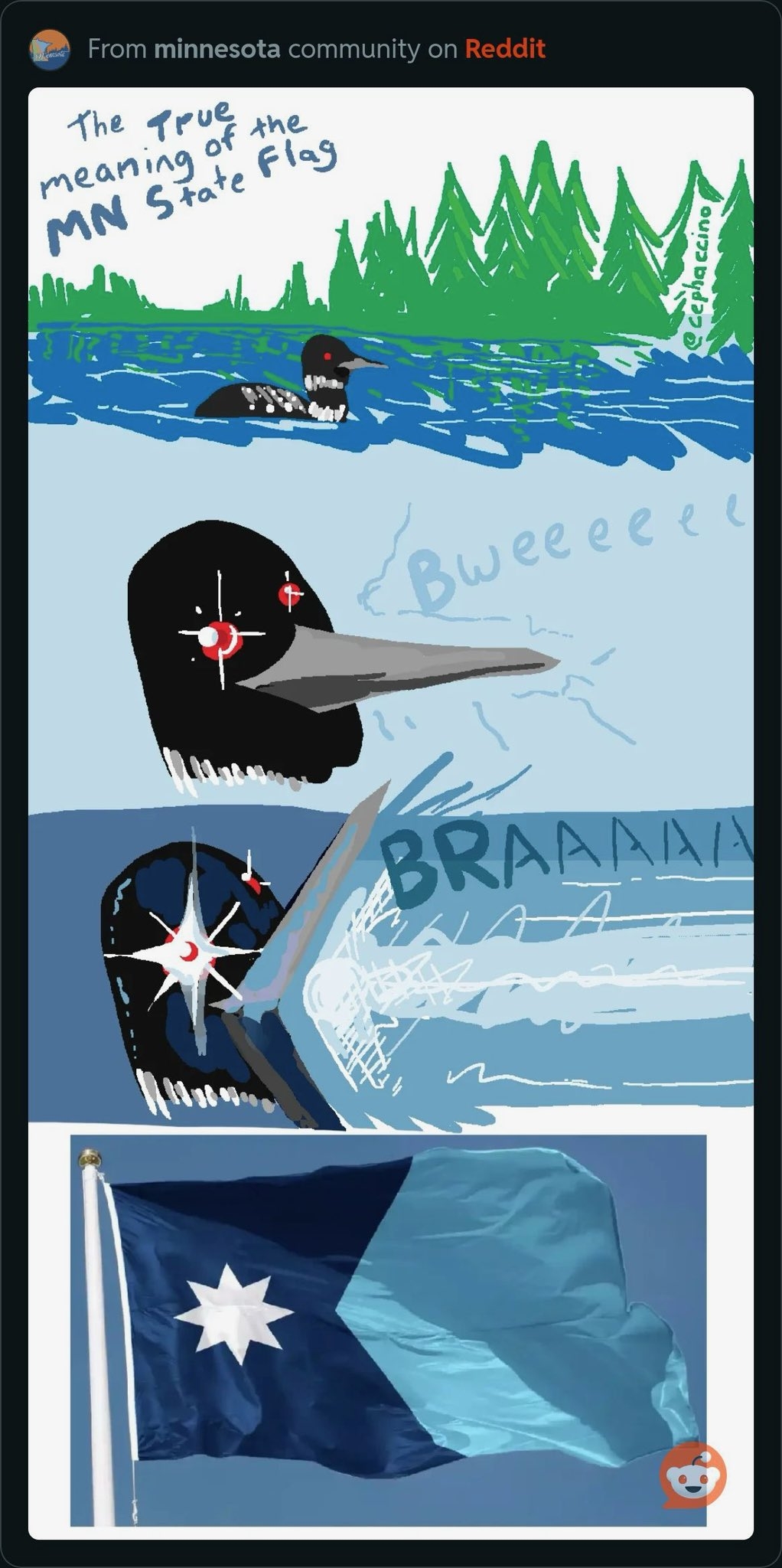
It's true that's what's happening anytime you hear a loon call.
Call doesn't seem like the right word. More like shriek.
aeronmelon@lemm.ee · 12 pts · 2y
*pierce the air with high-frequency hatred
Infynis@midwest.social · 1 pts · 2y
It's a warning
Zoomboingding@lemmy.world · 25 pts · 2y
They picked the right design, but they dropped the tri-color stripes? I'm happy with it regardless. Looks great
JaymesRS@literature.cafe · 24 pts · 2y
Loon: “Ima firin’ mah lazer”
SzethFriendOfNimi@lemmy.world · 19 pts · 2y
Welp… can’t unsee that now
fmstrat@lemmy.nowsci.com · 4 pts · 2y
I know, right? This should be a series.
Geek_King@lemmy.world · 18 pts · 2y
Power Word Loon. I love this, thank you.
theUnlikely@sopuli.xyz · 16 pts · 2y
I wonder if CGP Grey will be disappointed or not. https://youtu.be/lFwwo0W5Ugg
uriel238@lemmy.blahaj.zone · 12 pts · 2y
He was praising the reverse chevron which they kept. My argument is that a kid should be able to draw it with crayons to enough detail that grown-ups recognize it. And it does that nicely.
Stamau123@lemmy.world · 10 pts · 2y
I know I am, but at least the inverted side is kept, and the two blues could be thought of as keeping with the Sioux word for sky-tinted water that Minnesota got its name from.
adj16@lemmy.world · 5 pts · 2y
It could have gone worse for him, but it’s definitely not what he wanted!
Wirlocke@lemmy.blahaj.zone · 3 pts · 2y
I live here, personally the simplicity is growing on me, at least they didn't change the colors to be bright and obnoxious like some of the other variations of it proprosed.
The simple two blues and white feels cozy, the tricolor feels like it'd be an amazing country flag, but for a state I feel the simplicity is a benefit.
PipedLinkBot@feddit.rocks · 3 pts · 2y
Here is an alternative Piped link(s):
https://piped.video/lFwwo0W5Ugg
Piped is a privacy-respecting open-source alternative frontend to YouTube.
I'm open-source; check me out at GitHub.
ArtificialLink@yall.theatl.social · 1 pts · 2y
A bit. They picked his favorite design but he didn't like the variations as much. Im disappointed they dropped the extra color.
wafflez@lemmy.world · 15 pts · 2y
ima firin mah lazarrr
AlligatorBlizzard@sh.itjust.works · 5 pts · 2y
SHOOP DA WHOOP
pewgar_seemsimandroid@lemmy.blahaj.zone · 13 pts · 2y
show this to hexagon guy
Kase@lemmy.world · 8 pts · 2y
I think he just did a video on it lmao
pewgar_seemsimandroid@lemmy.blahaj.zone · 4 pts · 2y
show the meme
Kase@lemmy.world · 3 pts · 2y
Oh 🤦 sorry lmao
Teon@kbin.social · 10 pts · 2y
What a loon-e meme!
Kase@lemmy.world · 8 pts · 2y
Damn that's a nice flag. I'm jealous
hrimfaxi_work@midwest.social · 3 pts · 2y
Born and raised in Minnesota. Plan to die here. I can confirm this is 100% accurate.
quo@feddit.uk · -5 pts · 2y
FakeGreekGirl@lemmy.blahaj.zone · 22 pts · 2y
It will be next year.
poppy@lemm.ee · 2 pts · 2y
I watched a guy on YouTube go through and judge a shit load of the submissions and I wish I could remember if he saw this one. Though I doubt it because there was an ungodly amount. This one definitely more aesthetically pleasing than the old one.
FakeGreekGirl@lemmy.blahaj.zone · 7 pts · 2y
If I understand right, this isn't exactly any of the submissions, but it's a reworked version of one.
The version submitted had blue, green, and white stripes on the right side, and a different star shape on the left.
poppy@lemm.ee · 3 pts · 2y
Cool! I read through the related articles after seeing your comment and yeah that’s what it looks like to me as well. Weird that they didn’t just…design their own if they weren’t going to pick an submitted design wholly but I also understand sometimes you need guidance to an idea then you can spring off of it to land with what you wanted but didn’t know how to get there. Lol. Regardless, I like it a lot especially compared to the old one. I live in a “seal flag” state and I hate it they’re so busy.
Edit: sorry my app was having issues and I replied multiple times!
FakeGreekGirl@lemmy.blahaj.zone · 2 pts · 2y
Yeah, I'm also in a "seal flag" state. Kansas, specifically. Our flag is so indistict, they had to write Kansas on it so you could tell it from the ten other flags that are just the state seal on a blue field. Hopefully we're next in line for a redesign.
I do love my city flag (Wichita), though. It's everything you could want in a flag.
poppy@lemm.ee · 1 pts · 2y
poppy@lemm.ee · 1 pts · 2y