I respect the current one.
I do prefer the old one, but the current one is still regonizable as a fox around a globe representing the word wide web ball.
I think from 2013 is my favorite. I'd probably like the fox from 04 and the globe from 13 the best.
17 and 19 are both cool logos on their own, but are literally duller then the others. They got rid of all the pointy bits. The fire gradients on both are nicely done.
I honestly like 2004 the best. I could see the issue with it then when resolutions were lower, but I feel like we could go back to it now. It looks so much nicer, though arguably less recognizable at a glance from across the room or something.
im torn between old design and new frankly. I really like the little details present in the old logo, but not the explicit 3d nature of them. I much prefer the flat styling of modern applications, it's just more suited to functionality IMO.
Bring the modern one some more detail, give it a paw, make the globe blue, i'll be happy.
Everything to the right of Human is furry. It's funny because the Neko and Borderline Furry arethesamepicture.jpg.
(Ok hand claw hand claw fucked up hand paw...)
as a furry myself, i feel qualified to explain this in absence of the entire community.
IMO. Something is classifiable as furry if it more closely resembles an "objectively furry character" than if it more closely resembles a human character. I.E. a human with a tail and ears is simply not furry enough to be furry. Hence why neko exists. But if it more closely resembles an actual furry I.E. it's skin is covered in fur entirely, than i think it's fair to classify it as a furry.
TL;DR moving from left to the right, once you pass the median character, that's all furry, everything on the other side is more closely related to humans.
One of the primary differences between humans and apes is the hair after all.
This loser spends his days trolling everywhere. He is an insecure jobless brat that nobody IRL gives a shit about, so he lives with negative attention online. This is the second time I am seeing him somewhere.
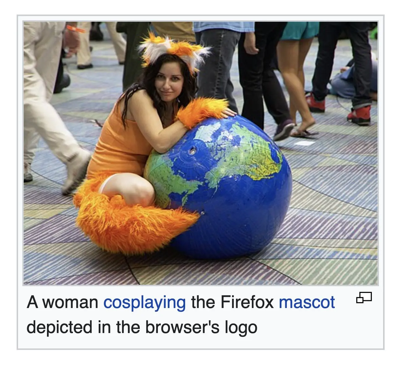
58 Comments
SorteKanin@feddit.dk · 66 pts · 2y
Nice cosplay. You gotta admit that the Firefox logo is better than all the other browser logos out there. It's pretty lit.
stebo02@lemmy.dbzer0.com · 9 pts · 2y
helpImTrappedOnline@lemmy.world · 34 pts · 2y
I respect the current one. I do prefer the old one, but the current one is still regonizable as a fox around a
globe representing the word wide webball.I think from 2013 is my favorite. I'd probably like the fox from 04 and the globe from 13 the best.
17 and 19 are both cool logos on their own, but are literally duller then the others. They got rid of all the pointy bits. The fire gradients on both are nicely done.
chetradley@lemmy.world · 21 pts · 2y
Going from left to right it looks like he spent nine years drinking the world's oceans and has since moved on to consuming the planet itself.
stebo02@lemmy.dbzer0.com · 11 pts · 2y
melpomenesclevage@lemm.ee · 9 pts · 2y
Its a metaphor for what's happened to the internet.
Cethin@lemmy.zip · 7 pts · 2y
I honestly like 2004 the best. I could see the issue with it then when resolutions were lower, but I feel like we could go back to it now. It looks so much nicer, though arguably less recognizable at a glance from across the room or something.
Obi@sopuli.xyz · 6 pts · 2y
Is it though? Regardless of the amount of detail you still see the big orange swirl around the blue ball from across the room.
petersr@lemmy.world · 6 pts · 2y
I will also go with 2013.
stebo02@lemmy.dbzer0.com · 2 pts · 2y
Corno@lemm.ee · 5 pts · 2y
2009 one is by far my fave. I love that 3D look compared to the flat minimalistic look the 2017 and 2019 versions have
notTheCat@lemmy.ml · 3 pts · 2y
Fal@yiffit.net · 2 pts · 2y
!paws@yiffit.net
KillingTimeItself@lemmy.dbzer0.com · 2 pts · 2y
oh no...
KillingTimeItself@lemmy.dbzer0.com · 2 pts · 2y
im torn between old design and new frankly. I really like the little details present in the old logo, but not the explicit 3d nature of them. I much prefer the flat styling of modern applications, it's just more suited to functionality IMO.
Bring the modern one some more detail, give it a paw, make the globe blue, i'll be happy.
melpomenesclevage@lemm.ee · 4 pts · 2y
By so fucking much.
chetradley@lemmy.world · 61 pts · 2y
NickwithaC@lemmy.world · 56 pts · 2y
+2 points for the paw and the continents.
ThatWeirdGuy1001@lemmy.world · 5 pts · 2y
The globe was probably bought not made. But still pretty neat overall
pete_the_cat@lemmy.world · 10 pts · 2y
Yep, it's clearly a vinyl blow-up ball.
kirbowo808@kbin.social · 28 pts · 2y
Based furry :0
MrJameGumb@lemmy.world · 28 pts · 2y
What's this?
┴┬┴┤( ͡° ͜ʖ├┬┴┬
9point6@lemmy.world · 35 pts · 2y
┬┴┤ \(°ロ\)
Shoo, get back in there
MrJameGumb@lemmy.world · 14 pts · 2y
Oh! Were you waving to me?
/╲/\╭( ͡°͡° ͜ʖ ͡°͡°)╮/\╱\
Hewwo fwen! UwU
9point6@lemmy.world · 15 pts · 2y
Ohgodohfuckhgcdr
(((( ;゚Д゚)))
RIPandTERROR@lemmy.blahaj.zone · 10 pts · 2y
ლ(ಠ益ಠლ)
Kedly@lemm.ee · 10 pts · 2y
Honytawk@lemmy.zip · 28 pts · 2y
Would look nice as an icon
DoucheBagMcSwag@lemmy.dbzer0.com · 61 pts · 2y
Go nuts
nublug@lemmy.blahaj.zone · 77 pts · 2y
fuckin lol
SorteKanin@feddit.dk · 16 pts · 2y
We did it R- I mean Lemmy
DoucheBagMcSwag@lemmy.dbzer0.com · 10 pts · 2y
Hell yeah that's what I'm talking about
BuryMyHorse@lemmy.world · 8 pts · 2y
Amazing
Retrograde@lemmy.world · 8 pts · 2y
Perfection
Ginger666@lemmy.world · 5 pts · 2y
Not bad. I've been using this pornhub icon forever for Firefox, but I almost wanna change it
DoucheBagMcSwag@lemmy.dbzer0.com · 4 pts · 2y
Holy shit you gotta tell me that theme that is and from where.... please.
Ginger666@lemmy.world · 2 pts · 2y
Nova launcher
And Darkunicorn Icons paid pack from the play store
DoucheBagMcSwag@lemmy.dbzer0.com · 2 pts · 2y
Thanks
ManniSturgis@lemmy.zip · 21 pts · 2y
Gonna tell my kids this was the firefox icon 20 years ago.
Akasazh@feddit.nl · 27 pts · 2y
Lots of people who haven't seen this before.
It's on wiki and thus has info:
28 August 2010, 20:33
I feel old now
ColeSloth@discuss.tchncs.de · 26 pts · 2y
"Wants to dress as a furry, but doesn't want the stigma as a furry"
blanketswithsmallpox@lemmy.world · 10 pts · 2y
https://i.kym-cdn.com/photos/images/original/000/855/796/94f.jpg
Everything to the right of Human is furry. It's funny because the Neko and Borderline Furry arethesamepicture.jpg. (Ok hand claw hand claw fucked up hand paw...)
https://knowyourmeme.com/memes/furry-scale
AnalogyAddict@lemmy.world · 12 pts · 2y
Something tells me you hated those spot the difference pages for kids. (It's the hand.)
That said, I can't take anything seriously that spells "boarderline," even if it IS something a furry would probably do.
PotatoKat@lemmy.world · 6 pts · 2y
The nose is also a slightly different dot
blanketswithsmallpox@lemmy.world · 1 pts · 2y
The hands are also the same on Neko and Pretty Furry. Don't forget Very Furrys regression to hand.
KillingTimeItself@lemmy.dbzer0.com · 0 pts · 2y
as a furry myself, i feel qualified to explain this in absence of the entire community.
IMO. Something is classifiable as furry if it more closely resembles an "objectively furry character" than if it more closely resembles a human character. I.E. a human with a tail and ears is simply not furry enough to be furry. Hence why neko exists. But if it more closely resembles an actual furry I.E. it's skin is covered in fur entirely, than i think it's fair to classify it as a furry.
TL;DR moving from left to the right, once you pass the median character, that's all furry, everything on the other side is more closely related to humans.
One of the primary differences between humans and apes is the hair after all.
Vigilante@lemmy.today · 15 pts · 2y
Foxy
(I'll show myself out thank you)
Anamnesis@lemmy.world · 13 pts · 2y
Damn, I've never wanted to be the world so bad.
melpomenesclevage@lemm.ee · 26 pts · 2y
Yes but remember, thats just a human woman under there; you wouldnt actually be caressed by the perfect web browser.
BallsandBayonets@lemmy.world · 1 pts · 2y
Functionally identical comment to another more self-aware comment in this thread, yet this one gets well-received.
EmperorHenry@discuss.tchncs.de · 12 pts · 2y
FutureMarkus@lemmy.world · 10 pts · 2y
I can fix her
phoneymouse@lemmy.world · 9 pts · 2y
Mango@lemmy.world · 8 pts · 2y
🥰
dditty@lemm.ee · 6 pts · 2y
This may have to be my Halloween costume next year
homesweethomeMrL@lemmy.world · 3 pts · 2y
Approved.
YarHarSuperstar@lemmy.world · 1 pts · 2y
More plz
vegantomato@lemmy.world · -24 pts · 2y
Omg, woman showing skin! Updoot!
Texas_Hangover@lemm.ee · 15 pts · 2y
It's a knee and an arm... What are you? Amish?
CCF_100@sh.itjust.works · 12 pts · 2y
It's the person that highschool principals think every boy is
myxi@feddit.nl · 8 pts · 2y
This loser spends his days trolling everywhere. He is an insecure jobless brat that nobody IRL gives a shit about, so he lives with negative attention online. This is the second time I am seeing him somewhere.
elbarto777@lemmy.world · 6 pts · 2y
vegantomato@lemmy.world · -6 pts · 2y
No, but they make my male lizard brain fire up. So I feel the need to provide engagement by updooting and leaving a silly comment.
KillingTimeItself@lemmy.dbzer0.com · 2 pts · 2y
damn, we shouldn't have let redditors on this site.
Texas_Hangover@lemm.ee · -1 pts · 2y
I do love me a good satire account. Keep on keeping on