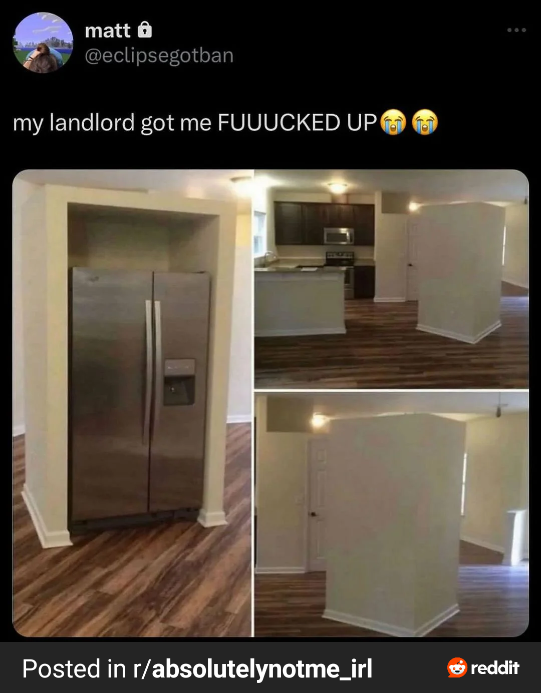
It looks bad because it's empty. To me, though, that's three more walls for art or shelving, or even a breakfast table. It's a little odd to be at that angle, but I don't hate it. It's just strange because it's all by itself.
Sure, but if the fridge walls themselves were fixed in place, then that's very restrictive for no reason. I would be much more satisfied with this if it were a shell that was sitting on the flooring, and could be moved or replaced if a different fridge is wanted.
Someone read a 1980s high school home-ec textbook, with the diagram noting that kitchen efficiency required the sink, stove, and fridge on facing walls, and ever since, would not take NO for an answer.
What jackass thought putting that there was a good idea? And I'm not even talking about how it just cuts off like 2 in from the ceiling. Just a cubby for a refrigerator in the middle of the floor at a goofy angle. That is just terrible and I hope whatever architect came up with that is homeless now. JFC.
12 Comments
chemical_cutthroat@lemmy.world · 23 pts · 1y
It looks bad because it's empty. To me, though, that's three more walls for art or shelving, or even a breakfast table. It's a little odd to be at that angle, but I don't hate it. It's just strange because it's all by itself.
rtxn@lemmy.world · 7 pts · 1y
Plant people always need more vertical space for ivy and similar plants.
mipadaitu@lemmy.world · 7 pts · 1y
Sure, but if the fridge walls themselves were fixed in place, then that's very restrictive for no reason. I would be much more satisfied with this if it were a shell that was sitting on the flooring, and could be moved or replaced if a different fridge is wanted.
SidewaysHighways@lemmy.world · 2 pts · 1y
Dat power tho
HakFoo@lemmy.sdf.org · 8 pts · 1y
Someone read a 1980s high school home-ec textbook, with the diagram noting that kitchen efficiency required the sink, stove, and fridge on facing walls, and ever since, would not take NO for an answer.
Confused_Emus@lemmy.dbzer0.com · 8 pts · 1y
I feel like if it just went all the way to the ceiling, it wouldn’t stick out as much?
BradleyUffner@lemmy.world · 5 pts · 1y
Eh, I kind of like the layout. The realtor could have staged it better though.
Takumidesh@lemmy.world · 8 pts · 1y
Or staged it at all
Etterra@lemmy.world · 5 pts · 1y
What jackass thought putting that there was a good idea? And I'm not even talking about how it just cuts off like 2 in from the ceiling. Just a cubby for a refrigerator in the middle of the floor at a goofy angle. That is just terrible and I hope whatever architect came up with that is homeless now. JFC.
stoly@lemmy.world · 2 pts · 1y
Architect lol lol.
LilB0kChoy@lemm.ee · 3 pts · 1y
Put a little edge around the top, maybe some plush carpet and our cats would probably make that their sleeping space.
snailfact@infosec.pub · 3 pts · 1y
i like it