Source from HN because they have shadowbans: https://news.ycombinator.com/item?id=47773594
I'm wondering too what you are looking for in a font. Good looks, features, options to enable or disable, ligatures?
Source from HN because they have shadowbans: https://news.ycombinator.com/item?id=47773594
I'm wondering too what you are looking for in a font. Good looks, features, options to enable or disable, ligatures?
50 Comments
atzanteol@sh.itjust.works · 25 pts · 109d
I'm not terribly picky, mostly just want to distinguish 0 from O and l from 1.
I rather like JetBrains mono though.
Colloidal@programming.dev · 2 pts · 108d
And l from I from | from 1. Stuff like that. And be pretty. And somewhat retro futuristic, without sacrificing readability.
vogi@piefed.social · 19 pts · 110d
Recently switched to Maple Mono because it is fun and cozy.
Kissaki@programming.dev · 6 pts · 109d
That's cool and interesting (you can see it in action and toggle-compare on the linked website)
I wonder how distracting it would be in code, though. If it is, their configurability allows skipping that feature though, which is great.
vogi@piefed.social · 4 pts · 109d
Yea, as its only applied to italics its less distracting than it might seem at first. Your IDE may not even use italics. In VSCode with my theme, italics are used for comments and variable names, which looks like this: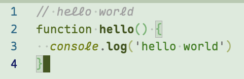
hallettj@leminal.space · 4 pts · 109d
I like to use this style of italics for keywords. (That's also what the Maple examples do.) My thinking is you see keywords so often that you recognize them by shape, not by reading the individual letters. And my theory is that the italic variant being a little harder to read helps my eyes skim over keywords, to focus more on words that I do need to read precisely, like variable names.
It does mean that I spend some time customizing my syntax highlighting theme to make it work the way I prefer. I've got examples set up on my blog. Although that's not Maple - it's a different font with cursive italics called Cartograph CF.
vogi@piefed.social · 1 pts · 108d
Oh wow that looks pretty and also makes total sense in theory. I think I have seen it in other places as well and might just steal that. :) Thank you for pointing that out.
thingsiplay@lemmy.ml · 2 pts · 108d
I don't like that one and the same character looks different on the same line (here
console.log).prole@lemmy.blahaj.zone · 2 pts · 108d
Why is 'l' the only cursive letter (and not connected to anything)? It's kind of jarring
rimu@piefed.social · 6 pts · 110d
I've been using JetBrains Mono and Maple looks the same but nicer. Thanks!
bitfucker@programming.dev · 2 pts · 109d
This is a great find. Thank you very much kind internet stranger
404@lemmy.zip · 2 pts · 109d
Yes! I built my own variant using their tool (removing the weird italic l etc). I love it.
spacemanspiffy@lemmy.world · 14 pts · 109d
No ligatures, and no ambiguity between O and 0, l and 1 and I, etc.
No serifs too, I guess. Although I don't think that's very common in coding fonts.
communism@lemmy.ml · 9 pts · 109d
Nice to look at. Disambiguates commonly confused characters (
l,1,I;0,O).mbirth@lemmy.ml · 9 pts · 109d
Ligatures, slashed zeros, clearly distinguishable Il1/O0, not too big of a gap between lines, and maybe script-like italics. My current main monospace font is IosevkaTerm Nerd Font.
I also find the idea of using retro pixel fonts interesting, but so far couldn't get myself to actually try some of the fonts mentioned here: https://news.ycombinator.com/item?id=47708411 .
MonkderVierte@lemmy.zip · 7 pts · 109d
Good readability of code.
deathmetal27@lemmy.world · 7 pts · 110d
I use Fira Code for coding, mostly because of the ligatures. For console I use Inconsolata because it's compact and good for long console lines.
one_old_coder@piefed.social · 4 pts · 109d
I admit that https://github.com/tonsky/FiraCode has the best presentation.
andicraft@lemmy.blahaj.zone · 6 pts · 109d
I want it to be Iosevka
prole@lemmy.blahaj.zone · 1 pts · 108d
Thank you for reminding me of this font name. I did a clean install of my OS a few weeks back, and forgot the terminal font I had been using
schnurrito@discuss.tchncs.de · 4 pts · 110d
Mainly that I can clearly distinguish Il1 and 0O. I like DejaVu Sans Mono because it does that; if I'm limited to fonts preinstalled on Windows, Lucida Console works too.
whotookkarl@lemmy.dbzer0.com · 3 pts · 109d
For mono space I've been using Ubuntu mono for a long time, there may be better but it was good enough when I was choosing and I haven't had any issues that made me want to pick a new one. For standard I use open sans.
prole@lemmy.blahaj.zone · 2 pts · 108d
I really like the Ubuntu font family. Been rocking it on my Bazzite install for a bit now
vext01@feddit.uk · 3 pts · 109d
I love iosevka because it's so condensed. You can fit so much on the screen.
one_old_coder@piefed.social · 1 pts · 109d
I love narrow fonts because it feels like regular text, but monospaced at the same time, and lines are easier to read too.
theherk@lemmy.world · 3 pts · 109d
Everything VictorMono offers, exactly as offered. Also good for me to be able to distinguish O, 0, and Ø.
one_old_coder@piefed.social · 2 pts · 109d
I like it, it's pleasant to my eyes. Thanks.
fulg@lemmy.world · 3 pts · 109d
I am a big fan of MonoLisa, but it is a paid font.
I wasn’t convinced initially (never paid for a font before!) and found some version of it online, found that I liked it very much, then willingly parted with my money for a license.
I really like the difference between normal and italics, I set up my code editor to use italics for comments.
Nighed@feddit.uk · 4 pts · 109d
When you said 'paid' I was thinking £5, not £50 (for the basic version!)
one_old_coder@piefed.social · 3 pts · 109d
On PragmataPro, I know it's a bit pricey (60 euros) but I've been using 12 hours a day for years, it has a lot of characters available, supposedly hand-made, and the guy updates it regularly.
I have bought software that was more expensive but had way less usefulness.
fulg@lemmy.world · 2 pts · 109d
Yeah that’s why I found an “evaluation” version before. Once I saw it was genuinely great I was happy to pay for a license.
I look at this font 12+ hours a day everyday for work, if this was just for ricing a terminal window I agree it is a bit steep.
bradboimler@lemmy.world · 1 pts · 109d
I stopped reading right there 🙂
olafurp@lemmy.world · 3 pts · 109d
For me, distinguish similar letters such as 0, O, I, l, 1. Then I want ligature because I like them, then emojis should align vertically to the grid, high resolution for small font sizes, size difference between tall and not-tall characters, and it shouldn't have narrow characters.
Last time when I was changing up the font I went to https://www.nerdfonts.com/font-downloads and tried out a couple until I found one that I liked. I'm really picky about the symbol shapes, I most often just bail on a font because the @, % or & is ugly I might also bail if ` vs ' is not distinct enough.
Some fonts have absolutely wild italics that are almost cursive which is a hard pass. Even though I only see it once every week maybe I'm just not up for it.
syklemil@discuss.tchncs.de · 3 pts · 109d
Not that big on ligatures in monospace, really. I think I just go with what seems to look kinda nice and has a big enough amount of symbols to not look weird once a few of them are needed.
Also generally prefer dotted zero, or an inverse Ø. Fonts that make 0 and Ø look the same might as well just drop the slash altogether.
In spite of that I've been using Fantasque Sans Mono for years. At least the slash in its 0 doesn't extend beyond the circle like in an Ø.
kata1yst@sh.itjust.works · 1 pts · 109d
This is my choice too. I love it.
one_old_coder@piefed.social · 2 pts · 110d
I personally use PragmataPro and Berkeley Mono (both paid fonts) because they are pretty, have ligatures, and are narrow enough to show more text on a line.
Edit: I forgot https://typeof.net/Iosevka/ which can be customized to mimic other fonts.
Mesa@programming.dev · 2 pts · 109d
Courier New but 0 has a distinguishing dot.
Mesa@programming.dev · 7 pts · 109d
No ligatures.
sfxrlz@lemmy.world · 2 pts · 109d
Vibes, gotta feel comfy. That’s why it’s 0xProto nerd font mono for me
Auster@thebrainbin.org · 2 pts · 110d
Archived ycombinator link: https://archive.ph/y43fV
one_old_coder@piefed.social · 1 pts · 109d
Thanks.
mimavox@piefed.social · 2 pts · 109d
I love Input sans because it gives me a very pleasant retro vibe, especially at heavy weights.
Kissaki@programming.dev · 2 pts · 109d
I use Cascadia Code / the NerdFonts extension Caskaydia Code.
Primarily I look for readability, distinguishability. Ligatures are nice, I came to like them. Eligibility on different font sizes and weight/bold and italic, and colors - they must remain very readable and distinguishable.
I'm using the same font (family) for coding and terminal/console.
one_old_coder@piefed.social · 1 pts · 109d
I had never heard of that font, I'll try it someday, thanks.
Kissaki@programming.dev · 1 pts · 108d
Cascadia Code is a Microsoft font (their most recent coding font). Because the name is protected, Nerd Fonts forks the name.
NewOldGuard@lemmy.ml · 2 pts · 109d
No ambiguous characters, nice ligatures
Maddier1993@programming.dev · 1 pts · 108d
I am picky and get bored all the time. These fonts below have had my attention for significant period of time.
Someone mentioned codingfont.com.. but I spoil it for myself by immediately recognizing the fonts I already got weary of and get varying results just like if I let my picky self choose.
Edit: Probably forgot to mention that I have tried the Nerd font variants and exclusively the NF variants of above fonts like CodeNewRoman NF, BlexMono, CommitMono NF
Matty_r@programming.dev · 1 pts · 109d
This came up the other week, https://www.codingfont.com/ can help you narrow down what you find looks the best.
AstroLightz@lemmy.world · 1 pts · 109d
Pretty colors. That's it
aivoton@sopuli.xyz · -1 pts · 108d
Not much, disambiguous characters mostly. I've been using M Plus for years because I sometimes need CJK glyphs. Inconsolata, Fira Code, etc. look OK to me. Still haven't found the perfect typeface to fill my developer-typographic font void.