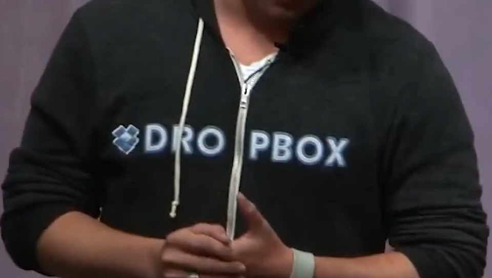
Probably because some corporate suit who works in branding wrote in the style guide that the name should never ever precede the logo or something like that, lest it minutely affect the vibes of capitalism in unpredictable ways.
You're probably right. I bet it's that it can never be 2 words so they had to cut it through 'drop'. Maybe also a matter of malicious compliance from the designers.
12 Comments
zikzak025@lemmy.world · 52 pts · 8d
Probably because some corporate suit who works in branding wrote in the style guide that the name should never ever precede the logo or something like that, lest it minutely affect the vibes of capitalism in unpredictable ways.
nightofmichelinstars@sopuli.xyz · 14 pts · 8d
But why split it with the zipper at all? Normal zip ups put the logo big on the back or small on the front shoulder.
Peppycito@sh.itjust.works · 9 pts · 8d
You're probably right. I bet it's that it can never be 2 words so they had to cut it through 'drop'. Maybe also a matter of malicious compliance from the designers.
timbuck2themoon@sh.itjust.works · 17 pts · 8d
4 "characters" on the left, four on the right.
Not saying it makes sense here but it's probably as simple as doing that for symmetry.
TheSlad@sh.itjust.works · 11 pts · 8d
Which is why OP suggested putting the logo at the end instead
timbuck2themoon@sh.itjust.works · 2 pts · 7d
Almost guarantee like top comment says that the logo can never go behind the name. Fairly common ime.
fan0m@lemmy.world · 2 pts · 8d
Right. It’s probably as dumb as this
zaphod@sopuli.xyz · 11 pts · 8d
Dr. Op Box
toynbee@piefed.social · 3 pts · 8d
Wonder whether they hang out with Dr. Acula and Dr. Jan Itor.
humancrayon@sh.itjust.works · 6 pts · 8d
As a designer, I would fire myself if I ever thought about doing something like this.
cholesterol@lemmy.world · 1 pts · 7d
Maybe the zipper option was a separate checkbox, and the Chinese machinist who set up production didn't read a word of English.
cheat700000007@lemmy.world · 1 pts · 8d
Dropbox made many a poor choice