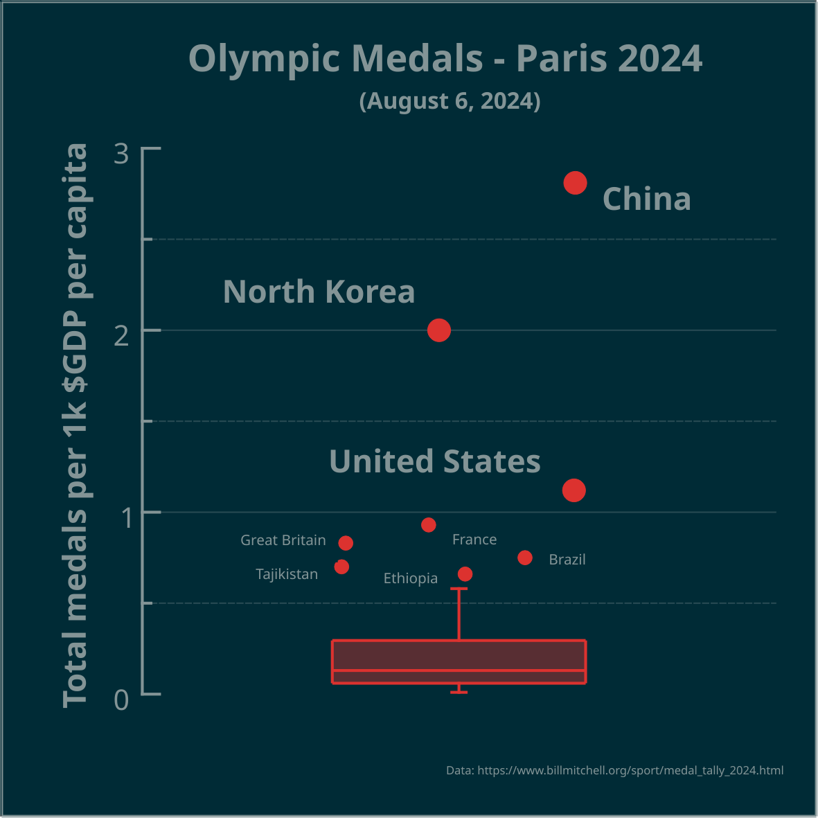
▶️ Total olympic medals per 1k $GDP per capita - Paris 2024 - represented in the Tukey's boxplot 🏅
Is the highest number, relative to $GDP per capita, best? Outliers marked as circles. Made in #LabPlot, an open-source data analysis and visualization software.
Edit: the problem is framed as a question.
#Olympics #Olympics2024 #France #China #NorthKorea #USA #UnitedStates #UnitedKingdom #UK #Brazil #Australia #Japan #Italy #Canada #Germany #Spain #DataAnalysis #DataViz
17 Comments
smeg@feddit.uk · 14 pts · 2y
LabPlot@floss.social · 0 pts · 2y
@smeg
The points are jittered along the x-axis, otherwise the data points could overlap.
smeg@feddit.uk · 1 pts · 2y
dgriffith@aussie.zone · 11 pts · 2y
Do we need a dataismanipulated community? I think we need a dataismanipulated community. 🤔
Edit: we could have challenges like, presenting a mundane dataset and saying, "display this data in a way that gives a clear advantage to this particular group even though they have no particular advantage in any obvious metric". The most obscure way to elevate that group with provided and/or inferred data wins.
teegus@sh.itjust.works · 5 pts · 2y
Now do one for medals per human rights violation
Sconrad122@lemmy.world · 2 pts · 2y
Only half serious, but saying "the highest number is best" next to a plot showing North Korea as second highest has to make you ask yourself if either the metric is flawed or your usage of the term best isn't in alignment with common parlance. A high density of medals per gdp per capita could be representative of an overinvestment into national prestige projects vs. other areas that may be more aligned to economic and social development. That probably goes for all three of the top three shown on this graph, to lesser or greater extents
LabPlot@floss.social · 2 pts · 2y
@Sconrad122
Any exploratory plot forms a question and your comment shows how to look for answers. Thanks!
architectonas@lemmy.world · 2 pts · 2y
How did you make the graph? I am asking because I am currently searching for ways to get into data stuff. Do you have good ressources?
LabPlot@floss.social · 3 pts · 2y
@architectonas
We used #LabPlot, a free, open source and cross-platform data visualization and analysis software.
LabPlot's homepage:
➡️ https://labplot.kde.org/
Video tutorials:
➡️ https://www.youtube.com/@LabPlot/videos
Eheran@lemmy.world · 1 pts · 2y
8 comments and I see none?
LabPlot@floss.social · 1 pts · 2y
@Eheran
We see all the replies here:
https://floss.social/@LabPlot/112915941751314965.
wildbus8979@sh.itjust.works · 1 pts · 2y
Eheran@lemmy.world · 1 pts · 2y
Why is this relevant?
LabPlot@floss.social · 0 pts · 2y
@Eheran
Great question! And what's _your_ answer?
JackGreenEarth@lemm.ee · 1 pts · 2y
You're OP who shared it, answer yourself what your reason was.
Eheran@lemmy.world · 1 pts · 2y
Sorry, I do not see any comments or replies to me. I get a notification and can read what you say there, but here in the link there is nothing. :(
LabPlot@floss.social · 1 pts · 2y
@dataisbeautiful
You can read more on boxplots here:
➡️ https://userbase.kde.org/LabPlot/2DPlotting/BoxPlot
NOT_RICK@lemmy.world · 1 pts · 2y
I’m surprised Australia isn’t an outlier too
LabPlot@floss.social · 2 pts · 2y
@NOT_RICK
Australia is the next country after Ethiopia, but it's not outlier in this case.
NOT_RICK@lemmy.world · 2 pts · 2y
I smell a fellow analyst. You should cross post this over at !dataisbeautiful@lemmy.world, it’s a bigger community.