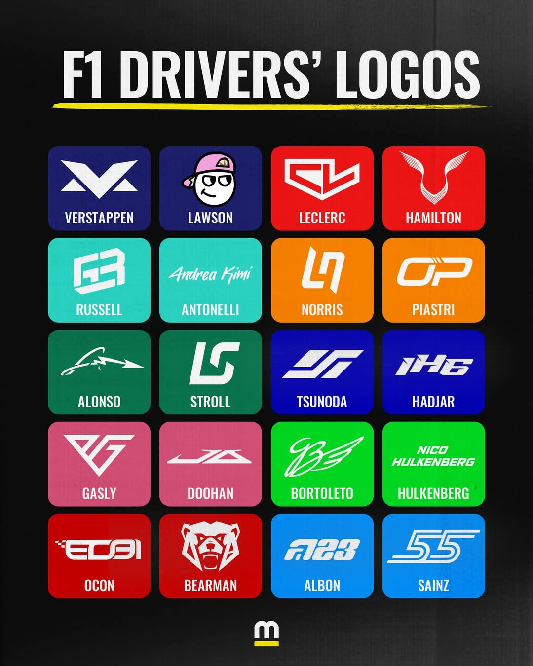
Gonna be honest, I don't like most of these. Half of them look like low budget RGB Gamer Headset brands or eSports brands to me.
They don't really remind me of racing, besides Carlos', which I like. Retro styling, two white lines on the sides just like a track, italic to give a sense of speed and forward movement. A good logo that reminds me of motorsport. If you put that logo on an F1 car from almost any era, it wouldn't look out of place.
I also like Lando's because the use of negative space is pretty cool.
Lewis' is, I guess, classy. It's subtle and it integrates well into helmet designs. Wings and the face of a panther. The problem is I only recognised it as such once it was pointed out to me, so I'm either stupid (and I won't rule that out) or it's a little too subtle.
Bortoleto's I like, although it kinda looks like they took Bentley's logo and changed it enough to not cause legal issues lol
12 Comments
Contentedness@lemmy.nz · 27 pts · 1y
My man Lawson the only one out there obviously drawing his own logo. Respect!
jonathan@lemmy.zip · 19 pts · 1y
Hulkenberg's logo is to be read in Danny Ric's voice.
Aarrodri@lemmy.world · 14 pts · 1y
For a second there I thought I was in dank. Lawson is real? 🤣.. temu graphic design..
FrostyTrichs@walledgarden.xyz · 6 pts · 1y
Checo now doing driver logos on Fiverr
TheGrandNagus@lemmy.world · 14 pts · 1y
Gonna be honest, I don't like most of these. Half of them look like low budget RGB Gamer Headset brands or eSports brands to me.
They don't really remind me of racing, besides Carlos', which I like. Retro styling, two white lines on the sides just like a track, italic to give a sense of speed and forward movement. A good logo that reminds me of motorsport. If you put that logo on an F1 car from almost any era, it wouldn't look out of place.
I also like Lando's because the use of negative space is pretty cool.
Lewis' is, I guess, classy. It's subtle and it integrates well into helmet designs. Wings and the face of a panther. The problem is I only recognised it as such once it was pointed out to me, so I'm either stupid (and I won't rule that out) or it's a little too subtle.
Bortoleto's I like, although it kinda looks like they took Bentley's logo and changed it enough to not cause legal issues lol
smeg@feddit.uk · 8 pts · 1y
Coelacanth@feddit.nu · 6 pts · 1y
I like Norris's, neat use of negative space.
keyez@lemmy.world · 2 pts · 1y
His and especially Oscar Piastri's which looks a lot like a racetrack
smeg@feddit.uk · 6 pts · 1y
Bearman, the man with a picture of a bear
CuddlyCassowary@lemmy.world · 3 pts · 1y
I think the bear’s cheeks are an O B, but still pretty funny he went so literal.
Hulkenberg clearly put a lot of artistic effort into his.
lnxtx@feddit.nl · 5 pts · 1y
How unique 💀
Props for the Lawson.
00L10@feddit.org · 2 pts · 1y
Bit too strong Van Halen vibes from the Gasly one.