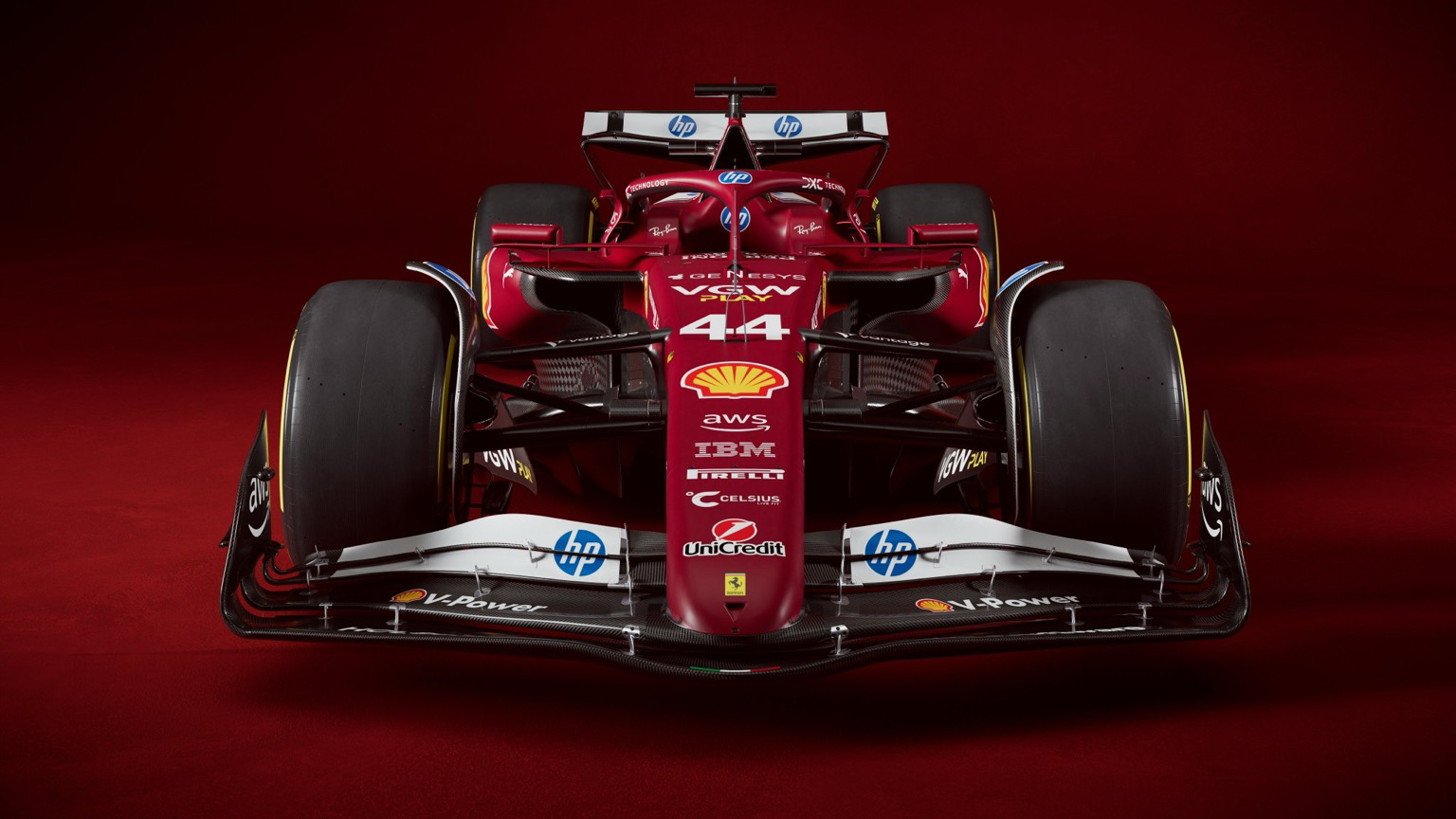
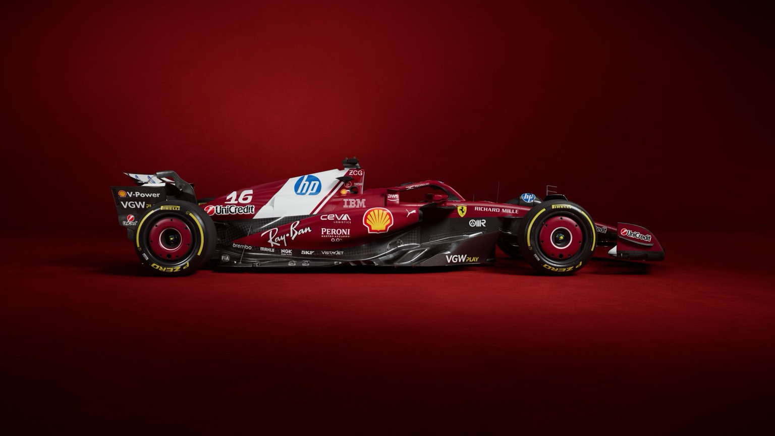
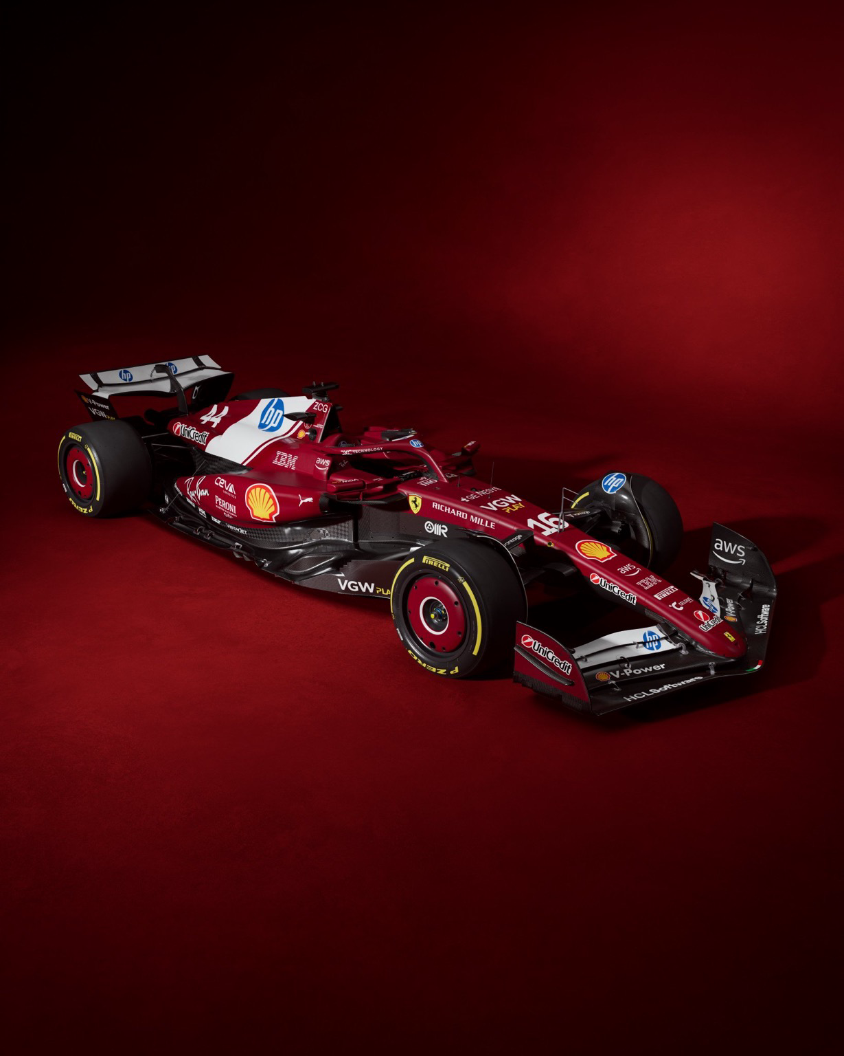
Looks like utter garbage to me but I hear they're paying astronomical amounts so 🤷 If you're contributing 66% if the budget I guess you feel like you can demand plastering 11 logos over the car you sponsor.
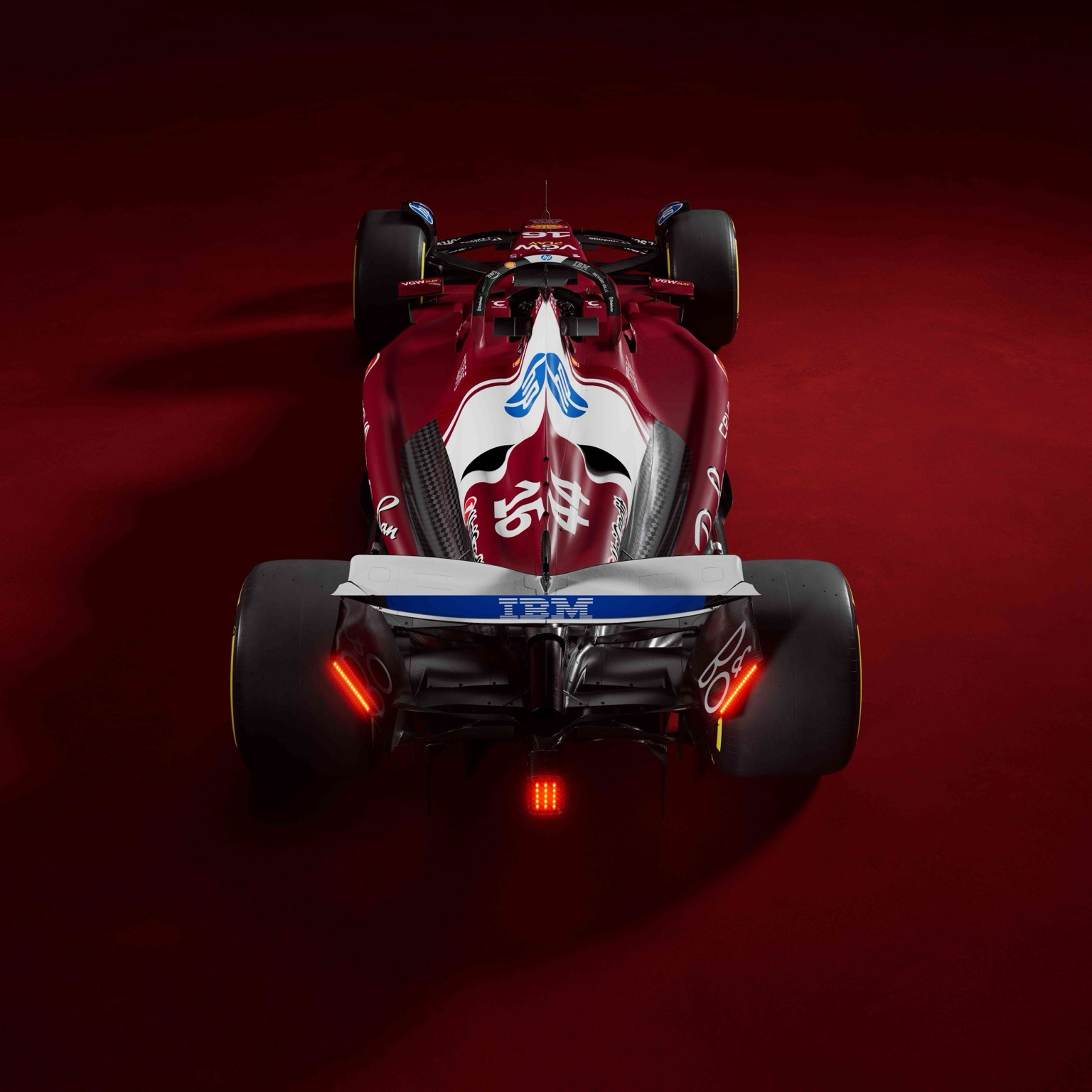
Would have been perfect without that giant white banner on the engine cover. I like the darker red, the white accents even look pretty good, it’s just that block
13 Comments
CMLVI@lemmy.world · 15 pts · 1y
Oh look it's
Alfa RomeoFerrari_ed@sopuli.xyz · 12 pts · 1y
I hope they’re paying Ferrari a ton of money for that. Not a fan personally.
Coelacanth@feddit.nu · 9 pts · 1y
Looks like utter garbage to me but I hear they're paying astronomical amounts so 🤷 If you're contributing 66% if the budget I guess you feel like you can demand plastering 11 logos over the car you sponsor.
resetbypeer@lemmy.world · 8 pts · 1y
The HP logo looks like it got printed on A4 paper with a HP Deskjet 500c
Microw@lemm.ee · 6 pts · 1y
I must say that I like the white HP stripe. Always nice to see a different-colour element towards the end of the red car.
PhobosAnomaly@feddit.uk · 9 pts · 1y
Personally I don't like it, but it does give me a warm fuzzy feeling like the 90's Marlboro branding.
Coelacanth@feddit.nu · 5 pts · 1y
The Marlboro livery was an absolute work of art. This... isn't.
DrCake@lemmy.world · 4 pts · 1y
Hard to see under so many sponsors but the car is actually red
BURN@lemmy.world · 4 pts · 1y
Would have been perfect without that giant white banner on the engine cover. I like the darker red, the white accents even look pretty good, it’s just that block
CaptDust@sh.itjust.works · 3 pts · 1y
They finally made the HP logo sort of work! And that's all I can say about it.
Coldmoon@sh.itjust.works · 3 pts · 1y
This feels wrong.
upside431@lemmy.world · 3 pts · 1y
Really ugly HP logo
superkret@feddit.org · 2 pts · 1y
Something somewhere went terribly wrong between this and that.