The layout of this guide is terrible - it's hard to tell what text goes with what album - but the suggestions are solid.
Starter Guide to Goth Rock - opinions? [infographic / meme]
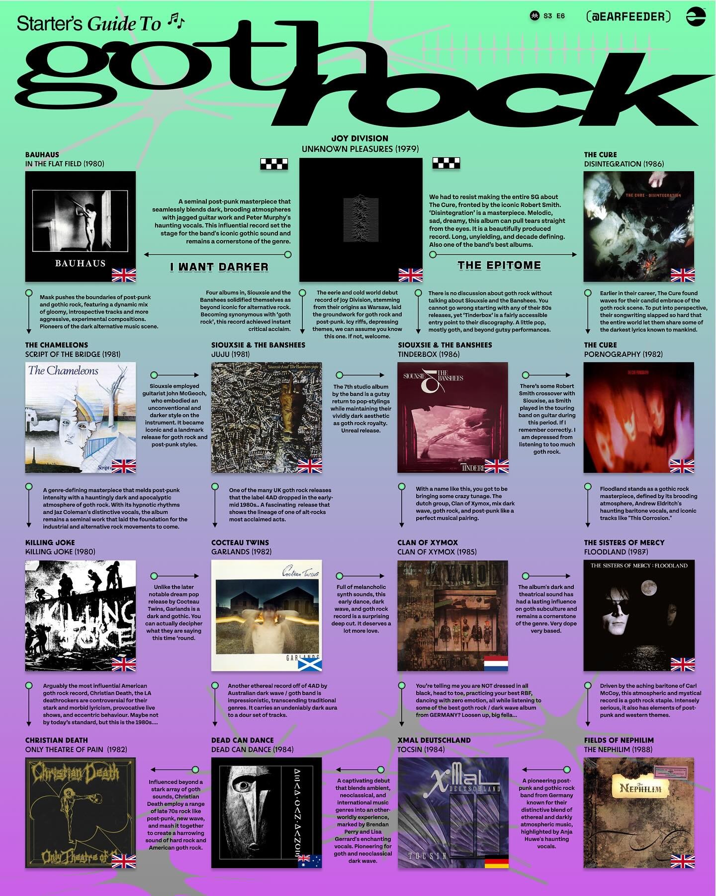
The layout of this guide is terrible - it's hard to tell what text goes with what album - but the suggestions are solid.
11 Comments
AllNewTypeFace@leminal.space · 6 pts · 136d
I’d substitute Floodland with First And Last And Always. Jim Steinman-era Sisters of Mercy is essentially Gothloaf, and once you hear that, you can’t unhear it.
gid@piefed.blahaj.zone · 5 pts · 136d
Yeah that's really difficult to follow.
I can't fault the suggestions without getting picky about genre definitions (Dead Can Dance as goth rock?!). They're all solid albums though.
Eldritch@piefed.world · 5 pts · 136d
Yeah, DCD is generally more neo-folk in my experience. Cocteau Twins shoegaze and ambient. Which isn't to shun either one or say they aren't goth etc. Just not the epitome of rock. The rest are solid though, kind of omitting ole captain sensible and rat scabies. I'll be damned if I made such a list and left out The Damned.
fx242@lemmy.world · 2 pts · 134d
DCD is not even close to being neofolk 😂
Eldritch@piefed.world · 2 pts · 134d
Aaaah yeah poor choice of terms on my part. Neoclassical all I remembered at the time was that I knew I always mixed it with qntal and death in June for dj sets. Though I don't do death in June anymore. No promotion of fash friends.
christian@lemmy.ml · 2 pts · 134d
Brendan Perry's songs match my mental picture of goth rock on that first Dead Can Dance album specifically, to the point that I'm wondering if you've only listened to their later albums. Lisa Gerrard's songs fit in smoothly, the album to me feels like goth rock with neoclassical interludes. The best Brendan Perry song on that one is track 8 (A Passage in Time), give it a listen and tell me if I'm crazy for thinking that's exactly what goth rock sounds like.
gid@piefed.blahaj.zone · 3 pts · 136d
What is going on with the flags? All the English bands have a UK flag but Cocteau Twins has a Scottish flag (Scotland is also in the UK, at least for now!).
Christian Death were from California, I have no idea why the UK flag is on there.
rumschlumpel@feddit.org · 2 pts · 136d
Took me a while to figure out, but the arrows show what album the text paragraph belongs to; at first I thought the arrows only indicated "this influenced that". Once you get that, it's fairly easy to read.
Sergio@piefed.social · 2 pts · 136d
ooohh... you're right... that explains wat they were going for...
tho the Joy Division text doesn't have any arrows. And the top says "I Want Darker" as if it IS a flowchart. The more I look at it the crazier this becomes: the colors, the background graphics, the fonts, they make no sense given the subject matter. I suspect this was put together by a clueless rando who picked the albums from a far superior source.
autonomous@lemmy.world · 2 pts · 135d
Just to start...
Where is F&TM? (or Strange Boutique before it?)
Where is This Ascension?
Where is The Shroud?
fx242@lemmy.world · 1 pts · 134d
All of those are obviously not for starters.