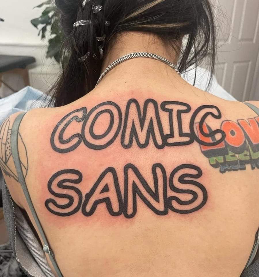
That's cool I like how it overlaps with the other traits, and I never got the hate for comic sans when it's used to convey the appropriate tone (break room notice board vs official comms)
I think the hate is that when used in the wrong context it can be offensive. Like a war memorial or something. The other "common" fonts aren't like that.
31 Comments
key@lemmy.keychat.org · 53 pts · 2y
LOVE NEEDS ASS ???
tiramichu@lemm.ee · 33 pts · 2y
Probably "All you need is love" read from the bottom of the stack to the top.
fine_sandy_bottom@discuss.tchncs.de · 18 pts · 2y
Damn it. I was trying to figure this out for 5 minutes before finally getting it only to find smarty pants here beat me by 11 minutes.
I think it's all "we" need is love BTW but you still win.
OpenStars@startrek.website · 8 pts · 2y
No those are clearly straight-edged letters. LOVE NEEDS ALE. :-P
It could almost be LOVE NEEDS ABE LINCOLN, except the I isn't quite right.:-D
Ignisnex@lemmy.world · 4 pts · 2y
I put some gel drops on my eyes, and could have sworn it was the Orcs Must Die logo
glnpf148@lemmy.world · 3 pts · 2y
I know you are joking. I just wanted to share my revelation, that it is probably 'All you need is love'.
Dolphinfreetuna@lemmy.world · 0 pts · 2y
2 MOUTH
6daemonbag@lemmy.dbzer0.com · 27 pts · 2y
That left-align is just 🤌
jopepa@lemmy.world · 6 pts · 2y
And the outline weight expanded just enough to make the A crossbar hump completely nonsense
UNWILLING_PARTICIPANT@sh.itjust.works · 27 pts · 2y
That's cool I like how it overlaps with the other traits, and I never got the hate for comic sans when it's used to convey the appropriate tone (break room notice board vs official comms)
fine_sandy_bottom@discuss.tchncs.de · 19 pts · 2y
I think the hate is that when used in the wrong context it can be offensive. Like a war memorial or something. The other "common" fonts aren't like that.
Lifebandit666@feddit.uk · 14 pts · 2y
I want it on my gravestone
crazyCat@sh.itjust.works · 16 pts · 2y
That’s photoshopped right?
brbposting@sh.itjust.works · 7 pts · 2y
Who knows - apparent reddit source.
It’s not the only one:
SomeGuy69@lemmy.world · 3 pts · 2y
That's or AI qrcodemonster
cabron_offsets@lemmy.world · 13 pts · 2y
n3m37h@lemmy.world · 11 pts · 2y
Comic Sans is one of the best fonts, fight me
smotherlove@sh.itjust.works · 10 pts · 2y
n3m37h@lemmy.world · 3 pts · 2y
Like getting a tattoo?
PrimeErective@startrek.website · 3 pts · 2y
Why would I fight you? you're right
FlyingSquid@lemmy.world · 2 pts · 2y
Better or worse than Papyrus?
n3m37h@lemmy.world · 3 pts · 2y
I've never seen that font before. I'm dyslexic as fuck so not much is better than CS for my eyes
FlyingSquid@lemmy.world · 4 pts · 2y
Papyrus was en vogue for a while in TV and movies. Including the first Avatar movie.
https://en.wikipedia.org/wiki/Papyrus_(typeface)
n3m37h@lemmy.world · 3 pts · 2y
Wow, that's a horrible font for reading. Makes sense for Avatar though
eRac@lemmings.world · 5 pts · 2y
It was the subtitles font in Avatar. It had to be read quickly on changing backgrounds.
Buffalobuffalo@lemmy.dbzer0.com · 9 pts · 2y
This type of dedication is pretty inspiring. Looking out for the dude with the
wingding'strampstamp coming up next week.unreachable@lemmy.world · 4 pts · 2y
Stamets@lemmy.world · 4 pts · 2y
don@lemm.ee · 3 pts · 2y
k
mrfriki@lemmy.world · 3 pts · 2y
You mad lad!
PatFussy@lemm.ee · 0 pts · 2y
Millennials 🤢🤮
frankenswine@lemmy.world · 1 pts · 2y
watch it, zoomer
PatFussy@lemm.ee · -1 pts · 2y
I'm actually mid 30s but I hate millennials too
Sticker@lemy.nl · -1 pts · 2y
What is the name of this model?