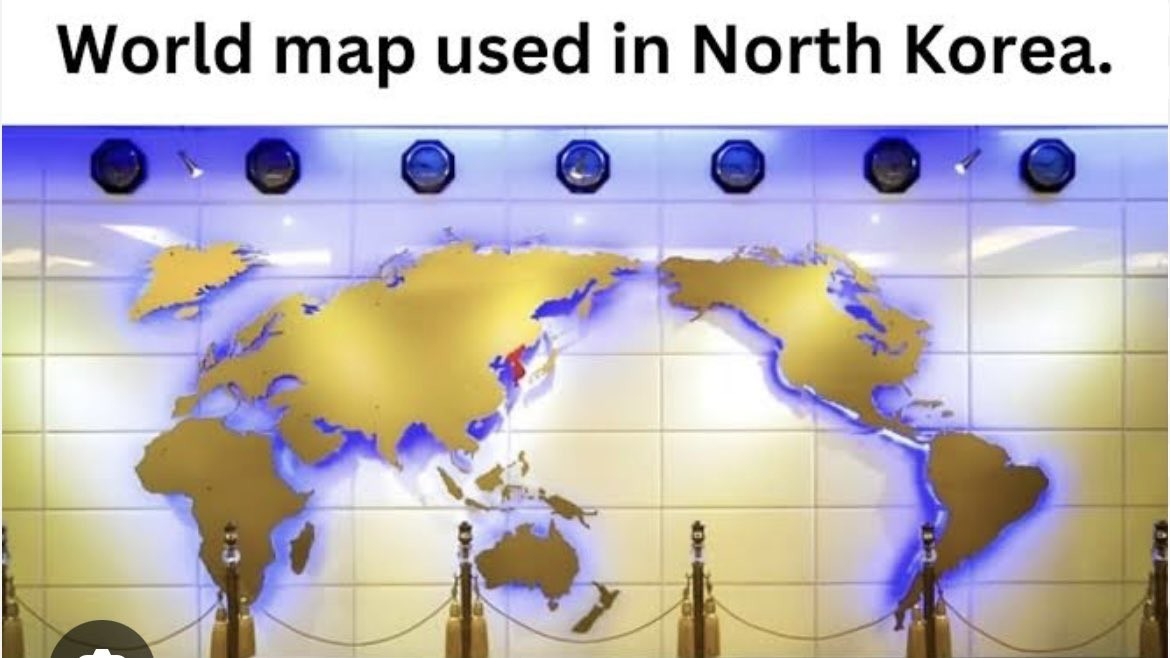
I'm no map understander, but I think the projection choice might have not been the best cause it seems to skew edges, while the part that it maintains has a lot of empty space (or maybe I'm just used to other maps). Though this is just a random map on a wall so 🤷
The solution is to create a new continent in the Pacific.
You are used to other maps. Yours are skewed the same way, at least when referencing the versions with curved edges (Robinson), but you just see the same anglo-centric projections, being centered on the prime meridian from the northern hemisphere. The USA is a little bigger than shown on the "normal" map. Greenland is quite smaller than represented. South America/Africa/Australia are significantly undersized. And there's no hope for understanding Antarctica in either version.
Yes, but the maps we're more used to split in the middle of the Pacific, far from all land, more or less at Point Nemo. That minimizes the visual distortion since the land is further from the edges of the map.
Splitting through the Atlantic makes it trickier, because the ocean is significantly narrower, meaning that the land masses are all closer to the edges.
Positioning the map with North at the top is truly arbitrary, but splitting the map in the Pacific actually makes a lot of sense from a usability perspective.
Less land? Sure, but not away from all land. Less people, debatable. The Atlantic split makes it hard to notice Alaska and Russia are miles apart. It also makes it seems like hundreds of pacific islands are at the edge of the world, isolated. It presents the Americas and Asia as, literally, a world apart. No matter where you draw your centerline, the edges have greatly distorted distances. It's not just continental mass that's important, but aquatic distances as well.
I don't think it's particularly debatable that more people live in Europe and Africa and South America (the most notably distorted landmasses in the Pacific-centered map) than in Alaska, Eastern Russia, and the few Pacific isles that aren't tucked right in next to Continental Asia and Australia. The most populous nation negatively affected by a Pacific split is probably New Zealand, and that only represents about five million people. The most populous nation negatively affected by an Atlantic split is probably Brazil, with over forty times as many people.
If you can see South America is distorted as an entire continent in the pictured map, then you should be able to realize the PM split does the same to Eastern Asia. China alone has triple the population of South America. Also going to point out the standard split is not really in the Atlantic, but through England, France, and Spain, and is so far east of the North Atlantic that about 8 African countries lie entirely west of the center.
If it supports your use case, sure. But splitting down the Pacific doesn't distort China and the rest of East Asia nearly as much as splitting down the Atlantic distorts South America and Africa, because Asia is much further from any reasonable dividing line than South America is.
And splitting through mainland Europe and Africa would only compound the problem, since it would put all of that distortion right down the middle of two very populous continents. If you're in a use case where a distortion that big is immaterial, it probably doesn't matter much where you split the map; you can probably just center the map over whichever country or region you're trying to focus the map on, and not even bother showing the other hemisphere.
They undercut the message buy putting upside down at the top.
I had a teacher in high school who always set his globe that had the text oriented to the nearest pole to have the south pole on top. Anyone switching it would start a conversation about how there isn't a 'correct' up direction.
where to cut is one of the hardest decisions. i am guilty of defaulting to cut through greenland more than any other country when making world map desktop wallpapers.
I don't think it's that difficult to decide. There's a lot more room between San Jose, California and Hokkaido, Japan than between Natal, Brazil and Dakar, Senegal; cutting through the Pacific makes the most sense for most applications, I think. Sure, the Bering Strait is pretty tiny, but if you break in the Atlantic you're going to get a lot of distortion in Greenland (hasn't it had enough?), mainland Europe, and Brazil.
I think putting the line down the Pacific makes the most sense in most cases. But the national narcissism has historically been a defining characteristic of the UK and the US
Don't the rest of the countries in the region use similar maps? South Korea, Australia, Japan...? I would expect that to be the case, it seems more natural.
Projection aside, proportionally it's a bit whack and Japan is a bit too far north. Taiwan also seems to be inexplicably MIA, which would be understandable if it were omitted due to size but there are several smaller islands still depicted.
Perhaps the real point of interest is that it seems to depict the North and South Koreas as united with the whole peninsula colored in red. As usual for the Juche Boys, this is probably a tacit threat rather than any indication of potential armistice or reconciliation.
They do this petty, embarrassing shit all the time on their maps. Made it look like Japan smaller while simultaneously peninsula bigger.
And this is not just from north but south too lol
Nerd sniped me enough to look it up. Both countries use different names for "all of korea." While the north generally refers to itself with the same term as all of korea, there are some contexts where there is a "north Korea" used.
Sorry if I didn't explain it well. What I mean is that dprk considers itself the "true" government of the Korean peninsula, and their terminology generally reflects this. Due to the functional reality of the ongoing conflict, "South Korea" is used often. Though it's used rarely, "North Korea" (literally north, functionally "unoccupied" or "free") does still show up occasionally in language.
Seems odd to me to want to put the largest ocean in the world as the focus. Yes, let's put most of the useful information around the edge of the map. Brilliant idea.
Let's draw maps with Antarctica in the middle instead.
69 Comments
poVoq@slrpnk.net · 92 pts · 314d
That is common in east Asia in general, and I don't see why not 🤷
ShinkanTrain@lemmy.ml · 23 pts · 314d
I'm no map understander, but I think the projection choice might have not been the best cause it seems to skew edges, while the part that it maintains has a lot of empty space (or maybe I'm just used to other maps). Though this is just a random map on a wall so 🤷
The solution is to create a new continent in the Pacific.
XeroxCool@lemmy.world · 16 pts · 314d
You are used to other maps. Yours are skewed the same way, at least when referencing the versions with curved edges (Robinson), but you just see the same anglo-centric projections, being centered on the prime meridian from the northern hemisphere. The USA is a little bigger than shown on the "normal" map. Greenland is quite smaller than represented. South America/Africa/Australia are significantly undersized. And there's no hope for understanding Antarctica in either version.
ilinamorato@lemmy.world · 5 pts · 314d
Yes, but the maps we're more used to split in the middle of the Pacific, far from all land, more or less at Point Nemo. That minimizes the visual distortion since the land is further from the edges of the map.
Splitting through the Atlantic makes it trickier, because the ocean is significantly narrower, meaning that the land masses are all closer to the edges.
Positioning the map with North at the top is truly arbitrary, but splitting the map in the Pacific actually makes a lot of sense from a usability perspective.
XeroxCool@lemmy.world · 3 pts · 313d
Less land? Sure, but not away from all land. Less people, debatable. The Atlantic split makes it hard to notice Alaska and Russia are miles apart. It also makes it seems like hundreds of pacific islands are at the edge of the world, isolated. It presents the Americas and Asia as, literally, a world apart. No matter where you draw your centerline, the edges have greatly distorted distances. It's not just continental mass that's important, but aquatic distances as well.
ilinamorato@lemmy.world · 1 pts · 313d
I don't think it's particularly debatable that more people live in Europe and Africa and South America (the most notably distorted landmasses in the Pacific-centered map) than in Alaska, Eastern Russia, and the few Pacific isles that aren't tucked right in next to Continental Asia and Australia. The most populous nation negatively affected by a Pacific split is probably New Zealand, and that only represents about five million people. The most populous nation negatively affected by an Atlantic split is probably Brazil, with over forty times as many people.
XeroxCool@lemmy.world · 1 pts · 313d
If you can see South America is distorted as an entire continent in the pictured map, then you should be able to realize the PM split does the same to Eastern Asia. China alone has triple the population of South America. Also going to point out the standard split is not really in the Atlantic, but through England, France, and Spain, and is so far east of the North Atlantic that about 8 African countries lie entirely west of the center.
ilinamorato@lemmy.world · 1 pts · 311d
If it supports your use case, sure. But splitting down the Pacific doesn't distort China and the rest of East Asia nearly as much as splitting down the Atlantic distorts South America and Africa, because Asia is much further from any reasonable dividing line than South America is.
And splitting through mainland Europe and Africa would only compound the problem, since it would put all of that distortion right down the middle of two very populous continents. If you're in a use case where a distortion that big is immaterial, it probably doesn't matter much where you split the map; you can probably just center the map over whichever country or region you're trying to focus the map on, and not even bother showing the other hemisphere.
HeyThisIsntTheYMCA@lemmy.world · 2 pts · 313d
I'm trying but they keep cleaning up my plastic
NochMehrG@feddit.org · 11 pts · 314d
And it has New Zealand on it!
lysol@lemmy.world · 3 pts · 313d
Exactly, no one here played Street Fighter 2 on SNES?!
slaneesh_is_right@lemmy.org · 1 pts · 313d
What do you mean america is not the center of the universe?
mech@feddit.org · 70 pts · 314d
Fun fact: Whether North or South are "up" on a map is also completely arbitrary.

snooggums@piefed.world · 29 pts · 314d
They undercut the message buy putting upside down at the top.
I had a teacher in high school who always set his globe that had the text oriented to the nearest pole to have the south pole on top. Anyone switching it would start a conversation about how there isn't a 'correct' up direction.
iamdefinitelyoverthirteen@lemmy.world · 3 pts · 313d
There is only a "correct" up direction if it has words. The "correct" up would be the direction of the letters.
m0darn@lemmy.ca · 10 pts · 314d
Oh god why Mercator?
mech@feddit.org · 44 pts · 314d
Mercator really starts to shine when you rotate it by 90 degrees.

_stranger_@lemmy.world · 13 pts · 314d
This is cursed enough to be an SCP
Burninator05@lemmy.world · 7 pts · 314d
At this point, Africa is almost represented at its actual size.
altphoto@lemmy.today · 8 pts · 314d
Or left right
Bgugi@lemmy.world · 5 pts · 314d
Should have rotated the other way so the sun scrolls satisfyingly top-to-bottom.
LorIps@lemmy.world · 6 pts · 314d
Yeah, but European borders aren't
captainlezbian@lemmy.world · 5 pts · 314d
Sure they are, they're fun to redraw too. I thought y'all loved doing that
Jankatarch@lemmy.world · 5 pts · 314d
This looks like a fantasy world map wtf.
toynbee@lemmy.world · 4 pts · 314d
https://www.youtube.com/watch?v=B14Gtm2Z_70
DirigibleProtein@aussie.zone · 3 pts · 314d
It’s freaking me out!
tonyn@lemmy.ml · 49 pts · 314d
It makes as much sense as any other 2D projection of the globe.
teft@piefed.social · 45 pts · 314d
SethranKada@lemmy.ca · 18 pts · 314d
I like this one
Jerb322@lemmy.world · 12 pts · 314d
Maybe a little more than this one...
_stranger_@lemmy.world · 5 pts · 314d
In this map's defense, it really highlights the value of a northwest passage and all the canals.
Gonzako@lemmy.world · 3 pts · 314d
thank god I needed a map with an inverse relationship with population and size on the map
Pechente@feddit.org · 21 pts · 314d
Doesn’t the US sometimes use one that puts America in the center and cuts Eurasia in half? Can we agree this one is definitely stupid?
ExistingConsumingSpace@midwest.social · 14 pts · 314d
I've never seen that in the US. That is extremely stupid. Typically maps in the US center around the Atlantic/Europe.
OneWomanCreamTeam@sh.itjust.works · 6 pts · 314d
From the US: I grew up with a map like this in the dining room. It was super confusing as s a little kid.
faythofdragons@slrpnk.net · 3 pts · 313d
This unlocked some memories, wow.
lurch@sh.itjust.works · 3 pts · 314d
where to cut is one of the hardest decisions. i am guilty of defaulting to cut through greenland more than any other country when making world map desktop wallpapers.
ilinamorato@lemmy.world · 3 pts · 314d
I don't think it's that difficult to decide. There's a lot more room between San Jose, California and Hokkaido, Japan than between Natal, Brazil and Dakar, Senegal; cutting through the Pacific makes the most sense for most applications, I think. Sure, the Bering Strait is pretty tiny, but if you break in the Atlantic you're going to get a lot of distortion in Greenland (hasn't it had enough?), mainland Europe, and Brazil.
scytale@piefed.zip · 40 pts · 314d
Most maps in Asia are like this. That’s why growing up I was confused why the US was called the west and East/Southeast Asia was called the far east.
toynbee@lemmy.world · 47 pts · 314d
edit: Oops, didn't realize the credit wouldn't be obvious. It's xkcd #503.
_stranger_@lemmy.world · 17 pts · 314d
I guess it kinda makes sense if you draw the line right down the middle of Germany. Weird, I wonder if there's any historical precedent for that...
mapleseedfall@lemmy.world · 5 pts · 314d
Its almost as if some country thinks they are the center of the world.
ilinamorato@lemmy.world · 2 pts · 314d
Well, specifically a couple of countries on either side of the Atlantic.
NiHaDuncan@lemmy.world · 8 pts · 314d
It’s more like most countries. Maps like the one shown in this post that place Asia as a central focus are common in Asia.
Maybe it’s not national narcissism, rather just focusing on what’s most relevant to any one people.
ilinamorato@lemmy.world · 1 pts · 313d
I think putting the line down the Pacific makes the most sense in most cases. But the national narcissism has historically been a defining characteristic of the UK and the US
HazardousBanjo@lemmy.world · 30 pts · 314d
They included New Zealand.
They're already leagues ahead of most US primary education text books
SleeplessCityLights@programming.dev · 28 pts · 314d
Maps with New Zealand.
dellish@lemmy.world · 7 pts · 314d
And Tasmania!
Colonel_Panic_@eviltoast.org · 18 pts · 314d
At least it has New Zealand.
OfCourseNot@fedia.io · 13 pts · 314d
Don't the rest of the countries in the region use similar maps? South Korea, Australia, Japan...? I would expect that to be the case, it seems more natural.
muhyb@programming.dev · 2 pts · 314d
Yes, and Australia even has it as upside down.
And009@lemmynsfw.com · 1 pts · 314d
They've not discovered Antarctica yet
Lemminary@lemmy.world · 13 pts · 314d
I like it, if only because it places Oceania at the center. They're always pushed aside and it's big sad.
Chezus9247@lemmy.world · 8 pts · 314d
Sea of Thieves lookin' map.
dual_sport_dork@lemmy.world · 7 pts · 314d
Projection aside, proportionally it's a bit whack and Japan is a bit too far north. Taiwan also seems to be inexplicably MIA, which would be understandable if it were omitted due to size but there are several smaller islands still depicted.
Perhaps the real point of interest is that it seems to depict the North and South Koreas as united with the whole peninsula colored in red. As usual for the Juche Boys, this is probably a tacit threat rather than any indication of potential armistice or reconciliation.
insomniac199@lemmy.world · 1 pts · 314d
They do this petty, embarrassing shit all the time on their maps. Made it look like Japan smaller while simultaneously peninsula bigger. And this is not just from north but south too lol
NigelFrobisher@aussie.zone · 6 pts · 313d
It makes sense they’d centre the Gulf Of Korea though.
A_norny_mousse@feddit.org · 5 pts · 314d
There is no North Korea in North Korea. There is only Korea.
Bgugi@lemmy.world · 1 pts · 314d
Nerd sniped me enough to look it up. Both countries use different names for "all of korea." While the north generally refers to itself with the same term as all of korea, there are some contexts where there is a "north Korea" used.
A_norny_mousse@feddit.org · 1 pts · 313d
The fuck's wrong with you?(I guess that wasn't directed at me)Look at the pic, all of Korea is red.
Bgugi@lemmy.world · 1 pts · 313d
Sorry if I didn't explain it well. What I mean is that dprk considers itself the "true" government of the Korean peninsula, and their terminology generally reflects this. Due to the functional reality of the ongoing conflict, "South Korea" is used often. Though it's used rarely, "North Korea" (literally north, functionally "unoccupied" or "free") does still show up occasionally in language.
RandomStickman@fedia.io · 5 pts · 314d
The oddest part for me is Greenland being split from the Americas
ChairmanMeow@programming.dev · 6 pts · 314d
I mean politically speaking it's Danish, so I suppose it makes sense to group it with Europe in some ways.
It does look a little odd though.
Ksin@lemmy.world · 4 pts · 313d
At first this map seemed perfectly fine to me, but the more I look the weirder it gets.
x00z@lemmy.world · 2 pts · 313d
They also claim South Korea.
wewbull@feddit.uk · 3 pts · 314d
Seems odd to me to want to put the largest ocean in the world as the focus. Yes, let's put most of the useful information around the edge of the map. Brilliant idea.
Let's draw maps with Antarctica in the middle instead.
XeroxCool@lemmy.world · 3 pts · 314d
That's just the back of the UN logo
HubertManne@piefed.social · 3 pts · 314d
north korea is pretty lose to center on the map.
kelpie_returns@lemmy.world · 3 pts · 314d
shalafi@lemmy.world · 1 pts · 314d
Looks good to me. I've also seen pics showing they can change the colors.