Voting has ended! Congrats to @fer0n@lemm.ee with option B. Thanks everyone for participating! :)
First off, thanks to everyone that participated in our icon contest last week!
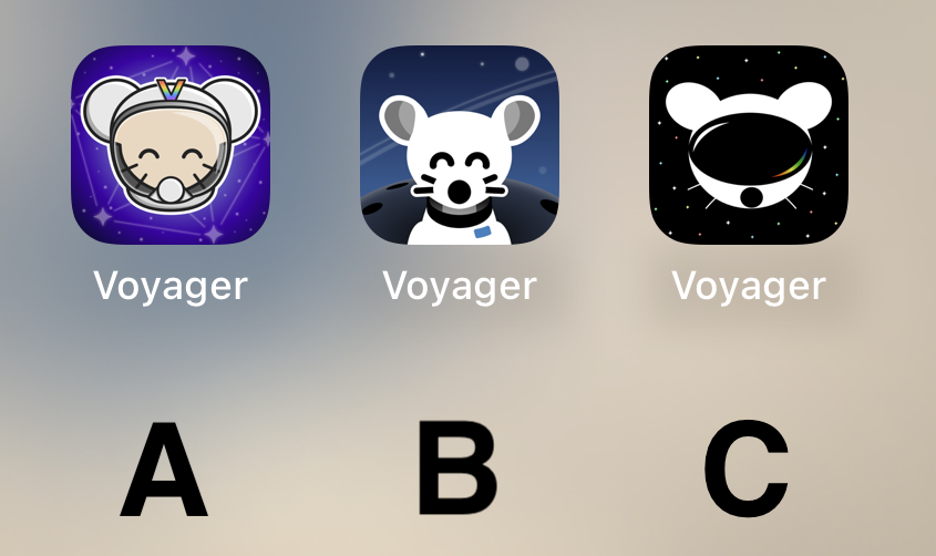
I'm excited to show the final three options for you to vote on below!
Overview
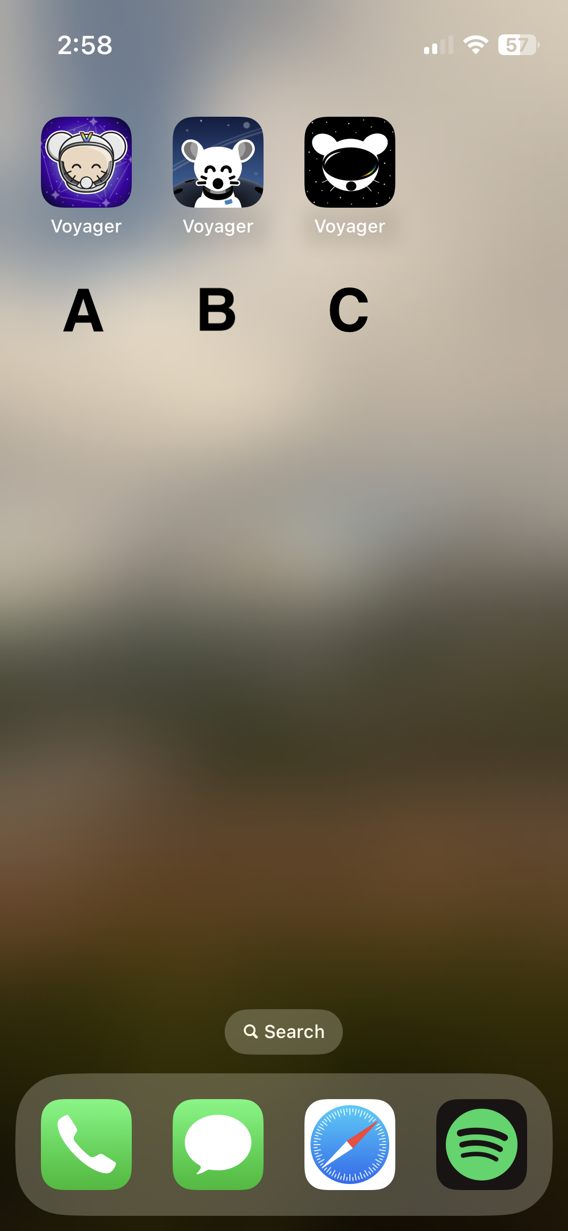
Option A
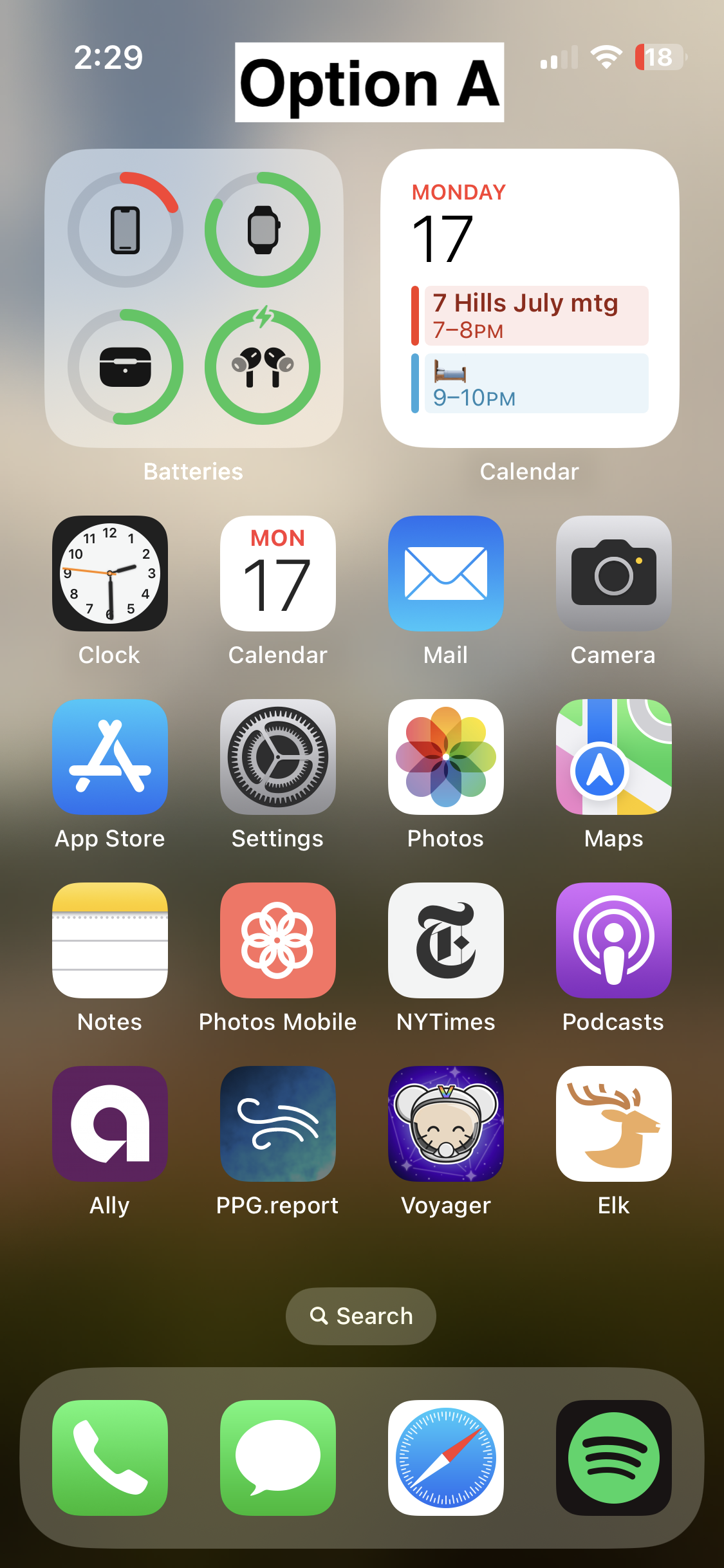

Option B
- 📸 On homescreen
- 📸 Icon
- Credit: @fer0n@lemm.ee
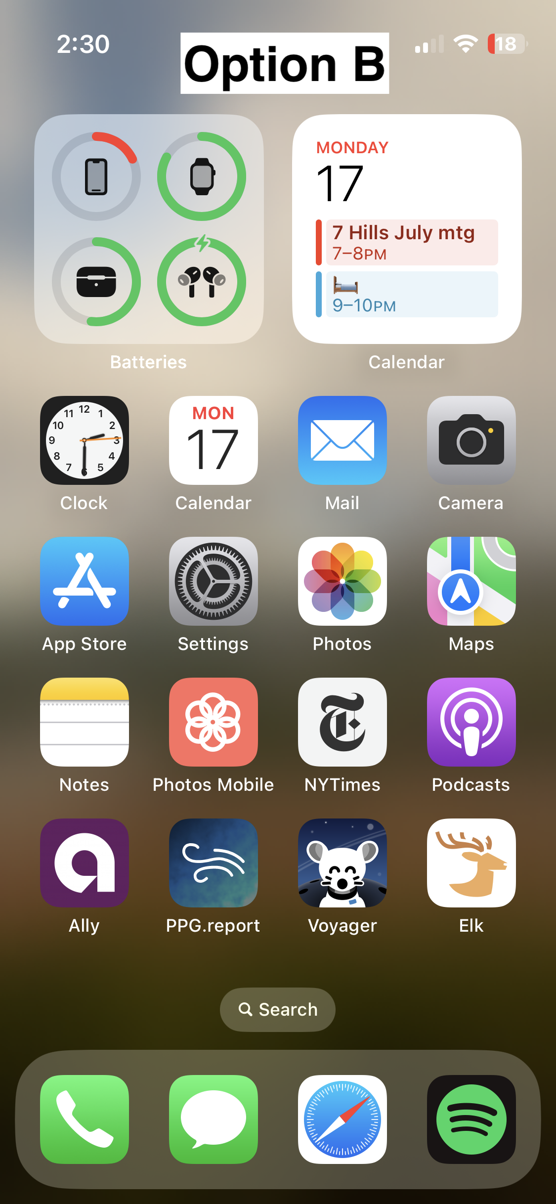

Option C

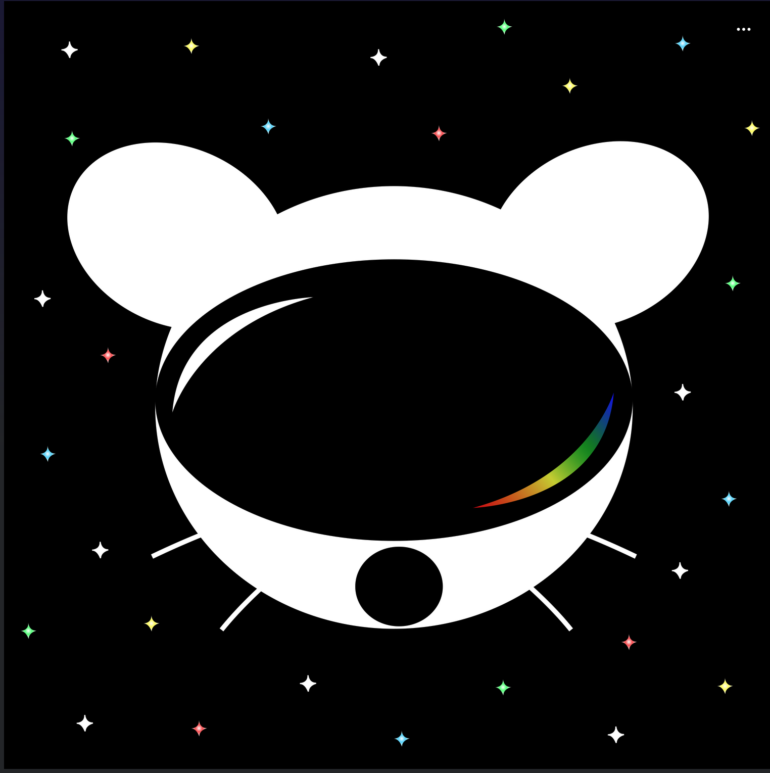
🗳️ Vote!
⚠️ BEFORE VOTING I encourage you to tap through the links above to see what it's like on your homescreen!
Results of the poll will not be available until it has ended, so no need to make a rushed decision.
VOTE HERE: https://strawpoll.com/BDyNEbKeqZR
~Polling ends in 24 hours! If there is a tie, I will cast the final vote.
286 Comments
gunnm@monero.town · 179 pts · 3y
I vote for C.
Ataraxia@lemmy.world · 8 pts · 3y
Kinda looks like that apple vr
why_rob_y@lemmy.world · 1 pts · 3y
Yes, though only because Apple just used pretty much a standard ski goggle aesthetic.
Polydextrous@lemmy.world · 6 pts · 3y
C, def.
daFRAKKINpope@lemmy.world · 5 pts · 3y
Same
Hizeh@hizeh.com · 2 pts · 3y
C all the way
Ginjutsu@lemmy.world · 137 pts · 3y
I think B looks the nicest of the three by far. Good use of a monochromatic color scheme, nice balance between background and foreground elements, perfectly readable at a distance.
The design direction of A is a bit busy and stands out a little too much IMO, it looks kind of out of place next to stock iOS apps. C looks a bit too amateur, and has several tangents in it that really bother me - I do like the overall idea of it, but it could really use a rework.
Humanbiscuit@lemmy.world · 16 pts · 3y
I started with C, but then clicked the links to compare what hey all looked like on a Home Screen (yes, I eventually followed instructions .. look at me go). B is clearly the standout for me.
aeharding@lemmy.world · 16 pts · 3y
If one is chosen, I’ll give the author the opportunity to tweak :)
Ginjutsu@lemmy.world · 10 pts · 3y
Good to know! :)
Dmian@lemmy.world · 11 pts · 3y
Orbiht@lemm.ee · 70 pts · 3y
My vote is for B, but I think it would look good with a splash of the multicolor like the other two do.
Glisten6159@waveform.social · 11 pts · 3y
I like the lack of multicolor for an icon. I also liked the ability to change icons in Apollo if I was feeling colorful during that period of my life.
fer0n@lemm.ee · 6 pts · 3y
If you’re on iOS, here‘s a shortcut that lets you change the icon to whatever you want.
This is the post about it.
victron@lemmy.world · 59 pts · 3y
MothBookkeeper@lemmy.world · 37 pts · 3y
It pains me to agree, since the community put so much effort into these, and that's truly appreciated, but I don't feel like any of them live up to Voyager's aesthetic. They're all kinda amateurish. Hopefully the devs do another one of these contests in time.
victron@lemmy.world · 20 pts · 3y
MothBookkeeper@lemmy.world · 18 pts · 3y
I also think the contest guidelines are partly to blame. The whole, "avoid the corporate vector look, look at these super detailed illustrations" thing is horrendous advice. It basically translates to, "avoid doing what the most talented app icon designers in the world do."
Yes, the icon should be fun and stand out. Yes, the Facebook "f" is boring as fuck. But some of the greatest app icons are extremely simple, and there are reasons for that. Fine details don't display well in the actual contexts that icons are used in; they make the design seem muddy and confused. People resonate with clear design that knows its purpose.
victron@lemmy.world · 10 pts · 3y
Tatters@feddit.uk · 14 pts · 3y
I prefer the current icon to any of these new ones.
adj16@lemmy.world · 2 pts · 3y
Looks like I can never delete the current one from my homescreen for any reason 😅
SilentStorms@lemmy.fmhy.ml · 8 pts · 3y
I honestly can't stand the cutesy eyes. I wish there was some more diversity in the options, something more abstract in there would be nice.
Oh well, through the magic of Android I can pick a different one to use from the thread.
darkstar@sh.itjust.works · 8 pts · 3y
I agree. All 3 options look outdated and are not good icons for a Home Screen. Icons need to be simple and clean, these are all too busy
8bit@lemmy.world · 2 pts · 3y
victron@lemmy.world · 1 pts · 3y
itadakimasu@lemmy.world · 1 pts · 3y
The probe is <3
Sad to not see it as an option to vote on!
8bit@lemmy.world · 45 pts · 3y
I hate to say it but the options are a bit disappointing. I wish the top community upvoted submission was considered:
https://lemmy.world/comment/1114273
fer0n@lemm.ee · 8 pts · 3y
I though C was the top one, but you’re right. One of the two there should’ve been up there, they look great.
minishoemaze@lemmy.world · 41 pts · 3y
I like B personally, but the choices aren't adaptable icons on Android 🥲 if anyone knows a good way of forcing that on Nova launcher let me know
can@sh.itjust.works · 2 pts · 3y
What do you want them to do?
reev@sh.itjust.works · 1 pts · 3y
Change color based on Material You.
fer0n@lemm.ee · 1 pts · 3y
Does it have to be a svg version or what does it need?
dm21@lemm.ee · 34 pts · 3y
Add me to the “unfortunately I don’t think any of them are great and can’t/won’t single out one to vote for, but truly appreciate all the effort that’s been put in” list
MNLFNUT8YG@lemmy.world · 11 pts · 3y
This is what I thought too. The original icon is better then the given 3 options. Sorry about all the effort from the contestants.
Thteven@lemmy.world · 33 pts · 3y
I'm going with C. A is pretty cute too though.
tryagain@lemmy.ml · 29 pts · 3y
I think C is the cleanest
infotainment@lemmy.world · 11 pts · 3y
I don't really get what's going on with C, it seems like it's the Lemmy logo wearing a VR headset.
droidiac@lemmy.world · 28 pts · 3y
The current one is way better than any of these. No offense to the designers they look great but I just don’t think they beat out what’s already there.
orphiebaby@lemmy.world · 28 pts · 3y
I like B the most.
C isn't bad. Give it the smiling eyes in white and it'll probably be better.
A is too busy.
Kuunha@lemmy.eco.br · 14 pts · 3y
👁️ 👁️ https://i.ibb.co/Hr1bDGr/eyes.png ^(sorry😅)^
overtinker@lemmy.world · 3 pts · 3y
Lmao
orphiebaby@lemmy.world · 3 pts · 3y
Lol
Z4rK@lemmy.world · 25 pts · 3y
My primary vote goes to D - The current icon. My secondary vote would go to C but much more colorful.
Edit: “VPN user voting is not allowed”. Really? We’re afraid someone will use VPN to brigade this icon vote?
TeckFire@lemmy.world · 7 pts · 3y
It’s a stawpoll thing, just a site-wide ban. Which doesn’t even really work, since I just voted using iCloud Private Relay (a proxy, not quite a VPN but still) and it worked just fine since the servers must not be registered to strawpoll yet.
dm21@lemm.ee · 4 pts · 3y
Yeah I could see C working with some colour inspiration from the current icon perhaps
darkstar@sh.itjust.works · 24 pts · 3y
I'm not voting because none of them look good, sorry :(
CaptObvious@lemmy.world · 24 pts · 3y
AusatKeyboardPremi@lemmy.world · 17 pts · 3y
I am in the same boat. I like the current icon just as I liked the previous name. :-)
CaptObvious@lemmy.world · 6 pts · 3y
fer0n@lemm.ee · 22 pts · 3y
The voting should’ve let us rank the icons instead of just choosing one (or at least choose multiple). That way, your second wish could count if the first one didn’t make it. Now, if the votes are split 1/3 each, you could end up with an icon that only 1/3 want, even if 2/3 preferred one of the other ones.
The winner-takes-it-all voting is a bad idea.
captsneeze@lemmy.one · 2 pts · 3y
It’s called “ranked-choice voting”, and I agree.
OutdoorDining@lemmy.world · 22 pts · 3y
C for me
Michael@lemmy.fmhy.ml · 21 pts · 3y
None, they are all markedly worse than the current icon.
L0Wigh@sh.itjust.works · 21 pts · 3y
B for sure
sknob@lemmy.world · 21 pts · 3y
Another vote for the current icon. These are all a lot worse.
SeatBeeSate@lemmy.world · 3 pts · 3y
All the new ones seem too busy, it's not gonna translate well when the icons shrunk down.
orphiebaby@lemmy.world · 2 pts · 3y
What is the current icon?
dm21@lemm.ee · 2 pts · 3y
The one you currently see in the browser here: https://vger.app/settings/install (and then on your Home Screen if you install the app)
orphiebaby@lemmy.world · 7 pts · 3y
Oh. Yeah, no, these new icons are better.
popemichael@lemmy.sdf.org · 20 pts · 3y
Is there an option to keep the current icon?
ninekeysdown@lemmy.world · 9 pts · 3y
Yeah I love the current icon!!
Streetdog@lemmy.world · 11 pts · 3y
SgtSilverLining@lemmy.blahaj.zone · 17 pts · 3y
B is a cutie 🥰
ruud@lemmy.world · 16 pts · 3y
A, but I like the current icon better.
adj16@lemmy.world · 1 pts · 3y
Looks like you’re going to have to do a fork on the m.lemmy.world branch that keeps the current icon :)
TwoGems@lemmy.world · 16 pts · 3y
Ribbit
fer0n@lemm.ee · 2 pts · 3y
There already are more submissions. They just picked out 3, you can check out the link at the top
Vub@lemmy.world · 15 pts · 3y
No offence to the creators of A and C but they both completely lack the right spacing, centering, decent line widths etc to suit an app icon. They both look broken.
So … B. By far.
But I almost like the current icon more because it is so colourful, it just needs a modified lemming.
Xanadia@lemmy.world · 15 pts · 3y
Diabolo96@lemmy.fmhy.ml · 15 pts · 3y
B is really the best of the 3 and by a long margin.
jiji@lemmy.world · 15 pts · 3y
I know it’s not productive to say but I don’t like any of them more than the current rainbow one. 😢
ThisIsNecessary@lemmy.world · 7 pts · 3y
I do love the current one!
SuicideSorcerer@lemm.ee · 15 pts · 3y
B is the best looking design.
eggshappedegg@sopuli.xyz · 14 pts · 3y
I am new here so haven't seen the previous suggestions but all three here are not ideal. Actually far from it.
I'd suggest letting people donate for a pro to make a few suggestions instead
ClarkDoom@lemmy.world · 14 pts · 3y
B Team!
MedicPigBabySaver@lemm.ee · 13 pts · 3y
None. (╯°□°)╯︵ ┻━┻
Ghostalmedia@lemmy.world · 12 pts · 3y
B.
Although I’m kinda bummed that only one of the community’s top three made it into the final around. 😔
Imbaster@lemm.ee · 11 pts · 3y
B
bdonvr@thelemmy.club · 11 pts · 3y
B and it's not even close
Tom_bishop@lemmy.world · 11 pts · 3y
Lemmy needs a poll function
robocall@lemmy.world · 11 pts · 3y
I vote B
Feddit@lemmy.world · 11 pts · 3y
Can a PWA have multiple/selectable icons? Like the src in the manifest file gets swapped upon selection or something.
fer0n@lemm.ee · 2 pts · 3y
I feel like it should be possible, at least on iOS you can already do it yourself with this shortcut.
This is the post about it.
You have to reinstall it though, not sure if that’s possible without doing so.
Feddit@lemmy.world · 1 pts · 3y
This looks promising. Client app installs a sub-app https://github.com/ivansandrk/multi-apps/blob/main/explainer.md
phoneymouse@lemmy.world · 11 pts · 3y
Richard@lemmy.world · 11 pts · 3y
Of the three, probably B.
I much prefer the current icon but to all three as the colour really pops on that one. I was very pleasantly surprised when that icon popped up on my device.
RIM74@lemmy.world · 11 pts · 3y
I like the C option best for its simplicity
Taako_Tuesday@lemmy.ca · 11 pts · 3y
B
a_guy_at_home@lemmy.world · 10 pts · 3y
I like B
notfromhere@lemmy.one · 10 pts · 3y
Of the three, I vote C, but would prefer a simpler design, e.g. no stars in the background, maybe monochrome
DekesEnormous@lemmy.world · 10 pts · 3y
B
tanker405th@lemmy.world · 10 pts · 3y
C is giving off those Daft Punk vibes! I wonder what it would look like with Material You theming? B looks more cohesive. Argh, so tough to choose!
Toxinflora@lemmy.ml · 10 pts · 3y
B
Sandevistan@lemmy.ml · 10 pts · 3y
Option B. I feel like it integrates the Lemmy logo the best.
Tygr@lemmy.world · 10 pts · 3y
I’ve been using B for a couple weeks now as it is. Obviously I voted B, still love it
scorpiosrevenge@lemmy.ml · 10 pts · 3y
A
Lemon@lemmy.blahaj.zone · 10 pts · 3y
A, is good but I don't like the brown fur (I would try grey or blue), grey around the face/chin (I would darken it with black or a dark blue), and stark white of the ears (needs shading, a thicker line, something to add visual weight). I like the overall composition best, just needs tweaks.
B, I love the contrast and unified feeling of the lemming and background. I wish he had a clear helmet. Best choice IMO.
C, not enough visual distinction, especially as a smaller size icon. shape, detail and color pallette too simple for me.
KoofNoof@lemmy.ml · 10 pts · 3y
I like the simplicity of C. The background of B. And the Lemmy of A.
Overall I would pick A
krnl386@lemmy.ca · 10 pts · 3y
I voted B. In terms of suitability for an icon, I think B is best.
vox@sopuli.xyz · 9 pts · 3y
what about making it optional?
both android and ios provide some sort of api for changing icons.
aeharding@lemmy.world · 7 pts · 3y
Mostly because Voyager is a progressive web app with no such API available because Apple and Google are large corporations that profit over their controlled app stores.
fer0n@lemm.ee · 3 pts · 3y
You’d probably have to reinstall it, but it should be possible, shouldn’t it?
vox@sopuli.xyz · 0 pts · 3y
oh, voyager is a PWA? (also android is not a closed ecosystem)
dnick@sh.itjust.works · 9 pts · 3y
B
Gwaer@lemmy.world · 9 pts · 3y
C
Mojeezy@lemmy.world · 9 pts · 3y
C
besorgterhase@feddit.de · 9 pts · 3y
I think B is the nicest design wise, but I would’ve loved the more colorful version
Venomnik0@lemmy.world · 9 pts · 3y
B is nice
Reva@startrek.website · 9 pts · 3y
LunchEnjoyer@lemmy.world · 9 pts · 3y
All great! But option B stands out the most and feels like the more natural one. The result of this poll will be good either way :)
alexius@lemmy.world · 9 pts · 3y
I guess B
anon_water@lemmy.ml · 9 pts · 3y
B
UhBell@lemmy.world · 9 pts · 3y
B
STUPIDVIPGUY@lemmy.world · 9 pts · 3y
B!
kbtaco@lemmy.world · 9 pts · 3y
B is my first choice. Most similar to what I used for Apollo. Second choice would be c.
Frostwolf@lemmy.world · 9 pts · 3y
Voting for B. A- color and background clashes. C- feels too simple and plain.
ThanksForAllTheFish@sh.itjust.works · 8 pts · 3y
I like B the best
Stiltonfondu@sopuli.xyz · 8 pts · 3y
B
iamthewalrus@lemmy.world · 8 pts · 3y
Current icon
yeather@lemmy.ca · 8 pts · 3y
B
greenashura@sh.itjust.works · 8 pts · 3y
B is the best by far
GracefulEntropy@lemmy.fmhy.ml · 8 pts · 3y
B!
vojta637@lemmy.dbzer0.com · 8 pts · 3y
Definitely B
WEAPONX@lemmy.world · 8 pts · 3y
B
sixty@sh.itjust.works · 8 pts · 3y
B
srxavi@lemm.ee · 8 pts · 3y
B
allforthebest@infosec.pub · 8 pts · 3y
B.
peterg75@lemmy.world · 8 pts · 3y
A, hands down
ScOULaris@lemmy.world · 8 pts · 3y
It's B all day. Close the polls because it ain't even close.
OnlyAStarOnlyTheSea@lemmy.world · 8 pts · 3y
I don't like any of them. That said, I voted for C. It's kinda plain, but that's what I like about it. The other ones are too messy.
fluffy@lemm.ee · 8 pts · 3y
B by a large margin.
weLookAbove@lemm.ee · 8 pts · 3y
I'm slow. I don't understand C. Is the lemming wearing a VR headset?
weksa@lemm.ee · 2 pts · 3y
I would guess space helmet based on the stars in the background and the name of the app being Voyager
weLookAbove@lemm.ee · 6 pts · 3y
Oh, so the white lemming outline is the space suit? It's awkward. "A" makes more sense--you can distinguish easier between the lemming and the spacesuit.
weksa@lemm.ee · 2 pts · 3y
Yeah I think C is designed minimalistic
Pietrasagh@lemmy.world · 8 pts · 3y
B
TheLoneBeatle@lemmy.world · 8 pts · 3y
C is my favorite, however, I have grown fond of the original icon, will we be able to choose? Thanks for all you do! Voyager is the BOMB!
cucumbernarwhal@lemmy.world · 8 pts · 3y
B!! :D
danielphan2003@lemm.ee · 8 pts · 3y
B
5h3r1dan@sh.itjust.works · 8 pts · 3y
Option C please!!!!
Squirrel@thelemmy.club · 8 pts · 3y
B for sure.
Kylamon1@lemmy.world · 7 pts · 3y
C
Octagon9561@lemmy.ml · 7 pts · 3y
B. A is also good. Don't like C at all.
Lord_Fluffington@lemmy.world · 7 pts · 3y
Definitely B
Simplesyrup@lemmy.ml · 7 pts · 3y
B my lord
Dong64@lemmy.world · 7 pts · 3y
Bakachu@lemmy.world · 2 pts · 3y
Good point! I can also see this one as easily the best to upgrade or evolve without having to do a complete redesign.
Dmian@lemmy.world · 7 pts · 3y
llama@lemm.ee · 7 pts · 3y
All are very good, but B takes the cake for me personally.
bugs@lemmy.world · 7 pts · 3y
B 100% !!! It's so cute
thayer@lemmy.ca · 7 pts · 3y
Voted C. It's by far the most robust option. It looks stylish, professional, and could easily accommodate a flat, 1-color design.
Ascend910@lemmy.ml · 7 pts · 3y
C
peddlerartist@lemmy.world · 7 pts · 3y
It’s really cool to have such talent in this community to go along with such an amazing app. The 3 finalists are really good. I don’t usually use dark icons but I love C so much. I hope to see variations of it as the app grows. Congratulations to all who made it to the top 3! That in itself is an accomplishment. I can’t wait to see the results of the final! This community is awesome!
sandayle@iusearchlinux.fyi · 7 pts · 3y
We'll be able to use Voyager on Android in the future, right?
aeharding@lemmy.world · 22 pts · 3y
You can use Voyager on Android today :)
edit: https://getvoyager.app
sandayle@iusearchlinux.fyi · 1 pts · 3y
I know. I'm writing from Voyager now. When the screenshots were of the IOS, I wondered if it will only be used on IOS in the future.
Azerick@lemmy.ml · 7 pts · 3y
B
AndreyAsimow@lemmy.world · 7 pts · 3y
C looks like Daft Punk mouse
jonwyattphillips@lemmy.ml · 7 pts · 3y
C mouse with A background please
sethal@lemmy.world · 6 pts · 3y
I like B the best.
NardoPolo@lemmy.world · 6 pts · 3y
I liked C best at first glance, but after looking at the screenshots my choice is A.
PuddingFeeling907@lemmy.world · 6 pts · 3y
I will be happy with either b or c
Kuunha@lemmy.eco.br · 6 pts · 3y
Quick comparison on Android (custom launcher): https://i.ibb.co/XVnM2NL/comp.png
Kuunha@lemmy.eco.br · 1 pts · 3y
I liked these too (Android): https://i.ibb.co/6ymf6xQ/vger.jpg
arsenick@lemmy.world · 6 pts · 3y
C
Cuttlefishcarl@sh.itjust.works · 6 pts · 3y
C
FuckSpez@lemmy.one · 6 pts · 3y
Definitely B
andrewta@lemmy.world · 6 pts · 3y
I prefer what we already have but if we have to change then go with A
wombatsignals@lemmy.ca · 6 pts · 3y
Really like A! Good job to all participants though!
LazaroFilm@lemmy.world · 6 pts · 3y
I’m just here to say: CHARGE YOUR PHONE!
Also, C A B is my ordered preference.
arcrust@lemmy.fmhy.ml · 6 pts · 3y
I like the background of B the best. But it looks more like a dog and it's throwing me off. I like the character of the first one better, especially with the V on the helmet.
So I think I'm voting for A
8eyedcorsair@lemm.ee · 6 pts · 3y
B Please! Looks so very clean.
h14h@midwest.social · 6 pts · 3y
I like A a lot, reminds me of the early iPhone days of tasteful skeumorphism.
B is probably my favorite tho -- definitely the cleanest.
C looks off to me, something about the goggles.
llIStormIll@feddit.de · 6 pts · 3y
C
ohlaph@lemmy.world · 6 pts · 3y
B gang
Gork@lemmy.ml · 6 pts · 3y
🅱️
techviator@kbin.social · 6 pts · 3y
C - It'd be cool to have C with the background of B.
fer0n@lemm.ee · 1 pts · 3y
Not sure if that’d be a good fit, since it’d be a bit of a floating head which isn’t the case if there’s no "background based in reality" as it currently is.
lazycouchpotato@lemmy.world · 6 pts · 3y
Why I chose "B": It's clean and professional-looking. "A" looks a bit complex in comparison, and "C" doesn't look much like a lemming.
bigfish@reddthat.com · 6 pts · 3y
A looks like something an elementary school aged kid would have on their iPad for help learning to add.
B's got my vote.
SharpMaxwell@lemmy.world · 6 pts · 3y
B, good middle ground of clean design yet still has personality
larktreblig@sh.itjust.works · 6 pts · 3y
B
Quill7513@slrpnk.net · 6 pts · 3y
C
weLookAbove@lemm.ee · 6 pts · 3y
B with the helmet of A (minus the “V”)
kratoz29@lemmy.world · 6 pts · 3y
I can't decide between A and C... I am gonna go for C I guess.
BTW can we have different icons like Apollo had?
skylestia@lemmy.blahaj.zone · 6 pts · 3y
i vote for B cuz i think it's the cutest 🐭
Cheese@sh.itjust.works · 6 pts · 3y
A and B has too many details for an app icon that isn’t for a game.
Snapz@lemmy.world · 6 pts · 3y
B, but the planet in the background makes it look like extremely large shoulders.
Bakachu@lemmy.world · 6 pts · 3y
Initially I liked the background on A and the lemmy on B....
....but I think C has my vote just for the sheer symbolism it projects - a confident lemmy ready to boldly venture into the future fediverse.
fer0n@lemm.ee · 1 pts · 3y
Isn’t that basically all of them ^^
MightyWeaksauce@lemmy.world · 5 pts · 3y
I'd go with A! I like the presentation of B better but the little guy reminds me of Chuck E. Cheese or fnaf. Character in A is adorable :)
I liked C too but it kinda looks like the Reddit guy in VR goggles.
MartianFox@feddit.de · 5 pts · 3y
I like Option B the most
Shit@sh.itjust.works · 5 pts · 3y
Can you add support for themed icons?
https://proandroiddev.com/implement-themed-icons-android-13-d20b89233681
ThisIsNecessary@lemmy.world · 5 pts · 3y
All the other Lemmy apps I tested have themed icons. Be nice to have the same with the only Lemmy app I use 😁
Flyspeck@lemmy.world · 5 pts · 3y
C is very sleek!
illah@lemmy.world · 5 pts · 3y
A or C
tDSpPd2C9MrT8n@lemmy.world · 5 pts · 3y
sulettaforgetta@lemmy.world · 5 pts · 3y
Voted for A, it’s definitely the cutest and I like the rainbow “V”. B has a nice background, though. C I think could do with better defining the shape of the head to look more like a helmet and less like a mouse wearing a VR headset :) Great job to all the applicants!
Esjee@lemmy.world · 5 pts · 3y
B but with the helmet and head of A would have been amazing. A looks to shiny rn.
tomkatt@lemmy.world · 5 pts · 3y
I vote B.
Achsonaja@sh.itjust.works · 5 pts · 3y
Can we have them all and a setting to choose? Other apps do that. Is it a limitation of the PWA?
aeharding@lemmy.world · 7 pts · 3y
It is a limitation of a PWA. A native app (wrapper) will likely be coming though, and a custom Capacitor plugin could theoretically interface with the native API to switch out icons.
Theoretically. No promises though :)
fer0n@lemm.ee · 1 pts · 3y
Do you already have an idea of how the result might look like? Is it just going to be a web view, or could it actually take advantage of native functionality such as e.g. the back gesture, haptics, scrolling hiccups, scroll-to-top etc.?
DigitalNirvana@lemm.ee · 5 pts · 3y
C for sure
Arthur_Leywin@lemmy.world · 5 pts · 3y
C Simple and cool but gets the point across.
ozymandias@lemmy.world · 5 pts · 3y
B looks best for me
ClevelandRock@lemmy.world · 5 pts · 3y
Definitely A.
B is kinda creepy and C looks like a VR app.
Poiar@sh.itjust.works · 5 pts · 3y
A
fer0n@lemm.ee · 5 pts · 3y
I really like A, feels very professional
Taeye0n@lemmy.world · 5 pts · 3y
I really like B!
A10@kerala.party · 5 pts · 3y
C
TheRealCharlesEames@lemm.ee · 5 pts · 3y
fer0n@lemm.ee · 1 pts · 3y
Haha nice one^^ I think all of them are already a step up from the current one, but each of them definitely has some issues. Maybe if it makes some money Alex will be able to pay some designers or let people buy icon packs directly which could then be passed on to the creator.
Zeram@lemmy.world · 5 pts · 3y
C
2d@kbin.social · 5 pts · 3y
C
jadrien1@lemmy.world · 4 pts · 3y
Can we just have the options to choose what icon we want??
aeharding@lemmy.world · 7 pts · 3y
Unfortunately it is not possible for a Progressive Webapp.
jadrien1@lemmy.world · 4 pts · 3y
Awwww alright well thanks for the reply!! Was hoping C would win it looks so clean.
zerocool@lemm.ee · 4 pts · 3y
B
botorfj@lemmy.world · 4 pts · 3y
obviously B
AnonymousLlama@kbin.social · 4 pts · 3y
Loving the C image design, it looks great
Epicurus0319@lemmy.world · 4 pts · 3y
I vote for A
MarioSpeedWagon@lemm.ee · 4 pts · 3y
C
Orionza@lemmy.zip · 4 pts · 3y
Middle B. SOOOO cute! Good definition and simpler than the others. Good contrast between foreground and background. Great little icon!
beccaboben@lemmy.world · 4 pts · 3y
C
baascus@lemmy.world · 4 pts · 3y
I want them all! They all look fabulous!
Targox@lemmy.world · 4 pts · 3y
¯_(ツ)_/¯ https://i.ibb.co/44Xvh75/IMG-5329.png
fer0n@lemm.ee · 2 pts · 3y
Is that legal? ^^ Probably my favorite of the Lemmy app icons so far
Karyoplasma@discuss.tchncs.de · 1 pts · 3y
Dutch?
Vertabr@lemmy.world · 4 pts · 3y
I like the current one but I voted for A if you have to change it. It looked the best on the desktop.
Jujuki@lemmy.world · 4 pts · 3y
I Vote for A. It pops out a bit. But then again it's my most used app. But B Also works. C is a bit unpolished IMHO.
ThisIsNecessary@lemmy.world · 4 pts · 3y
I was hoping for a more rainbow theme! This will be a tough decision.
fer0n@lemm.ee · 1 pts · 3y
A is probably closest to that
Thoxy@lemmy.zip · 4 pts · 3y
B by far
IanAtCambio@lemm.ee · 4 pts · 3y
A
WoolyNelson@lemmy.world · 4 pts · 3y
A
Macallan@lemmy.world · 4 pts · 3y
I like C.
fer0n@lemm.ee · 4 pts · 3y
I made a shortcut that lets you change web app icons on iOS, so if you either want to try out the icons or actually use a different icon (maybe one of the other great ones that haven’t made it to the final vote). Here it is: Shortcut link
Llamajockey@lemmy.world · 3 pts · 3y
C runner up A
neo2478@sh.itjust.works · 3 pts · 3y
ndsvw@feddit.de · 3 pts · 3y
Dantpool@lemmy.world · 3 pts · 3y
A
Jeff@lemm.ee · 3 pts · 3y
No matter which all three are solid!
odama626@lemmy.world · 3 pts · 3y
C
MrBeastReal@lemmy.world · 3 pts · 3y
Voting for A
ilovetacos@lemmy.world · 3 pts · 3y
A or C
ghostcookies@lemmynsfw.com · 3 pts · 3y
B
theykilledkenny@sh.itjust.works · 3 pts · 3y
c
G0FuckThyself@lemmy.world · 3 pts · 3y
dhruv@lemmy.world · 3 pts · 3y
I like the one we have right now. But C is nice otherwise.
FordBeeblebrox@lemmy.world · 3 pts · 3y
One vote for C
Weylandyuta@lemmy.world · 3 pts · 3y
They are pretty nice but I like A or the current one.
PaperVinyl@lemm.ee · 3 pts · 3y
C is amazing.
CMGX78@lemmy.world · 3 pts · 3y
C
Zatore@lemmy.world · 3 pts · 3y
C, but it needs the eyes to be cute'r
TheFrirish@jlai.lu · 3 pts · 3y
I wanna see C it's the cooles imo.
Samwise@lemmy.world · 3 pts · 3y
C all the way!
vmstan@vmst.io · 2 pts · 3y
@aeharding A or B
DaveNa@lemmy.ml · 2 pts · 3y
Aren't mice a plague?
Selmafudd@lemmy.world · 4 pts · 3y
Depends on how many you got
bobomongo@lemmy.world · 2 pts · 3y
Sad, I was hoping to see an icon for Dino Spoon :(
Nioxic@lemmy.world · 2 pts · 3y
A, BUT without the whiskers
If that cant be removed, then C.
Ximo@lemmy.world · 2 pts · 3y
Those are really good, but I find the option B the better one.
LegionElite@lemmy.world · 2 pts · 3y
Where's the app for android? I can't find it...
Toxinflora@lemmy.ml · 7 pts · 3y
it is a webapp so you dont download it on your phone, it's a website vger.app
LegionElite@lemmy.world · 2 pts · 3y
Oh ok... thanks! Is this going to turn into an app one day?
TeckFire@lemmy.world · 1 pts · 3y
It’s a progressive web app, so you can add it to your homescreen and it will let you use it like an app, it just won’t quite have all the capabilities of a full app like certain APIs
revs@feddit.uk · 2 pts · 3y
C, except I have a plain black wallpaper, so it’ll look a bit odd with no border
Yarla98@lemmy.world · 1 pts · 3y
I like C
GustavoM@lemmy.world · 1 pts · 3y
C lacks more detail. B is just "cute" and A is both cute and makes more sense than the rest (app title is voyager, so...) so I'd go with A.
1draw4u@discuss.tchncs.de · 1 pts · 3y
Option B
Thedogspaw@midwest.social · 1 pts · 3y
Option D current icon
dylanmorgan@slrpnk.net · 1 pts · 3y
C
nisby44@lemmy.world · 1 pts · 3y
C
Huxleywaswrite@lemmy.world · 1 pts · 3y
I vote for c
Chickenstalker@lemmy.world · 1 pts · 3y
>voyager
>no Neelix or Janeway
Dropped
Z4rK@lemmy.world · 1 pts · 3y
I think what this poll failed to reflect is people’s dislike for some of the alternatives.
I like B so little that I’ll have to stop having Voyager installed as a PWA.
With such a close race I would prefer if @aeharding would hold back a little and extend the search for a new icon until something with a clearer consensus appears.
Meowzebub@lemmy.world · 1 pts · 3y
Current icon, otherwise C
KingBoo@lemmy.world · 1 pts · 3y
kwoodall@lemmy.world · 1 pts · 3y
A
jadrien1@lemmy.world · 1 pts · 3y
C
cianmor@lemmy.world · 1 pts · 3y
Option D current icon or https://lemmy.world/post/1203104
dos_user@lemm.ee · 0 pts · 3y
C
cryptkeepingogre@lemmy.world · 0 pts · 3y
C
Trolled@lemmy.world · -1 pts · 3y
B