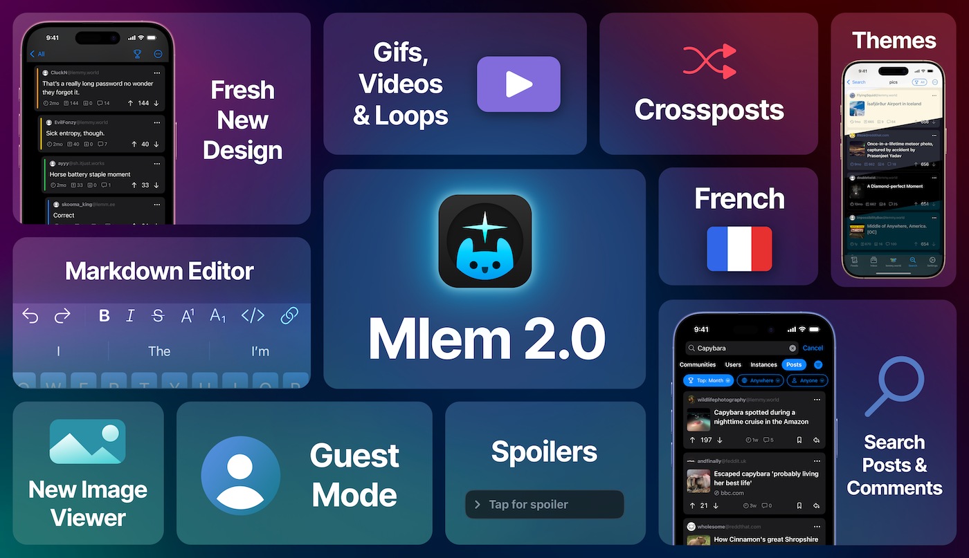
After a year in development and six months in beta, we are thrilled to announce that Mlem for Lemmy 2.0 is available on the App Store!
We've rewritten the app from the ground up--it's still the same Mlem our users know and love, but with significant performance improvements, a set of new features that were infeasible in our v1 app, and a fresh new design that feels right at home with the latest versions of iOS. There are more changes than we could list here, so the best way to see what's new is to just download the app, but some of the highlights include:
Media Enhancements
2.0 ships with a brand new image viewer and full support for gifs, videos, and animated webps. We've even added loops.video embedding--link posts to loops.video will display the linked video directly in Mlem.

Color Themes
In addition to the standard light and dark, Mlem 2.0 offers OLED, Solarized, and Dracula color themes, with more on the way. If you'd like us to support your favorite theme, let us know!
Markdown Handling
Powered by our custom cmark fork, Mlem 2.0 supports the full range of Lemmydown syntax.
Enhanced Post Composer
You can now create crossposts directly in the post editor (+ -> Crosspost), and can even post to multiple communities from multiple accounts at once. The keyboard now also sports a comprehensive set of Markdown editing tools.
French Localization
Mlem is now available in French, thanks to pylapp.
And More...
- Guest mode: you can now browse instances without an account
- Added a new Tiled post layout
- Keep place on switch: you can now switch accounts without reloading the app. This behavior can be toggled in
Settings->Accountsor accessed by long pressing an account in the account switcher. - You can now search for posts and comments
Compatibility Notice: Mlem 2.0 supports iOS 17 and later. If you are on an older iOS, you won't be able to download this update but will be able to continue using the previous version of Mlem.
Thank you to all of our beta testers, whose feedback and support has been invaluable.
Cheers,
Mlem is a free and open source project. 100% of our funding, which pays for things like server time, comes from our generous donors; we do not, and will never, run ads or sell data. If you'd like to help support Mlem, you can donate here.
57 Comments
Thekingoflorda@lemmy.world · 21 pts · 1y
Nice! Thank you (:
fan0m@lemmy.world · 11 pts · 1y
Very happy about the markdown editor!
ModernRisk@lemmy.dbzer0.com · 10 pts · 1y
I LOVE the new design and for me it’ll replace Voyager (for now).
capybeby@sh.itjust.works · 4 pts · 1y
Is that a threat?
leaf@lemmy.blahaj.zone · 2 pts · 1y
It's an arm's race to get involved in your love triangle.
Fecundpossum@lemmy.world · 10 pts · 1y
Just decided based on this post to check it out as I used to use Mlem back when I first joined, then used voyager for the last year or so. It’s beautiful and smooth and I think I’m keeping it.
BeigeAgenda@lemmy.ca · 8 pts · 1y
I searched for it on f-droid, too bad open source iPhone apps don't show up there 😁
ericbandrews@lemmy.ml · 4 pts · 1y
Haha not yet, though there are some promising transpiler projects to bridge SwiftUI over to Android—nothing’s mature enough yet to make supporting both platforms viable, but it’s only a matter of time.
Hamartiogonic@sopuli.xyz · 6 pts · 1y
The Loops integration is fantastic. Just love it!
leaf@lemmy.blahaj.zone · 3 pts · 1y
It's so easy to see Loops content now!
OccasionallyFeralya@lemmy.ml · 6 pts · 1y
Coincidentally yall updated the app right as I installed it. Gorgeous design, but the posts are so similar to comments I find it confusing sometimes. Would it be possible to have just the comments appear is bubbles while posts remain a rectangle? Or something visually distinct.
sjmarf@lemmy.ml · 7 pts · 1y
Thanks for the feedback. I've opened an issue here to keep track of this :)
OccasionallyFeralya@lemmy.ml · 5 pts · 1y
Oh wow thank you!
sjmarf@lemmy.ml · 2 pts · 1y
Hey again. We've updated the app to add a gray bar to the left of all comments in the profile feed, to give them similar styling to the comments that you'd see when reading the replies of a post.
Example:
I hope this makes them easier to distinguish from posts in the profile feed. Let us know if you have any further feedback :)
OccasionallyFeralya@lemmy.ml · 2 pts · 1y
Hello! I’ve just gone back to Mlem now and this is perfect! Thank so much for all the work you’ve been doing <3
sjmarf@lemmy.ml · 2 pts · 1y
Yw, I’m glad you like it :)
QuarterSwede@lemmy.world · 6 pts · 1y
Been using 2 since the beta and wanted to say great job to the devs. It’s very good and better than Voyager. Looks native and the markdown keyboard is super good.
esteemedtogami@lemmy.one · 5 pts · 1y
Damn, my iPad doesn't go beyond iPadOS 16. Guess I'm going out to get a new iPad. Great work!
leaf@lemmy.blahaj.zone · 4 pts · 1y
Amazing work 🤩
This update is going to cause another surge in user registrations!
awesomesauce309@midwest.social · 4 pts · 1y
Love the new features. You could post the markdown editor as its own keyboard extension. Undo and redo right there are invaluable, maybe with cut and paste.
The only features I can think of is a toggle so when you scroll the feed, if you long press media instead of save/share have it show the media in something like Quick Look. And video scrubbing
I feel like sometimes people shy away from open source because it can be unpolished, but not Mlem. This is polished to a shine, and adding loops integration is a cherry on top.
ericbandrews@lemmy.ml · 3 pts · 1y
Thanks for your kind words!
Scrubbing is actually next up on my todo list, so you shouldn’t have to wait too long for that one.
windowsphoneguy@feddit.org · 4 pts · 1y
Looks great!
mbtrhcs@feddit.org · 4 pts · 1y
Really like the new design and I think Mlem definitely carries the same "native" feel that Apollo used to. I just wish it had customizable swipes so I could make the switch from Voyager, but it looks like that's a low priority feature for now
sjmarf@lemmy.ml · 4 pts · 1y
Thanks for the feedback! This has a been a highly requested feature for a while. It would have been tricky to implement in Mlem 1.0 due to the app’s original design. However, in Mlem 2.0, we’ve built the swipe actions system with future customization in mind. We're planning to add customizable swipe actions sometime soon - the GitHub issue is here, if you want to keep an eye on our progress :)
mbtrhcs@feddit.org · 2 pts · 1y
That's great to hear! I saw the issue a few days ago but since it didn't have any comments or milestones (at the time) I assumed it was just lost in the backlog. Thanks for the update! :)
sjmarf@lemmy.ml · 2 pts · 1y
We've added swipe action customization to the TestFlight version of Mlem. It'll be live on the App Store in a couple of weeks or so :)
mbtrhcs@feddit.org · 1 pts · 1y
Ah, thanks so much for reaching out again! Downloading now :D
sjmarf@lemmy.ml · 2 pts · 1y
Yw :)
Jhogenbaum@leminal.space · 3 pts · 1y
Not in Google play store. Seems to only be ios.
sjmarf@lemmy.ml · 7 pts · 1y
That is correct - Mlem is available on iOS only.
xnx@slrpnk.net · 3 pts · 1y
Looks great! Was the hide read posts button removed? Cant find it
sjmarf@lemmy.ml · 3 pts · 1y
Nope, it should still be there:
xnx@slrpnk.net · 2 pts · 1y
Oh i thought there was an option to also make it a button in the home screen
ericbandrews@lemmy.ml · 1 pts · 1y
capybeby@sh.itjust.works · 3 pts · 1y
I adore the card mode!!
Shezzagrad@lemmy.ml · 3 pts · 1y
No android?
ericbandrews@lemmy.ml · 8 pts · 1y
Mlem is written in SwiftUI, which unfortunately is not compatible with Android. There are some promising projects to port Swift apps to Android, but nothing mature enough that we could feasibly support both platforms, though we’d like to if/when the cross platform Swift ecosystem matures enough for that to be realistic.
Shezzagrad@lemmy.ml · 3 pts · 1y
Totally understand and thank you for your excellent response
leaf@lemmy.blahaj.zone · 2 pts · 1y
Nice, it could work out like Orion with the chromium/firefox extensions working on ios.
sqw@lemmy.sdf.org · 3 pts · 1y
it just keeps getting better! thank you mlem devs!
Isa@feddit.org · 3 pts · 1y
It's sooo wonderful, thanks! 🫶
chase_what_matters@lemmy.world · 2 pts · 1y
I’m wondering how difficult it would be to allow us to change text size. Compared to the rest of the UI, comments feel large and bold.
sjmarf@lemmy.ml · 2 pts · 1y
You can change the text size for the app as a whole by going to System Settings -> Accessibility -> Per-App Settings (at the very bottom) -> Mlem -> Larger Text. We don't currently offer a way to change this for only part of the app, such as for comments only.
chase_what_matters@lemmy.world · 1 pts · 1y
Ah, thank you. Much better.
lazycouchpotato@lemmy.world · 2 pts · 1y
Congrats on the release! Just got around to updating the app on my iPad.
Wisens@discuss.tchncs.de · 2 pts · 1y
I like the ability to have "Blur NSFW" content from the quick menu on the top right when I'm in public or at work. Why was that moved/removed?
sjmarf@lemmy.ml · 4 pts · 1y
In 2.0 we rewrote the whole app from the ground up, and just forgot to re-implement that feature haha. We'll add it back in for next week's beta 👍
sjmarf@lemmy.ml · 1 pts · 1y
We've added this back to Mlem on the TestFlight version :)
Wisens@discuss.tchncs.de · 2 pts · 1y
Awesome! I'll check it out! Thank you so much!
Walican132@lemmy.today · 2 pts · 1y
Are filters broken or am I using them wrong? For example I previously filtered the phrase “PlayStation lifestyle” to block that particular website however I am still seeing its posts since updating and re entering my filters.
ericbandrews@lemmy.ml · 3 pts · 1y
We updated the filtering logic in 2.0 to make it more reliably filter keywords around punctuation, but it looks like that broke multi-word filters. Sorry about that, we'll have it fixed in the next build!
Walican132@lemmy.today · 2 pts · 1y
Thank you for letting me know. Good luck!
StraponStratos@lemmy.sdf.org · 1 pts · 1y
Ahh I am not a fan, it feels very clunky and bloated. And the cards seem to unnecessary.
It takes even more clicks to share a link post now, and it was already annoying enough already.
sjmarf@lemmy.ml · 1 pts · 1y
Thank you for your feedback. We're sorry that you aren't completely satisfied with the update.
We decided to switch to the card styling to provide better visual separation between posts in the feed. This was in response to feedback from some of our users that posts (and comments) felt too squished together. Is there anything in particular that you don't like about the cards?
If you don't like the background color of the cards in dark mode, you can revert to the pure black background by enabling the OLED theme under Settings -> Theme.
"Bloated" as in "too many unnecessary features"? We're trying to strike a balance between having a wide array of features to tailor to everyone's needs, and providing a simple, clean experience that's approachable to new users. If you have anything specific in mind that you think we should revisit, let me know.
The UX of the post composer has been tricky for us to work out - we've tried many different designs so far. I'll do some more prototyping and see if I can cut it back down from 3 -> 2 taps :)
Bogus5553@lemm.ee · 1 pts · 1y
It’s absolutely marvelous, but the little info box about which image type is on display is in many cases covering text.
sjmarf@lemmy.ml · 3 pts · 1y
The image type label is only shown when Developer Mode in switched on under Settings -> Advanced. If you turn off that setting, you won't see the label. We've got an issue open to move the image type label out of the way of the image when developer mode is on (link).
Bogus5553@lemm.ee · 4 pts · 1y
Thanks a lot, and thanks for the great app! It’s a pleasure to run it (:
sjmarf@lemmy.ml · 3 pts · 1y
I'm glad you're enjoying it :)
ChaoticNeutralCzech@feddit.org · -14 pts · 1y
lemmus@lemmy.world · 5 pts · 1y