Not my neighborhood! Upon re-siding my house a few years ago, the last white house on the street and block is gone. Heck yeah.
We have blues, reds, greens, a pink or two, and very few beige/neutral colors. One of my neighbors even has a bright blue roof and trim to make up for the gray siding.
Granted, many of them are painted so it’s decently easy to recolor. But those paint jobs set the tone for the area for sure. Also helps that there’s no HOA.
If you mean interior, that’s maybe more true, but much easier to remedy.
Thanks for the link! Id like to learn more about this esthetic.
It comes across as cheesy and lazy if its done poorly, but I might incorporate this style into a project now that I know who to look up for inspiration.
The 70s had their plastic craziness that lasted for decades, because it was expensive at the beginning. But no, things looking like they are made of plastic is very hard to do well and bad most of the time. Things looking like they are made of wood is normally much better.
IMO, it's less about the plastic and more about everything besides the plastic: the cool toned color palette with design shapes that stand out, the long benches and tables that chop out corners into various seats and small tables, etc.
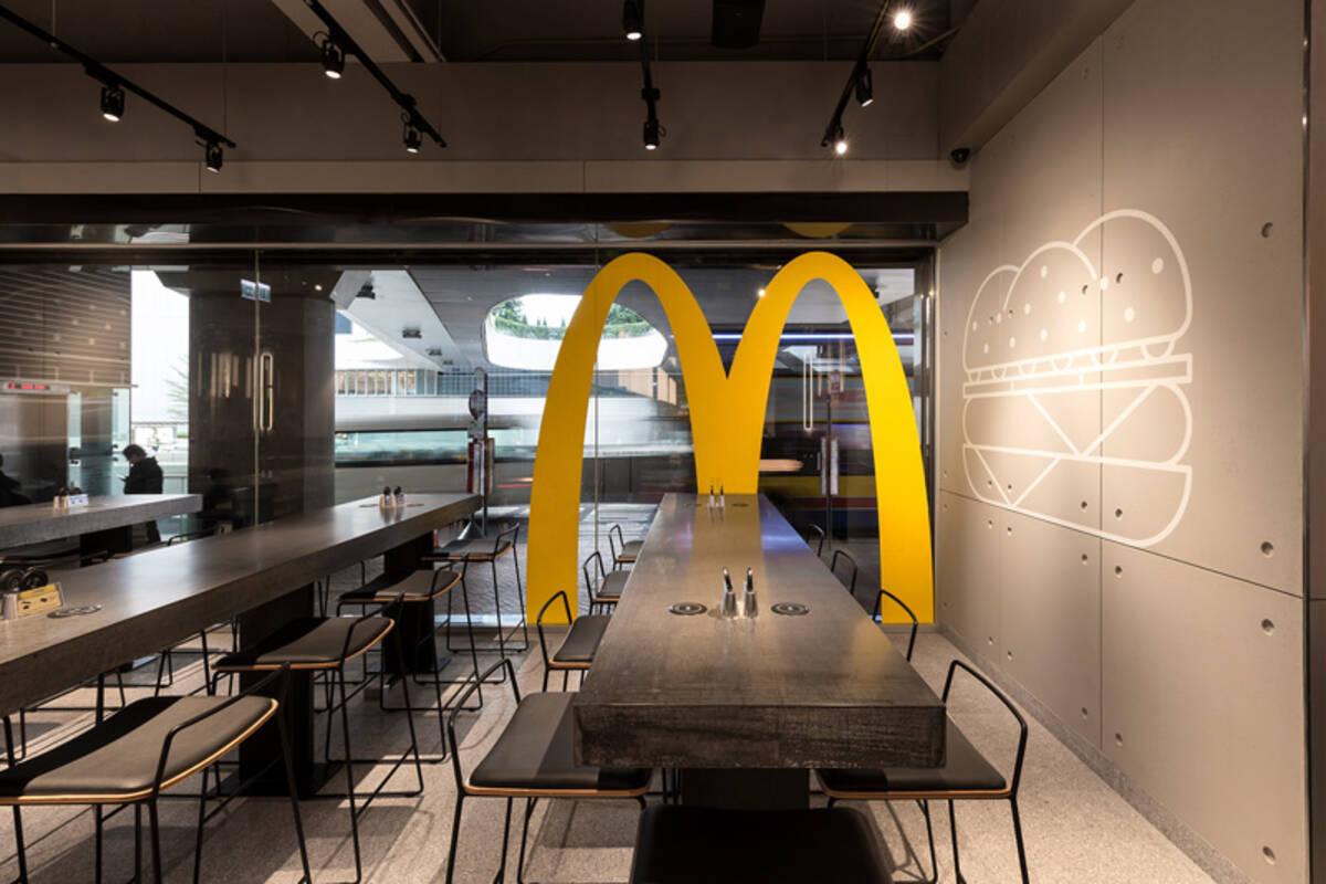
Today, business architecture and interior design feels...bland isn't quite the right word despite it being a good descriptor. McDonald's today looks like the "modern" coffee shops at airports like 10 or 20 years ago. It's that, like, "metropolitan" style with faux wood and stone with metal accents. Everything feels like an ouroboros of copying the homework of corporate minimalism that focuses on maximizing square footage and dollar extraction value while trying to look "professional" instead of a place meant for people. These places aren't meant for you to walk inside and patronage, they're just there to put the multi lane drive through on.
McDonald’s today looks like the “modern” coffee shops at airports like 10 or 20 years ago.
Yeah, it's the expensive of 20 years ago. It's still chic, because we had a monotone crazy at the 00s, just like we had a plastic crazy in the 70s. It's starting to look tired right now, so expect those places to stop using those soon.
Personally, I do prefer colors, but they are harder to get right, and both examples on the post are horrible. Also, they will probably "upgrade" to some tasteless "rococo" next that won't be any better. At least the tasteless monochrome is less imposing than those other ones.

20 Comments
Eheran@lemmy.world · 41 pts · 203d
That is because of real estate business. You can not sell a custom restaurant, you can a generic one.
Lucky_777@lemmy.world · 32 pts · 203d
Same goes for residential homes. People leave their houses neutral for the resale. It's sad shit really
ButteryMonkey@piefed.social · 14 pts · 203d
Not my neighborhood! Upon re-siding my house a few years ago, the last white house on the street and block is gone. Heck yeah.
We have blues, reds, greens, a pink or two, and very few beige/neutral colors. One of my neighbors even has a bright blue roof and trim to make up for the gray siding.
Granted, many of them are painted so it’s decently easy to recolor. But those paint jobs set the tone for the area for sure. Also helps that there’s no HOA.
If you mean interior, that’s maybe more true, but much easier to remedy.
SpaceNoodle@lemmy.world · 12 pts · 203d
Obligatory Fuck HOAs
errer@lemmy.world · 4 pts · 203d
If only more businesses embraced the old design, like Angry Pete’s in San Diego that took over an old Taco Bell https://www.sandiegoville.com/2024/01/angry-petes-brings-motor-city.html?m=1
aeronmelon@lemmy.world · 36 pts · 203d
Paper cup: the restaurant.
MeatPilot@sh.itjust.works · 24 pts · 203d
You can thank The Memphis Groups designs for making a strong influence on the 80s/90s
lectricleopard@lemmy.world · 7 pts · 203d
Thanks for the link! Id like to learn more about this esthetic.
It comes across as cheesy and lazy if its done poorly, but I might incorporate this style into a project now that I know who to look up for inspiration.
dmention7@midwest.social · 14 pts · 203d
This photo looks exactly how nachos and cinnamon twists taste. I will not be taking questions.
Semi_Hemi_Demigod@lemmy.world · 13 pts · 203d
There’s a Chase bank branch across the street from a Chipotle and from the exterior they’re identical except for the signs.
aeronmelon@lemmy.world · 15 pts · 203d
After I get a Chase burrito I’m going to open up a Chipotle savings account.
HakFoo@lemmy.sdf.org · 9 pts · 203d
The difference between Chase and Chipotle is that one is less eager to give you the runs.
marcos@lemmy.world · 11 pts · 203d
Looks cheap and uncomfortable.
The 70s had their plastic craziness that lasted for decades, because it was expensive at the beginning. But no, things looking like they are made of plastic is very hard to do well and bad most of the time. Things looking like they are made of wood is normally much better.
That said, yes, your modern example is bland.
EldritchFeminity@lemmy.blahaj.zone · 8 pts · 203d
IMO, it's less about the plastic and more about everything besides the plastic: the cool toned color palette with design shapes that stand out, the long benches and tables that chop out corners into various seats and small tables, etc.
Today, business architecture and interior design feels...bland isn't quite the right word despite it being a good descriptor. McDonald's today looks like the "modern" coffee shops at airports like 10 or 20 years ago. It's that, like, "metropolitan" style with faux wood and stone with metal accents. Everything feels like an ouroboros of copying the homework of corporate minimalism that focuses on maximizing square footage and dollar extraction value while trying to look "professional" instead of a place meant for people. These places aren't meant for you to walk inside and patronage, they're just there to put the multi lane drive through on.
marcos@lemmy.world · 0 pts · 203d
Yeah, it's the expensive of 20 years ago. It's still chic, because we had a monotone crazy at the 00s, just like we had a plastic crazy in the 70s. It's starting to look tired right now, so expect those places to stop using those soon.
Personally, I do prefer colors, but they are harder to get right, and both examples on the post are horrible. Also, they will probably "upgrade" to some tasteless "rococo" next that won't be any better. At least the tasteless monochrome is less imposing than those other ones.
RememberTheApollo_@lemmy.world · 5 pts · 203d
It was cheap, but comfortable enough for the 20-ish minutes you spent there to eat.
Jackcooper@lemmy.world · 4 pts · 203d
Agree. This is nostalgia bait. It was cheap and plastic and the teal and purple was everywhere you looked.
corsicanguppy@lemmy.ca · 9 pts · 203d
We went on a trip to a sunny place, and we saw when we arrived that all the houses and shops were brightly-coloured. It was beautiful.
QueenHawlSera@sh.itjust.works · 3 pts · 203d
I swear we just make everything an iPod nowadays
Willoughby@piefed.world · 2 pts · 132d
plot twist: these were taken last week in Alabama
/s