He wants to embed himself in the history as some kind of victor. It's his sick phantasy to be presented in history books as a hero. That's why he is doing everything he can to irreversibly leave his legacy wherever he can. That's why he's building the Epstein ballroom. That's why he renames buildings and places after himself. That's why he wants to create new colonies. He's a narcissist.
It is quick becoming a very important strategic hub in the Arctic due to shipping lanes opening up due to global heating. Greenland is also continuously opening up to natural resource extraction as ice disappears, and they have vast quantities of a lot of very valuable shit under the ground that keeps getting easier to access for the same reason, like rare earth elements, oil, natural gas, copper, gold, zinc, uranium, lithium, tungsten, the list goes on...
Controlling and exploiting that land is a major strategic interest for all the big (and small) powers. That's why he wants it, and everyone else too. Fuck his fat fucking ass though.
The dissonance with Trump is astonishing. The Arctic is recently becoming more important strategically due to ice disappearing, and yet he's one of the biggest and most stubborn climate change deniers.
I don't think that's the true size. You'll find all those countries are actually a lot bigger than presented on that map and scaled down to fit on a screen
Yes, but blue (Mercator) preserves direction and shape, which were all that really mattered for navigation by sea, so Mercator was a fantastic projection for centuries.
And we still use it today for smaller scale areas, since it does a remarkably good job at preserving all 4 features (shape, area, distance, and direction) close to the map origin line. Universal Transverse Mercator is a system that has 60 zones of Mercator turned sideways.
The reason it's Transverse is because, unlike lattitude depending on a defined equator, longitude has an arbitrary meridian, so by turning the map sideways we can move the distortion point, and any map area that doesn't stray too far East or West will be very accurate.
Think of trying to map something like Chile or Florida, where the area of interest is pretty far North to South, but not East to West.
TL;DR Somebody made an awful mistake rendering this map, it's way too low-poly.
It't not exactly the European portion but most of its recognizable parts (Kola peninsula, Caucascus...) are missing because of the horrible SVG compression that deleted vertices presumably by count rather than keeping the most significant* ones. Just look how the Mercator/shrunk versions differ from each other and from an actually good map! Not even they will show every fjord of Iceland but at least they won't reduce it to a triangle!
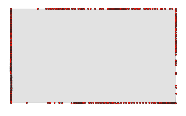
* A simple illustration would be Colorado, originally defined as a (Mercator) rectangle (between meridians and parallels) but ending up a 697-sided polygon (still way fewer than most surveyed administrative areas that size) largely because of surveying errors. However, if you pick the 1ˢᵗ, 175ᵗʰ, 349ᵗʰ and 523ʳᵈ vertex (or points every 362 mi/582 km along the border), you don't approximate the shape nearly as well as by picking the 4 corners of the defining rectangle.
And because corners are always mostly convex (they have to be because turns add up to 360° for closed areas), this compression will remove area more frequently than add it. This makes the map quite disingenuous (maybe not intentionally), as it amplifies the effect OOP was trying to show.
If I were a full-time Lemmy commenter, I'd download the Colorado polygon from OSM, import sone geo-libraries into Python and do all 174** combinations of picking the 1ˢᵗ, 175ᵗʰ, 349ᵗʰ and 523ʳᵈ vertex, visualize each quadrilateral (with great-circe edges) as a video frame with its area printed in the center.
What Colorado might look like using an algorithm similar to OOP's:
(Manually created single frame but accurate to the number of digits shown. Also, I actually used every 228ᵗʰ of the 912 OSM waypoints, which are sometimes redundant (colinear), which I didn't bother to check.)
(Edit: maybe official government geoJSON would help? The best files are "500k" or "1:500,000 resolution", and even they reduce Colorado to 357 vertices. The complete dataset is probably https://www2.census.gov/geo/docs/maps-data/data/grfc/public_grfc_cur25_08.txt (50 MB text file!); see also legend and FIPS but that is for all Colorado's counties, I'd have to merge the polygons and maybe also remove any non-polygon data if there's any.) ArcGIS says they processed the data but they probably left lots of redundant colinear points in, since there's 1565 vertices in their dataset.
** Technically 697 options because 697 is not divisible by 4. But only ¼ of them are fully distinct, as every consecutive 4 maps have an identical starting vertex and just differ in which pair of vertices is 175 apart as opposed to the normal 174.
Why is the difference only extremely pronounced in the northern hemisphere? If I understand the math behind the projection correctly, the equator should be true scale, and things should vary more the further north AND south you go.
This image shows the extreme southern latitudes to be almost equal to their true area. Is the image wrong, or am I misunderstanding something about the projection?
And the sphere is specifically large enough so that the curvature is too small to measure. Except every experiment that they've done to prove the Earth is flat just ends up proving that it's a sphere (or close enough) of the size we're taught in school.
Interesting how much closer kazakhstan (and by extension, china) is to europe when you see it like this. Like if the red outlines were all smooshed back closely together.
Crossing the globe north to south is the same distance as east to west, but since it is folded open on 2d maps it looks as if the earth is wider then it is higher. In this projection that means the map is stretched more horizontally than vertically, if i understand correctly.
Crossing the globe north to south is the same distance as east to west
Not true, the earth isn't a perfect sphere. Though I guess I'm just being nitpicky because I looked it up and it's only ~27mi/43km longer along the equator.
In this projection that means the map is stretched more horizontally than vertically, if i understand correctly
You're right! And yes, north to south is roughly the same distance as east to west. Subconsciously I've always felt like north to south is a quicker journey, but that was just Mercator playing a trick upon me
but that was just Mercator playing a trick upon me
Nearly every projection that show the entire globe on a 2d canvas will show you a map where the horizontal distance is almost double the vertical distance, so it is very correct that a journey from the top to the bottom is much shorter than from the most left to the most right.
True size is possible just fine on a 2D surface. For both too large and too small to be even possible there must exist some transitional point where the size is correct.
You cannot have both the size and shape correct at the same time. Having the correct size means distorting the shape, and vise versa. One or the other can be correct, but never both.
Also I just noticed that the borders no longer line up and it looks like there is ocean in between which isn’t the case. So I shows the size more accurately but is not useable as a map really.
They want a 2d map of earth but with every continent to true size at scale, rather than Mercator projection where the northern hemisphere is expanded to increase their importance over the southern hemisphere.
Mercator wasn’t created in order to increase importance of the northern hemisphere, but to allow for directional rhumb lines to be drawn for shipping. For its intended purpose of navigation, it does an excellent job.
It may not be the intended purpose but I certainly does change how the world is seen by everyone using it to warp the mind's eye to how the world actually physically is.
Edit: Does it do an excellent job for navigational purposes if you are shipping from Japan to Brazil or it it only excellent for shipping from the northern hemisphere to the northern hemisphere?
The Mercator projection was designed for use in marine navigation because of its unique property of representing any course of constant bearing as a straight segment. Such a course, known as a rhumb (alternately called a rhumb line or loxodrome) is preferred in marine navigation because ships can sail in a constant compass direction.
Perhaps if they are unaware that a 3D image of a geoid projected onto a 2D plane can cause issues, however every projection will have its own failings whether area, shape or directional (angular). Familiarity also comes into play, and i believe that is more at the root of the issue you bring up.
I don't know what you mean by "other such variations", but maybe you are looking for a map with something like the Mollweide projection? That's a bit of distortion in shape but trying to keep areas real.
The projection is the mathematical transformation from the curved surface of the Earth to a mathematical surface. You can have types of projections based on the mathematical surface (conical, cylindrical...), or based on the features they want to rescue from this transformation (conformal, equal-area...), but, sorry, I've never heard of a classification based on these "slices". Moreover, now that I think of it, even those projections we are familiar with have to be cut somewhere.
No, I know what you mean but that looks like some azimuthal projections put together in some conventional way. Maybe the concept you are looking for is a "composite" projection?
Equal area projections usually preserve straight and perpendicular meridians and parallels. That's neutral but then there's the political decision of what latitude gets the correct aspect ratio. And Gall-Peters is not anti-colonialist if representing Africa correctly was your goal.
Technically, the outer surface of a sphere is, itself, two-dimensional. It is, however, non-Euclidean and cannot be perfectly preserved in a Euclidean two-dimensional space.
The Goode Homolosine projection. You lose accurate direction, shape, AND size to a degree, but less size issues than some projections. It's a good way to remind kids that the world is round, but once you try to use it for anything like showing a route or visualizing relative distances, the limitations become significant.
I'm curious if anyone ever made a "Super Mercator" projection, something where "ze west" is even more exaggerated and some continents even more disproportionately reduced missing/removed to own the libs. It kinda sounds like something governments would do/people would like nowadays.
Africa is fucking vast! I always knew that,but looking at mercator maps puts it in perspective. You could comfortably fit Russia into it, the worlds largest country by are 😳

140 Comments
Smart_Penicillin@lemmy.world · 144 pts · 210d
Show this map to Trump. He will not want Greenland anymore.
CannonFodder@lemmy.world · 33 pts · 210d
Acquiring Greenland would move the USA up 2 places in the list of largest countries (past Canada and China). That's probably why he wants it.
thejml@sh.itjust.works · 26 pts · 210d
He just wants it ti deflect from the Epstein Files.
Opisek@piefed.blahaj.zone · 20 pts · 210d
He wants to embed himself in the history as some kind of victor. It's his sick phantasy to be presented in history books as a hero. That's why he is doing everything he can to irreversibly leave his legacy wherever he can. That's why he's building the Epstein ballroom. That's why he renames buildings and places after himself. That's why he wants to create new colonies. He's a narcissist.
tomiant@piefed.social · 16 pts · 210d
It is quick becoming a very important strategic hub in the Arctic due to shipping lanes opening up due to global heating. Greenland is also continuously opening up to natural resource extraction as ice disappears, and they have vast quantities of a lot of very valuable shit under the ground that keeps getting easier to access for the same reason, like rare earth elements, oil, natural gas, copper, gold, zinc, uranium, lithium, tungsten, the list goes on...
Controlling and exploiting that land is a major strategic interest for all the big (and small) powers. That's why he wants it, and everyone else too. Fuck his fat fucking ass though.
foo@feddit.uk · 3 pts · 210d
The dissonance with Trump is astonishing. The Arctic is recently becoming more important strategically due to ice disappearing, and yet he's one of the biggest and most stubborn climate change deniers.
Elgenzay@lemmy.ml · 18 pts · 210d
Wait till he finds out it's not green at all!
EtAl@lemmy.dbzer0.com · 11 pts · 210d
He knows it's all ice. That why it's called Iceland.
MajorMajormajormajor@lemmy.ca · 55 pts · 210d
Greenland: I was in the pool!
acockworkorange@mander.xyz · 2 pts · 209d
There's shrinkage!
DaddleDew@lemmy.world · 50 pts · 210d
Map Men most entertainingly explained this
sbeak@sopuli.xyz · 27 pts · 210d
Map Men Map Men Map Map Map Men Men!
protogen420@lemmy.blahaj.zone · 9 pts · 210d
Men map men map men map!
tomiant@piefed.social · 8 pts · 210d
So, these men... What is their area of expertise?
HeyThisIsntTheYMCA@lemmy.world · 6 pts · 210d
Glue
degen@midwest.social · 2 pts · 209d
Huffing, or...?
HeyThisIsntTheYMCA@lemmy.world · 1 pts · 209d
technically and
observes_depths@aussie.zone · 46 pts · 210d
I'll add that we use the mercator projection because it preserves shapes but not scale. There's other projections that preserve scale but not shapes.
ZombiFrancis@sh.itjust.works · 26 pts · 210d
Dymaxion Map supremacy.
https://en.wikipedia.org/wiki/Dymaxion_map
Rooster326@programming.dev · 6 pts · 210d
But how will we ever know who the anonymous "West" is?
ZombiFrancis@sh.itjust.works · 6 pts · 209d
Only the Mathematics and Cartographer classes, or the most elite Historians shall be able to decipher such knowledge.
BuboScandiacus@mander.xyz · 0 pts · 209d
Szupermaci
chonglibloodsport@lemmy.world · 20 pts · 210d
None of those preserve the shape of Antarctica!
WorldsDumbestMan@lemmy.today · 7 pts · 210d
What is this Twin-peak Earth?
HeyThisIsntTheYMCA@lemmy.world · 2 pts · 210d
how are the owls?
RizzRustbolt@lemmy.world · 5 pts · 209d
Superb!
ivanafterall@lemmy.world · 6 pts · 210d
Not to start any shit, but the Robinson Projection looks pretty nice.
Tehdastehdas@piefed.social · 37 pts · 210d
This post didn't need to include an ad for x-dot-com.
ZkhqrD5o@lemmy.world · 33 pts · 210d
Ragebait
ChaoticNeutralCzech@feddit.org · 5 pts · 209d
Tbh any discussion of Mercator is ragebait enough. (There's no better choice for slippy maps btw)
NaoPb@eviltoast.org · 4 pts · 209d
Croissant shape please.
ZpbkPEcaHhIveqdR@lemmy.world · 32 pts · 209d
I don't think that's the true size. You'll find all those countries are actually a lot bigger than presented on that map and scaled down to fit on a screen
MashedHobbits@lemy.lol · 15 pts · 209d
You don't know how big my screen is.
jaennaet@sopuli.xyz · 6 pts · 209d
rickywithanm@aussie.zone · 4 pts · 209d
It needs to be at least 3 times bigger then this
BarneyPiccolo@lemmy.today · 31 pts · 210d
This is why Trump wants Greenland so bad. He sees it, and says "It's big, I want it. Get it for me!" and gets all Veruca Salt about it.
All because he doesn't understand what a Mercator Projection is, on account of he beat up some nerd to do his homework that day, like every day.
ameancow@lemmy.world · 12 pts · 210d
BarneyPiccolo@lemmy.today · 5 pts · 209d
The Dems need to make a major case out of PeeWee Himmler for the Midterms. Expose him, and add him to the list of horrors that we are running against.
ameancow@lemmy.world · 4 pts · 209d
RizzRustbolt@lemmy.world · 2 pts · 209d
I don't want people associating Stephen Miller with a Brad Dourif character.
Mr. Dourif is a saint, and mensch, and doesn't deserve that smoke.
ameancow@lemmy.world · 4 pts · 209d
crank0271@lemmy.world · 29 pts · 210d
Hmm, so the Mercator projection makes things look larger than they are? I think I've got an idea for another use for it... 😏
Pwalabwa@quokk.au · 37 pts · 210d
::: spoiler Is that it? :::
:::
makyo@lemmy.world · 18 pts · 210d
Your penis isn’t far enough north for it to help
crank0271@lemmy.world · 5 pts · 210d
All right, well first I may need to see a doctor.
HeyThisIsntTheYMCA@lemmy.world · 1 pts · 210d
Yet
MajorMajormajormajor@lemmy.ca · 15 pts · 210d
Slightly enlarging something that is microscopic doesn't change much.
mnemonicmonkeys@sh.itjust.works · 4 pts · 210d
10 x 0 = 0
NaibofTabr@infosec.pub · 27 pts · 210d
This just in: projection requires distortion.
sik0fewl@piefed.ca · 5 pts · 210d
Not if you project it onto an oblate spheroid.
chiliedogg@lemmy.world · 25 pts · 209d
Yes, but blue (Mercator) preserves direction and shape, which were all that really mattered for navigation by sea, so Mercator was a fantastic projection for centuries.
And we still use it today for smaller scale areas, since it does a remarkably good job at preserving all 4 features (shape, area, distance, and direction) close to the map origin line. Universal Transverse Mercator is a system that has 60 zones of Mercator turned sideways.
The reason it's Transverse is because, unlike lattitude depending on a defined equator, longitude has an arbitrary meridian, so by turning the map sideways we can move the distortion point, and any map area that doesn't stray too far East or West will be very accurate.
Think of trying to map something like Chile or Florida, where the area of interest is pretty far North to South, but not East to West.
Zerush@lemmy.ml · 22 pts · 209d
huppakee@piefed.social · 21 pts · 210d
There also an interactive version of this, also a bunch of copies (not sure if this is the original, but i believe so): https://thetruesize.com/
Pyr_Pressure@lemmy.ca · 20 pts · 209d
How much do you wanna bet Trump wouldn't be so gung ho on Greenland if he saw this map? He probably thinks he is going to double the size of America.
Jankatarch@lemmy.world · 6 pts · 209d
Can they spot grrenland on the map tho?
piccolo@sh.itjust.works · 5 pts · 209d
Trump handlers want the resources. Trump wants it because his ego is inflated by mercator projection.
Knightfox@lemmy.world · 2 pts · 209d
Eh, I doubt that's the case. It could be a 20 m^2 area, but if it had Greenland's resources they would want it.
Hackworth@piefed.ca · 16 pts · 210d
Relevant West Wing Scene
marcos@lemmy.world · 15 pts · 210d
Did it cut out the European portion of Russia?
mEEGal@lemmy.world · 48 pts · 210d
No, it just can't be scaled down and somehow kept in place at the tame time
LodeMike@lemmy.today · 9 pts · 210d
Its distorted on the Mercator projection quite a bit because of its width. So the true shape looks very different presented like this.
ChaoticNeutralCzech@feddit.org · 5 pts · 210d
TL;DR Somebody made an awful mistake rendering this map, it's way too low-poly.
It't not exactly the European portion but most of its recognizable parts (Kola peninsula, Caucascus...) are missing because of the horrible SVG compression that deleted vertices presumably by count rather than keeping the most significant* ones. Just look how the Mercator/shrunk versions differ from each other and from an actually good map! Not even they will show every fjord of Iceland but at least they won't reduce it to a triangle!
* A simple illustration would be Colorado, originally defined as a (Mercator) rectangle (between meridians and parallels) but ending up a 697-sided polygon (still way fewer than most surveyed administrative areas that size) largely because of surveying errors. However, if you pick the 1ˢᵗ, 175ᵗʰ, 349ᵗʰ and 523ʳᵈ vertex (or points every 362 mi/582 km along the border), you don't approximate the shape nearly as well as by picking the 4 corners of the defining rectangle.
And because corners are always mostly convex (they have to be because turns add up to 360° for closed areas), this compression will remove area more frequently than add it. This makes the map quite disingenuous (maybe not intentionally), as it amplifies the effect OOP was trying to show.
If I were a full-time Lemmy commenter, I'd download the Colorado polygon from OSM, import sone geo-libraries into Python and do all 174** combinations of picking the 1ˢᵗ, 175ᵗʰ, 349ᵗʰ and 523ʳᵈ vertex, visualize each quadrilateral (with great-circe edges) as a video frame with its area printed in the center.
What Colorado might look like using an algorithm similar to OOP's:
(Manually created single frame but accurate to the number of digits shown. Also, I actually used every 228ᵗʰ of the 912 OSM waypoints, which are sometimes redundant (colinear), which I didn't bother to check.)
(Edit: maybe official government geoJSON would help? The best files are "500k" or "1:500,000 resolution", and even they reduce Colorado to 357 vertices. The complete dataset is probably https://www2.census.gov/geo/docs/maps-data/data/grfc/public_grfc_cur25_08.txt (50 MB text file!); see also legend and FIPS but that is for all Colorado's counties, I'd have to merge the polygons and maybe also remove any non-polygon data if there's any.) ArcGIS says they processed the data but they probably left lots of redundant colinear points in, since there's 1565 vertices in their dataset.
** Technically 697 options because 697 is not divisible by 4. But only ¼ of them are fully distinct, as every consecutive 4 maps have an identical starting vertex and just differ in which pair of vertices is 175 apart as opposed to the normal 174.
BarneyPiccolo@lemmy.today · 14 pts · 210d
I need a Mercator Projection in my pants.
AngryCommieKender@lemmy.world · 7 pts · 210d
That close to your equator, wouldn't it have the opposite of the intended effect?
BarneyPiccolo@lemmy.today · 5 pts · 209d
I only know that it helicopters in the opposite direction when you cross the equator.
MajorasTerribleFate@lemmy.zip · 1 pts · 209d
Penis so big, the Coriolis effect applies.
nieminen@lemmy.world · 1 pts · 208d
Sadly, it'll never experience the clitoris effect.
AnnaFrankfurter@lemmy.ml · 14 pts · 209d
Maybe show this to taco trump and he'll realize Greenland is small and
levelleave it be.Edit fixed typo
DeathByBigSad@sh.itjust.works · 16 pts · 209d
INSTRUCTIONS UNCLEAR, ICBM SEQUENCE INITIATED
☢️🚀⤵️💥🌇
(You made a fatal spelling mistake, you killed Greenland, its all your fault!)
ChaoticNeutralCzech@feddit.org · 14 pts · 209d
Instructions nuclear
tigeruppercut@lemmy.zip · 8 pts · 209d
He's gonna nuuk it
BradleyUffner@lemmy.world · 13 pts · 210d
Why is the difference only extremely pronounced in the northern hemisphere? If I understand the math behind the projection correctly, the equator should be true scale, and things should vary more the further north AND south you go.
This image shows the extreme southern latitudes to be almost equal to their true area. Is the image wrong, or am I misunderstanding something about the projection?
lvxferre@mander.xyz · 37 pts · 210d
bort@sopuli.xyz · 8 pts · 210d
huh. so flat earthers were right all along.
ruplicant@sh.itjust.works · 4 pts · 210d
so they've gone full circle (or should I say sphere) and we really inhabit a sphere, just not the sphere the sheeple believe in? that's amazing
mnemonicmonkeys@sh.itjust.works · 3 pts · 210d
And the sphere is specifically large enough so that the curvature is too small to measure. Except every experiment that they've done to prove the Earth is flat just ends up proving that it's a sphere (or close enough) of the size we're taught in school.
All flat Earthers are fucking stupid
Hupf@feddit.org · 2 pts · 210d
https://youtu.be/7ayNc1iXfE8
SkaveRat@discuss.tchncs.de · 18 pts · 210d
Antarctica is missing, which skews it heavily towards north
bdonvr@thelemmy.club · 13 pts · 210d
It doesn't show Antarctica, but also there's just more stuff in the far north than the far south (if we aren't counting Antarctica)
gigachad@piefed.social · 11 pts · 210d
FinjaminPoach@lemmy.world · 11 pts · 210d
Interesting how much closer kazakhstan (and by extension, china) is to europe when you see it like this. Like if the red outlines were all smooshed back closely together.
huppakee@piefed.social · 9 pts · 210d
Crossing the globe north to south is the same distance as east to west, but since it is folded open on 2d maps it looks as if the earth is wider then it is higher. In this projection that means the map is stretched more horizontally than vertically, if i understand correctly.
bdonvr@thelemmy.club · 4 pts · 210d
Not true, the earth isn't a perfect sphere. Though I guess I'm just being nitpicky because I looked it up and it's only ~27mi/43km longer along the equator.
FinjaminPoach@lemmy.world · 1 pts · 209d
You're right! And yes, north to south is roughly the same distance as east to west. Subconsciously I've always felt like north to south is a quicker journey, but that was just Mercator playing a trick upon me
huppakee@piefed.social · 1 pts · 209d
Nearly every projection that show the entire globe on a 2d canvas will show you a map where the horizontal distance is almost double the vertical distance, so it is very correct that a journey from the top to the bottom is much shorter than from the most left to the most right.
SlurpingPus@lemmy.world · 2 pts · 209d
Now guess where China builds railroads for exports to Europe.
ComradeRachel@lemmy.blahaj.zone · 11 pts · 210d
How can it be the true size if it’s still a projection on a 2d surface? I thought could only see the true size on a 3d globe.
vithigar@lemmy.ca · 18 pts · 210d
True size is possible just fine on a 2D surface. For both too large and too small to be even possible there must exist some transitional point where the size is correct.
You cannot have both the size and shape correct at the same time. Having the correct size means distorting the shape, and vise versa. One or the other can be correct, but never both.
HeyThisIsntTheYMCA@lemmy.world · 4 pts · 210d
It's a curved 2d surface
Liz@midwest.social · 1 pts · 210d
It's a much closer approximation, anyway.
ComradeRachel@lemmy.blahaj.zone · 1 pts · 210d
Also I just noticed that the borders no longer line up and it looks like there is ocean in between which isn’t the case. So I shows the size more accurately but is not useable as a map really.
Liz@midwest.social · 1 pts · 207d
Ah, yes, this would be a frustrating map to try and actually use.
melsaskca@lemmy.ca · 7 pts · 209d
If I have to shower in gym class I want the mercator-projection showers.
WhiskyTangoFoxtrot@lemmy.world · 7 pts · 209d
But then everything near the equator will be smaller.
Natanael@infosec.pub · 2 pts · 209d
This map won't be centered on the equator
000@lemmy.dbzer0.com · 1 pts · 209d
stevedice@sh.itjust.works · 3 pts · 209d
Do you shower in a handstand?
someguy3@lemmy.world · 7 pts · 210d
Go Robinson or Winkel.
https://futuremaps.com/blogs/news/top-10-world-map-projections
yermaw@sh.itjust.works · 6 pts · 210d
Is Africa the only one here not stuffing socks down their trousers?
ILikeBoobies@lemmy.ca · 5 pts · 209d
The oceans are huge.
Eiri@lemmy.ca · 5 pts · 210d
Doesn't that kinda make Canada look smaller than the US?
Warl0k3@lemmy.world · 18 pts · 210d
Canada (9.98M sqkm) is only slightly larger than the US (9.83M sqkm), so it checks out that they're really close in size here
Eiri@lemmy.ca · 2 pts · 210d
Huh. I was convinced there was a bigger difference.
Jankatarch@lemmy.world · 5 pts · 209d
Damn Indonesia is huge.
ryannathans@aussie.zone · 4 pts · 210d
I don't think Tasmania is right
scala@lemmy.ml · 4 pts · 210d
Anyone know of a 2D map print of true size? All I've found print wise is Mercator or other such variations.
Denixen@feddit.nu · 4 pts · 209d
Let me know if I understand correctly. You want a true to life sized map of earth? 😳
Mycatiskai@lemmy.ca · 2 pts · 209d
They want a 2d map of earth but with every continent to true size at scale, rather than Mercator projection where the northern hemisphere is expanded to increase their importance over the southern hemisphere.
snapoff@sh.itjust.works · 4 pts · 209d
Mercator wasn’t created in order to increase importance of the northern hemisphere, but to allow for directional rhumb lines to be drawn for shipping. For its intended purpose of navigation, it does an excellent job.
Mycatiskai@lemmy.ca · 2 pts · 209d
It may not be the intended purpose but I certainly does change how the world is seen by everyone using it to warp the mind's eye to how the world actually physically is.
Edit: Does it do an excellent job for navigational purposes if you are shipping from Japan to Brazil or it it only excellent for shipping from the northern hemisphere to the northern hemisphere?
tigeruppercut@lemmy.zip · 3 pts · 209d
It works for any shipping lines
https://en.wikipedia.org/wiki/Mercator_projection
SlurpingPus@lemmy.world · 3 pts · 209d
Do you seriously think that the geometrical properties of the projection change below the equator? You need to learn yourself some geometry.
snapoff@sh.itjust.works · 1 pts · 209d
Perhaps if they are unaware that a 3D image of a geoid projected onto a 2D plane can cause issues, however every projection will have its own failings whether area, shape or directional (angular). Familiarity also comes into play, and i believe that is more at the root of the issue you bring up.
As for your navigational questions, this Reddit thread may be helpful https://www.reddit.com/r/explainlikeimfive/comments/4s4869/eli5_how_mercator_projections_are_better_for/
scala@lemmy.ml · 2 pts · 209d
Exactl, this.
ThunderclapSasquatch@startrek.website · 1 pts · 209d
That's not why Mercator exists
Denixen@feddit.nu · 1 pts · 209d
Ah that makes a lot more sense! 😅
selokichtli@lemmy.ml · 3 pts · 209d
I don't know what you mean by "other such variations", but maybe you are looking for a map with something like the Mollweide projection? That's a bit of distortion in shape but trying to keep areas real.
scala@lemmy.ml · 1 pts · 209d
No, because Africa is larger than Russia, this shows Russia as massive.
MajorasTerribleFate@lemmy.zip · 1 pts · 209d
Africa: 30.3 million km²
Asia: 44 million km²
Nowhere near the difference Mercator projection maps make it out to be, but Asia definitely is larger.
scala@lemmy.ml · 1 pts · 209d
Russia*
MajorasTerribleFate@lemmy.zip · 0 pts · 207d
Your original comment definitely said Asia.
selokichtli@lemmy.ml · 1 pts · 209d
You may want to double check that, or you probably will need an imaginary map.
WhiskyTangoFoxtrot@lemmy.world · 1 pts · 209d
What do they call the projections that have slices taken out of them at the oceans?
selokichtli@lemmy.ml · 1 pts · 209d
The projection is the mathematical transformation from the curved surface of the Earth to a mathematical surface. You can have types of projections based on the mathematical surface (conical, cylindrical...), or based on the features they want to rescue from this transformation (conformal, equal-area...), but, sorry, I've never heard of a classification based on these "slices". Moreover, now that I think of it, even those projections we are familiar with have to be cut somewhere.
WhiskyTangoFoxtrot@lemmy.world · 1 pts · 209d
Another post in this thread had an example of one, called Goode's Homolosine Equal-area Projection.
selokichtli@lemmy.ml · 1 pts · 209d
No, I know what you mean but that looks like some azimuthal projections put together in some conventional way. Maybe the concept you are looking for is a "composite" projection?
fossilesque@mander.xyz · 3 pts · 209d
ChaoticNeutralCzech@feddit.org · 2 pts · 209d
Equal area projections usually preserve straight and perpendicular meridians and parallels. That's neutral but then there's the political decision of what latitude gets the correct aspect ratio. And Gall-Peters is not anti-colonialist if representing Africa correctly was your goal.
scala@lemmy.ml · 1 pts · 209d
Essentially this. A true sized projection, it can be in any "cut" of the globe as long as all the continents are true to size.
MajorasTerribleFate@lemmy.zip · 2 pts · 209d
Technically, the outer surface of a sphere is, itself, two-dimensional. It is, however, non-Euclidean and cannot be perfectly preserved in a Euclidean two-dimensional space.
doingthestuff@lemy.lol · 4 pts · 209d
Brazil could be the world's superpower but they have other priorities.
SLVRDRGN@lemmy.world · 2 pts · 209d
Skullgrid@lemmy.world · 2 pts · 209d
O RUMBO A HEXA
ILikeBoobies@lemmy.ca · 1 pts · 209d
The world wouldn't let them destroy enough of the rainforest to do so.
YiddishMcSquidish@lemmy.today · 3 pts · 209d
Whatever happened to that wavy "W/M" looking one I remember seeing on some news stations when I was younger?
BanMe@lemmy.world · 3 pts · 209d
The Goode Homolosine projection. You lose accurate direction, shape, AND size to a degree, but less size issues than some projections. It's a good way to remind kids that the world is round, but once you try to use it for anything like showing a route or visualizing relative distances, the limitations become significant.
lemmydividebyzero@reddthat.com · 2 pts · 209d
Russia 😂
doingthestuff@lemy.lol · 1 pts · 209d
It's still pretty big.
SubArcticTundra@lemmy.ml · 2 pts · 210d
Russia gains most from this
LainTrain@lemmy.dbzer0.com · 2 pts · 210d
I'm curious if anyone ever made a "Super Mercator" projection, something where "ze west" is even more exaggerated and some continents even more disproportionately reduced missing/removed to own the libs. It kinda sounds like something governments would do/people would like nowadays.
fossilesque@mander.xyz · 9 pts · 210d
tigeruppercut@lemmy.zip · 4 pts · 210d
Oh god, they made Boston the center of the world
fossilesque@mander.xyz · 2 pts · 210d
gergolippai@lemmy.world · 1 pts · 210d
in summary, australia is fucking big.
Avicenna@programming.dev · 1 pts · 210d
over compensation, much like americans using monster trucks
selokichtli@lemmy.ml · 1 pts · 209d
Side note: Damn, that's shit-res data, come on.
Denixen@feddit.nu · 1 pts · 209d
Africa is fucking vast! I always knew that,but looking at mercator maps puts it in perspective. You could comfortably fit Russia into it, the worlds largest country by are 😳
Lauchmelder@feddit.org · -6 pts · 210d
How is this a science meme
fossilesque@mander.xyz · 5 pts · 210d
Lauchmelder@feddit.org · -1 pts · 210d
This isn't a meme
fossilesque@mander.xyz · 4 pts · 210d